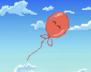
Play game
Windy Balloon's itch.io pageResults
| Criteria | Rank | Score* | Raw Score |
| Fun/Engagement | #7 | 3.643 | 3.643 |
| Theme | #14 | 3.952 | 3.952 |
| Overall | #23 | 3.321 | 3.321 |
| Audio/Music | #38 | 2.929 | 2.929 |
| Art/Graphics | #48 | 2.762 | 2.762 |
Ranked from 42 ratings. Score is adjusted from raw score by the median number of ratings per game in the jam.
Judge feedback
Judge feedback is anonymous and shown in a random order.
- Rage games aren't my cup of tea, but I think this one is pretty well made. There were a lot of nice little touches like the audio of the buzzsaws getting louder as you got nearer to them. Unfortunately I wasn't able to beat the trial, getting stuck at the narrow hallway with spikes and flames, but here's my feedback on what I was able to play. The wind coming from just a circle was very frustrating to get used to as I generally had a pretty poor idea of where and how fast the balloon was going to move when I clicked. Something on the cursor that always rotated to face the balloon on the cursor so you had a better idea of which direction you were about to blow in would have helped a lot. (I'm imagining like the fan icon that your cursor becomes in mario galaxy on the levels where you blow mario around in a bubble). Some of the hitboxes could have also been a little more forgiving as well. I know it's meant to be a rage game, but having the hitboxes be the exact size of the dangerous objects made it feel a little too unforgiving. If there had been a little more wiggle room by making the hitboxes a tad bit smaller, I think I would have felt like it was more my fault when I died. I also think giving the player the option to zoom the camera in would have been really useful. The balloon is extremely smaller and very similar in tone to the background, so at some tighter spots it was extremely difficult to tell where it was and I just wished I could zoom a little to navigate tight corners. All in all I think this a decent game which could use a little extra attention to player experience.
- Good tutorials, very cool use of the theme. The game was a lot too hard for me tho. The tutorials were nice, then there was a single level with brutal difficulty, just the very first obstacle was a very very tiny space to go between a wall and a flame. I feel the game would've felt better if there was multiple levels with progressing difficulty. In that state it was "super easy tutorial" then "super hardcore" there was just no time to get better at the game and familiarize with the unusual controls.
Did you work alone, or as part of a group? (If in a group, list their names)
Alone
Disclose if you used any public domain assets or not.
Yes, animated sprites are from the GDevelop asset store
Leave a comment
Log in with itch.io to leave a comment.


Comments
I got 7.35s xD
You had to make me check the leaderboard… 7 mins! Not 7 seconds! I thought there was a noclip glitch you had managed and when straight to the end! 🤣
Sorry my bad! I forgot time has milisecond precision xD
Getting Over It vibes with how difficult the movement system was, but it was fun!
Super fun to play :) nicely made!
I love this mechanic! The gravity turns it into a whole new experience, and I love it. I gave up 4 minutes into the Trial of Looney, only getting halfway, but if I was better at the game, I'm sure I would be addicted to it.
Love the mechanic, would make a great mobile game. Good Job!