Play Scale
Scale Factor's itch.io pageResults
| Criteria | Rank | Score* | Raw Score |
| Style | #705 | 4.029 | 4.029 |
| Overall | #1329 | 3.549 | 3.549 |
| Creativity | #1505 | 3.588 | 3.588 |
| Enjoyment | #2446 | 3.029 | 3.029 |
Ranked from 34 ratings. Score is adjusted from raw score by the median number of ratings per game in the jam.
How does your game fit the theme?
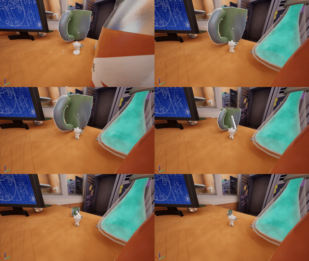
The player has the ability to scale objects around them wether it's speed, size or mass
Development Time
96 hours
(Optional) Please credit all assets you've used
All members are credited in game and are also authors on the itch.io
Leave a comment
Log in with itch.io to leave a comment.




Comments
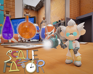
Such an enjoyable game! Love the quirky character and all these well-crafted assets. A very fun and quite polished game. Great job!
Note. Some objects that clearly should scale cannot be scaled due to a bug. However, this wont stop you from finishing the demo! Scaling the objects in the scales can be difficult to a bug that we didn't have time to fix, but you can still do it with persistence!
We will update it after we are allowed to do so.
However I think the game needs a little more clarity. I found it a bit difficult to play. Here's some feedback from me in case ya'll keep working on this:
I wish there was some feedback on what items you can scale and what items you can't. Maybe a highlight when you mouse over them?
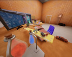
I love the diegetic tutorials on the notepads, however since there are only 4 different camera angles it makes some of them hard to read. The red one in the picture gave me a lot of trouble.
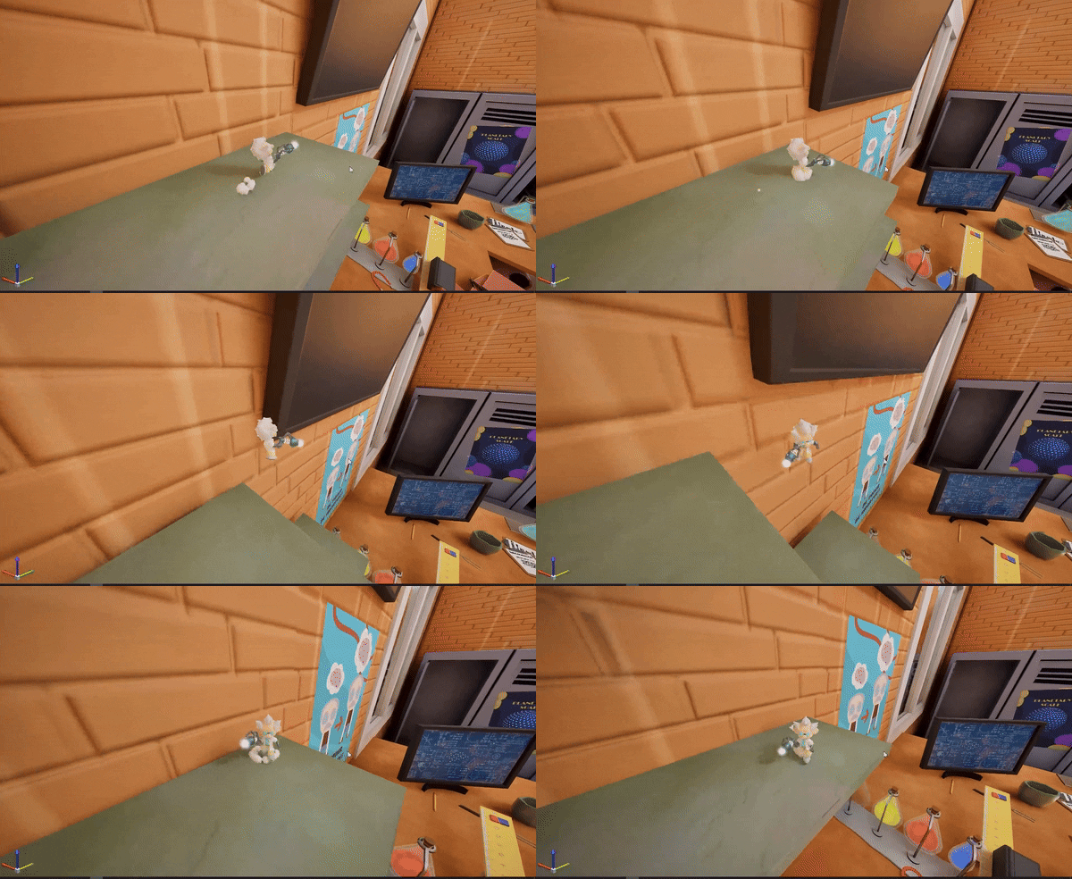
These books with the blue arrow are a great piece of set dressing, but makes it confusing for the player on whats traversable. I was able to jump on that book with some difficulty, but at first I thought that's what the solution was. I'd move the second book in the stack so it doesn't look like a platform, or move it one book higher so it's clear you cannot jump that high.
I fell off the table and had to start all the way back at the beginning. This made me sad, it would be great to have a checkpoint system!
This game is really cool and I'd love to see more of it, awesome job!
The hardwork put in this is unquestionable. Gameplay just requires a bit more clarity. Great work
The visuals were great, and I loved the concept. But I found it very awkward to play. The camera snapping to certain rotations made it difficult to aim at anything or see where I was going, and it wasn't clear what things you could or could not scale. >.<'
this game is fire hof hof hof
I liked the art here. The idea was also kinda nice, but i just could not figure out what objects were scalable.
This is when a mad scientist decides to be a good person : )
( The camera is mad too but the visuals stll amazing! )
Love this game!
nice graphics and game idea ! control were a bit hard to handle but still, quite impressive, well done
Loved the graphics and the gameplay style is also awesome
Sorry, it may be my bad PC, but the game went on 1 FPS :(
It looks great though :)
Really Nice visuals! Cool concept execution too!
Would greatly appreciate it if you checked out my game!
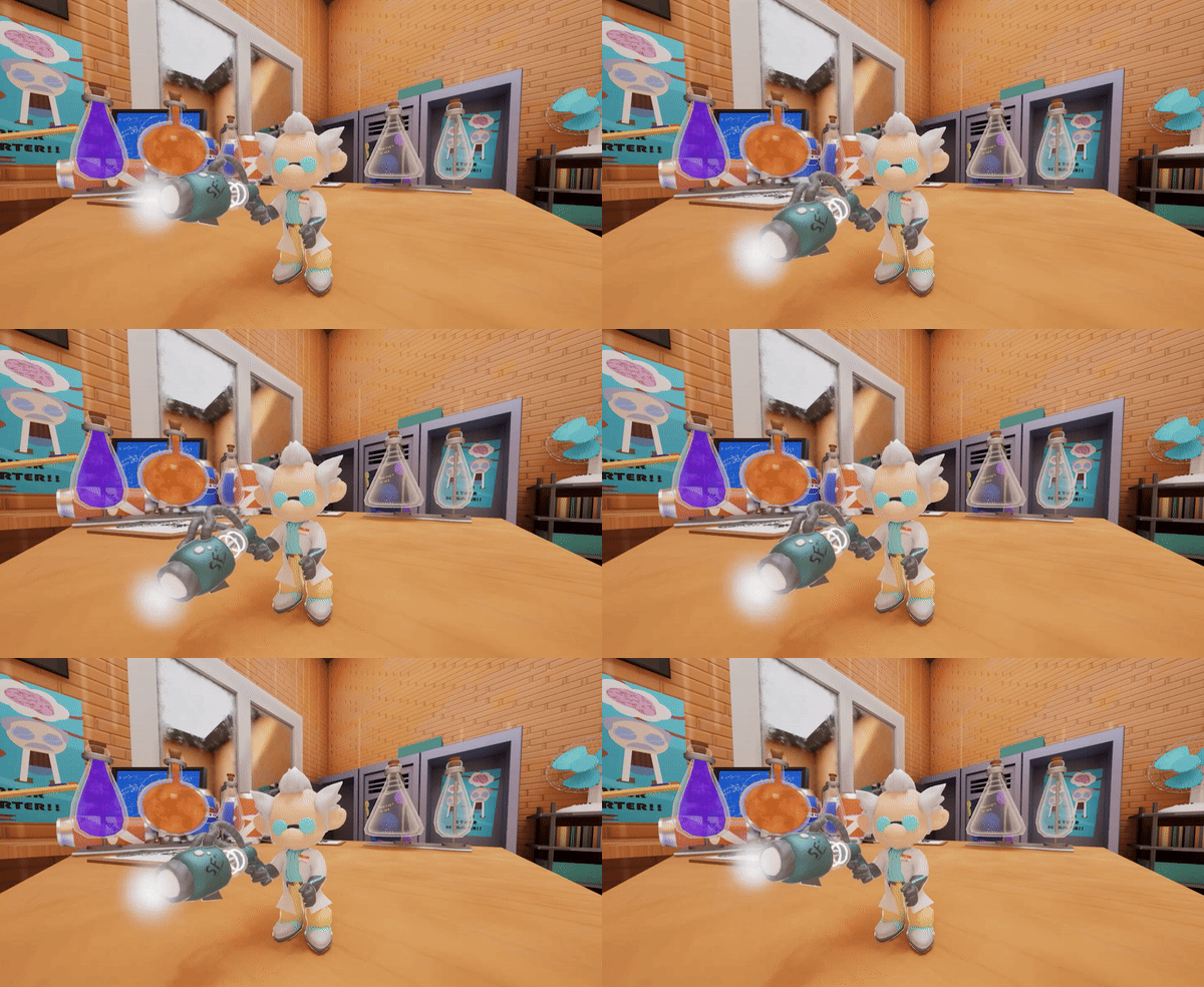
Cute visuals, and love the funny little scientist!
Really good looking models and a fun concept!
Amazing visuals and concept!Nice take on the theme! Amazing job!
Art is, as everyone else has said, phenomenal for a game jam game. Well done!
Would be very grateful if you tried our game!
Really liked the art style and concept. Great job!
I really liked the artstyle, and the concept, the main character felt charismatic.
I liked the audio part a lot as well (especially, when you can't scale down anymore)
The tutorial notes kept me focus in the game, and I liked that.
I felt like the speed up was introduced a bit early considering the theme of the jam.
Overall I think this game and concept has a lot of potential !
I basically agree in every point with ComfyMittenCole, graphic is great also quite a lot of invisible walls and janky camera doesn't help, i would say if you put some visual clues, like yellow paint witch showed you path, it would help....
I like the style and the music and the overall vibe of the game. I hate the camera controls, and mixing that style camera control with the walking controls locked to angles made most of the jumps incredibly frustrating. I know its supposed to be a "figure it out along the way" kind of game but I found it difficult to understand where I was supposed to go as a player. I have no idea where "the machine" is so it felt like I was just stumbling through puzzles that I could bypass by squeezing through spaces and abusing the hitboxes/jump mechanic. I also am not sure what was going on with the hit detection for the shrink/enlarge ray but pretty much every time I tried to shoot I had to mess with the camera angle or wiggle the mouse erratically to find where it would actually fire.