Play game
Jerry Broke The Wall's itch.io pageResults
| Criteria | Rank | Score* | Raw Score |
| Graphics/Animation | #1 | 4.618 | 4.618 |
| Technical Implementation | #4 | 3.945 | 3.945 |
| Music/Sound | #6 | 3.909 | 3.909 |
| Overall | #10 | 3.811 | 3.811 |
| Fun/Design | #50 | 3.455 | 3.455 |
| Theme/Limitation | #67 | 3.127 | 3.127 |
Ranked from 55 ratings. Score is adjusted from raw score by the median number of ratings per game in the jam.
How does your game implement the focus, Multi-Use?
You can use a single button to perform multiple actions which are chosen appropriately for the moment.
Team Size
Solo (1)
Completeness
Complete Game
What tools did your team use to construct the game?
Unity
Leave a comment
Log in with itch.io to leave a comment.



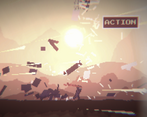
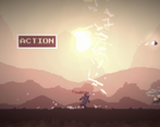
Comments
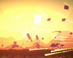
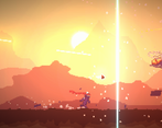
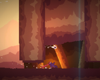
Amazing visuals (best I've seen so far in the jam) and good idea. Action buttons a bit finicky (sometimes it will not register the click) and the helicopters coming at you part is impossible (for me at least - I played in normal). Really good execution. Sound can get tiresome and repetitive too soon.
Thanks for your feedback! I don't believe the button didn't register the click, maybe you missed it because the hitbox is accurate. I also wanted to mention that the helicopter part is very possible, even in Jerry Mode (I tested it on mobile too).
It's a very fun and original idea! I love how many different uses you managed to make with a single button, even if i felt like sometimes the button was pressed but the action failed anyway.
I would be really grateful if you played and rated my entry too.
Thank you for your feedback! Sometimes, you need time the press of The Action Button perfectly to land where you're supposed to, and that was very intentional. There are spots in the game where you need to wait a bit and then press it, so you still ned to pay attention to the enviroment! :D
Yea that actually adds depth to the game
I really didn't enjoy the game when I first played it but I took a day to gather my thoughts and separate personal preferences from constructive critique and gave it another play. Still didn't like it, but that's besides the point, I hope my perspective is at least something useful because the game does clearly show some strong proficiencies from you, the developer.
So first off, I don't think the mechanic you chose is a particularly load bearing one. QTEs have their place in game design but it doesn't particularly feel like it gels with the multi-use focus of the jam; the visuals in the background are practically ancillary to what the player does or does not do, the player doesn't use the mechanic in multiple ways, Jerry does. So it does fit the criteria to the letter, but it doesn't lend itself to impact on the gameplay that the player can appreciate.
I don't tend to like pure reaction tests anyways, but I recognize it's a perfectly valid mode of play. But I did find myself frustrated with instances where I'd click the button in the window of time where it was up, Jerry's animation was initiated, but he'd still die. And I don't mean the cases where you are supposed to NOT press the button (which, due credit, that is a clever enough spin on the very unconducive to spinning QTE mechanic). I mean he'd jump over a gap and bump his head on the lip on the way down, or a helicopter would rush and he he wouldn't clear it in time. I don't know if this 'true' reaction time frame is an intentional design decision or an emergent quirk, but either way it led me to quit the first time I played and still heavily detracted from my second due to dissonant player feedback.
The audio is fantastic, the ending track made it worthwhile reaching the end on my second play. I wish I could give more on this topic but its my own personal weak area so, I'm just out of my depth giving thoughtful feedback for it.
The visuals however I found to be a bit too overly busy to the game's detriment. They generally provide solid feedback and stylization, it's still quite good, but there are some considerations to note.
The color palette is nice but it blends together a bit too much for the particularities of the game, a complimentary scheme could've lent itself to better contrast. In particular I found the clarity of the action button to be too variable based on whether it popped up on the lower half or upper half of the screen.
Jerry's animations are quite stiff, the flowing headband helps a lot to convey his movement so kudos to that,l but his form does little favors. A stickman-esque figure is perfectly fine, don't get me wrong on that regard, but it could still benefit from deliberately applying some animation principles.
All in all, I look forward to seeing more of your work even if this particular entry goes against my grain. You should be quite proud of it none-the-less!
EDIT: Also as a note, you REALLY should've made the credits accessible from the title screen instead of only at the end game, as per 8 Bits to Infinity rules. That kind of technicality can get one disqualified so you should probably at least contact Retro Indie Josh or something to make sure everything's copacetic, but you gotta keep an eye out for that kind of thing in the future.
Thank you for your feedback! The events when you had to click the action button at the perfect time were very intentional, so you need to wait a bit on a certain jump. I also wanted to mention that I made sure the credits are in the game, and ALSO in the itch page. The rules state that there can be credits on the page. Thanks again for the comment and have a nice one! :D
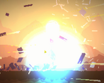
My thoughts while playing the game: "Uh, that looks nice!", "Did a helicopter that chased me just exploded? Cool!", "Hm, why do I smash into the same wall all the time?"
The first impression was great. The game looks awesome and sound pretty good. First I did not understand the controls, seems like you have to click the action button at least once after each death before space works again (I assume the Unity button loses focus?).
The first couple of minutes it was quite entertaining but then I stumbled upon an action sequence that always killed me. I probably missed something. So I can't say if the gameplay will change later on but I found it a bit flat because there is nothing for me to choose to do. I think it would work better if you could just jump anytime and maybe slide too. Just like in Canabalt.
Don't take this the wrong way, it's really cool what you did and very promising. I'll add it to my collection and keep an eye out for updates.
Thank you for your feedback! I don't know what do you mean by "click the button once after each death before space works again". You just need to press the Action button, and Jerry will do his thing. Thanks again for the comment and have a nice one! :D
Oh ok, I didn't read the "How to play" section of your game page and assumed Space is the Action key. But it seems like it was intended to use the mouse all the time :D
I loved the Graphics. It was very Nice Game
Thanks! :D
QTE the game! Fantastic visuals, sfx and music. Very nice work
Thank you!
So much to like. The asthetics are fantastic. I love the attitude. I was so looking forward to the game loop, but my over all experience was it put me in a foul mood. With a mouse I found it too punishing to be fun. Now I am sure to a certain extent that is down to being an old man and my reactions slowing down, but I am not sure that's quite it. More often than not I was going the right way and just overshooting by a fraction. I am sure with time that would get better. The issue is not whether I would get better, the issue is would I want to get better and the answer suprised me. I have quite a lot of staying power usually but for some reason in this instance I just did not want to after 5 minutes of frustration. I think it is a reward vs frustration issue that could have been solved with a gradually shrinking hit box or something like that. If each run started of a little gentler and then quickly ramped up you would have had me I am sure. As it stands I just got properly pissed off and left in a strop. Love the music, it made me think of Cannabault and the many lost hours I had dying in that. That I guess is what I am comparing the difficulty ramp to I suppose, gently to frantic on a gradient, in this case generous target to precise target. I wanted to love it and actually I do, but just not as a playing experience. I wouldn't have written all this is it was bad, I've written this because it is fantastic but I wasn't let in. I'd imagine touch makes all the difference and will check it out on the phone at some point. kudos
Thank you for your feedback! The game was supposed to be hard, but if you're frustrated, there is the easy mode.
Hey thanks for pointing out there was a different mode. I had thought about it just forgot that pressing 'r' was an option to check. I have updated my rating now that I got to see the full thing and complete it. Having played it through on easy, now there is no challenge at all and I think the essence of my feedback still stands. The speed could ramp up over time, the target to click could shrink over time etc. I think this would have made the game loop pretty addictive for me. Easy was too dull for me and normal made me angry. That was with me loving everything else that was going on. The level design, the artwork, everything else awesome. That's why I would bother to write the feedback in the first place I guess. I am capable of loving this game and it suprises me that the simple act of clicking outside of a button would be enough to take the fun away from me. So none of this is a criticism more just a reflection on an experience I don't quite understand why I am having.
Such a great game! It was a little bit hard to hit the button sometimes but still, it was a great experience.
Thank you for your feedback! The game is supposed to be hard, but yeah.
This is easily one of the best looking games in the jam.
Thank you for your support!
You just made an awesome clicker gamer! Just awesome art & music!
Hope your game reaches the top10 :)
Congratz!
Thank you for your support! Yeah, an action clicker game! :D
Great game!
This game is great both aesthetically and in gameplay. I'm not sure if I would prefer the action button be in the same spot every time which would allow for faster gameplay but I definately liked how clear it was what you need to watch out for to preempt an action.
The part where the helicopter flies at you took a lot of tries to get past likely due to the fact it is quite fast and I'm not quite at 'jerry' level. Additionally, the button spawns randomly and so perhaps constraining the action button spawn area to a smaller area would help fluidity and feelings of fairness. A fun game none-the-less
Thank you for your feedback! The game was meant to be hard, and if the button stayed in one place, you could click it as soon as it spawns. Thanks again for playing! :)
Wow! Man, this is awesome. The action feels very exciting and thrilling. It feels awesome when you think Jerry is going to hit the wall, but is able to slide under it. The effects and audio are very very good. Overall a solid great game. And it has a perfect length too. Congratulations! Already see it in the top 10!
Thank you so much for your feedback! I really appreciate it! :D
Your game is very nice too!
I loved this game! The graphics are astonishing. The effects are awesome for a 2d pixel art game. The song is great for the game! It would be a solid 5 star IF the theme was a little obvious. I really didn't see the theme there but otherwise it was a really good experience
I loved this game! The graphics are astonishing. The effects are awesome for a 2d pixel art game. The song is great for the game! It would be a solid 5 star IF the theme was a little obvious. I really didn't see the theme there but otherwise it was a really good experience
Thank you for your feedback! The theme in my game is not literal. It gets more intense and harder over time, so it turns up the heat. :)
Oh ok! It's because I played on a laptop. So it started hard for me not having a mouse only that little mousepad. So I'll review you as a SOLID 5 STAR.
Thank you! :D Yeah, it's very hard to play with a mousepad.
Really fun game! The only thing I can think of is to only play the click sound effect when you hit the button, since sometimes I thought I hit it but I didn't. Also, I didn't really see the theme to be honest, but the actual gameplay was amazing. Great job! I'd also appreciate if you played my submission too.
Thank you for your feedback! The gameplay was getting more intense over time, so it was turning up the heat.
really cool but i was so bad and missed like everything
Thank you for playing!
Very cool!
I couldn't beat the game sadly. But man this was a fun well executed game. Diggin' the art style. Thanks for making this fun game.
Thank you for commenting and playing! There is the Easy difficulty if the game is too hard. ;)
Your artstyle is incredible I have no complaints small issues that the others mentioned idc about these issues I gave you a solid rating your sfx and artstyle are just....incredible thank you for this amazing submission hope it gets the attention it deserves
Thank you so much for your comment! It means a lot to me! :D