Play asset pack
Knight of the Voidwood's itch.io pageResults
| Criteria | Rank | Score* | Raw Score |
| Research & Development | #7 | 4.000 | 4.000 |
| Documentation | #10 | 3.667 | 3.667 |
| Creative | #12 | 3.667 | 3.667 |
| Presentation | #13 | 3.333 | 3.333 |
| Overall | #14 | 3.533 | 3.533 |
| Technical | #15 | 3.000 | 3.000 |
Ranked from 3 ratings. Score is adjusted from raw score by the median number of ratings per game in the jam.
Judge feedback
Judge feedback is anonymous and shown in a random order.
Submission Title: Knight of the VoidWood
Submission Tier: Sumo Digital Rising Star
Assessor: Anthony O’Donnell Lead Artist Firesprite
Concept design & Development:
All the exploratory sketch work as the artist worked through the design process is great to see. The drawings are good. Evidence of appropriate research gathering was carried out.
Technical Art:
Base models in Maya and then to Zbrush and the initial body shape derived from ZSpheres are solid workflows.
The eyes and hair could have been added to the head texture map there was no noticeable reason to keep them separate.
Channel packed textures were used and were correctly set to no SRGB.
Material definition – There was variety of roughness in the surface types and a general noise for further variation. The metals look good.
The amount of cube reflection captures used is a bit overkill, this stack up when it comes to render cost at runtime.
The polycount in some areas is heavy such as the backplate, it contains more than the armour we see.
I’d be careful using multiply and power nodes in conjunction with roughness and metallic outputs. These need to be in the 0-1 range. It’s possible in the current material setup to introduce rendering artefacts by going above 1. The clamp node is the way to stop this or adjust the source texture.
Creative Art:
Overall the design is good and the execution also. It was nice to see the development of the design and it be translated to 3d well.
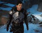
The final concept had a consistent amount of stylisation to it from the characters face to the armour. This was less apparent in the final model where the face leaned more towards a realistic look. The chunkiness of the armour made it from concept to model.
The arms seem too short, I’d expect the distance from shoulder to elbow to be longer and an appropriate relative increase from elbow to wrist.
The final colours were duller than the original concept. As the texturing took a more realistic approach it took away from fully realising the stylised design.
The addition of the backpack, sleeping bag and bottles are nice touches and add some interest to the character. The damage on the armour also.
The face sculpting could have more definition and clear planes to the face with stronger features if a more stylised final result as per the design is desired. The end result was similar but had softer features than the sketch.
Some elements such as the belt looked too “thick” even for stylised art. The final pose is a bit stiff.
Written Documentation:
The written document is well presented with some detail regarding the workflow used.
Final Presentation:
The final model and images look good. The addition of the provided environment helps.
lovely model. i suggest more pratise in anatomy, possibly investing in a statue also. Some busts perhaps etc. to develop a keener eye in anatomy. but very well done!
There were some really great character sketches in Thomas' documentation, with a well thought out final concept.
It was nice to see a variety of mood boards, based on different themes. The modelling in zbrush looks really detailed and it's clear the concepts helped develop this.
The texturing is a good start, it might have been nice to see some more research/development in to the art style direction for this.
Over all a great effort!
Challenge Tier
Leave a comment
Log in with itch.io to leave a comment.


Comments
No one has posted a comment yet