Neat game! I included it in my 7DRL Challenge compilation video series, if you’d like to take a look. :)
Play game
Dimlit's itch.io pageResults
| Criteria | Rank | Score* | Raw Score |
| Scope | #3 | 3.667 | 3.667 |
| Fun | #4 | 3.667 | 3.667 |
| Overall | #9 | 3.500 | 3.500 |
| Completeness | #13 | 3.667 | 3.667 |
| Innovation | #15 | 3.333 | 3.333 |
| Aesthethics | #37 | 3.333 | 3.333 |
| Roguelikeness | #52 | 3.333 | 3.333 |
Ranked from 3 ratings. Score is adjusted from raw score by the median number of ratings per game in the jam.
Judge feedback
Judge feedback is anonymous and shown in a random order.
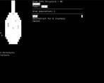
Dimlit is really interesting entry. Although it doesn't feature fancy graphics with tiles and animations, it looks elegant and stylish. It's ASCII power, I think . UI is simple and easy to use. The base of the gameplay is lightning mechanics - player has to survive in ever-darkness plane, filled with dangerous grues. With use of glowsuit, PC needs to collect crystals, to build structures that emit light that helps to deal with enemies. Simple, yet innovative (a bit, for a roguelike genre), and very pleasant.
This game is very original defense/base building game. But not quite roguelike. Being text and turn based doesn't make a game roguelike. This game could be much more fun if starting 'safe' period would be longer. Even easy difficulty do not give enough time to explore "info" tree. Most of the time grues are starting to invade lit area before I could build something defensive.
Dimlit is a very interesting game. It hews to the roguelike requirement of tactical decision making; but rather than tactics being determined by a level generator; they are determined by the world you've assembled out of darkness. After a bit of a learning curve you swiftly get to the point where you feel the adrenaline rush of venturing into the dark in search of crystals, risking all for a chance at a new structure....
Completeness: The game is steady and seems bug free. For a game with a survival theme, however, some form of high score list would make an excellent addition to let one see how much better one has done. The right hand of the screen is strangely unused, as if it were designed for a narrower window. I'd recommend resizing the console to better fit the area used (Which is why i put this under completeness, not aesthetics) At one point a dark tower was damaged by a grue (!). When I tried to destroy it, it wanted me first to repair it! I'm also not sure sentry towers work as I had plenty of grues wandering about them, and never saw a fire. And the harvester I built seemed to generate bonus crystals only back at my base, not where it was.
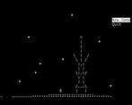
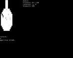
Aesthetics: What a brave choice! Black and white in 2018? The opening screen art raises little hope of an aesthetically pleasing game. But, to my shock, the author pulls this off in the game-proper. With only Inversion as the signifier, a large number of different states and situations are expressed. I would have used more shades of grey, which would let you tell true-black from black, and maybe feather the edge of the light. But this would have been unwise. The sharp cut off makes it 100% clear where you escape the realm of darkness, an essential thing to track. The lack of true-black makes finding dark towers a bit more interesting as you need to find where your beams can't light up. Meanwhile, controls support vi-keys and arrows, and usability is all space + bump. The menus are easy to flow through, and the lack of named monsters makes the tech-buildings have nice clear glyphs.
Fun: Balance is remarkably well done. It is not too harsh on the easy level to let you start to gain a feeling before bad stuff starts happening; and the slow ramp up leads to an increasingly hopeless fight against the dark. It avoids the risk of being too easy and boring; there is always a dark storm about to mess with all your careful plans. (This is how it rewards tactics; how you react to to situations, over strategy; how you prepare. And thus why it is a roguelike) I do object to 4-way movement. I believe 8-way movement would make it more interesting how to move to fetch crystals, 4-way makes little interest in optimizing path finding. Also, it would be easier to repair advance techs surrounded by power if I could bump diagonally - I had to demolish power to do so.
Innovation: As a base-building roguelike that doesn't even feel overmuch like a base-building game, I think this is very innovative.
Scope: The tech tree alone, with careful help and stats provided for everything, is a start. But as you progress farther and encounter dark towers, etc, one begins to appreciate how much is actually in this game.
Roguelikeness: Single modal interface, focused on the player. Tactical grid-based action. And lots of RNG to keep the planning horizon short. Very much a roguelike!
Successful or Incomplete?


Leave a comment
Log in with itch.io to leave a comment.