Play game
Cunning Rogue's itch.io pageResults
| Criteria | Rank | Score* | Raw Score |
| Roguelikeness | #1 | 4.000 | 4.000 |
| Scope | #1 | 4.000 | 4.000 |
| Overall | #18 | 3.333 | 3.333 |
| Fun | #21 | 3.000 | 3.000 |
| Completeness | #22 | 3.500 | 3.500 |
| Innovation | #26 | 3.000 | 3.000 |
| Aesthethics | #86 | 2.500 | 2.500 |
Ranked from 2 ratings. Score is adjusted from raw score by the median number of ratings per game in the jam.
Judge feedback
Judge feedback is anonymous and shown in a random order.
A fantastic effort. It feels a lot like Rogue in a way many rogue-likes do not. Examples include the type of combat, the bestiary, the tone, the use of items (particularly single use). I particularly enjoyed the use of movement and 'dancing' with multiple goblins, zombies or bats to get hits in without getting hit.
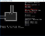
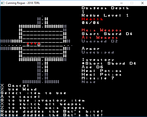
The interface could really do with some work. I've got a big screen, and ended up having to magnify the screen in order to see the elements - particularly when combined with the font. The messages showed no obvious way of seeing recent messages which proved particularly difficult with inventory management. A resizable window, and more streamlined inventory management would do a world of good to this game.
For the record - After about an hour, I got about a quarter of the way down the dungeon before dying to hubris: another very traditional roguelike trait. This was a far more complete experience then I was expecting, and it felt balanced and tough. In the best possible ways, it felt like a Roguelike. A mighty effort - really well done.
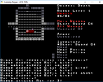
This is a really impressive entry. Huge diversity of enemies with unique and thematic movesets. Fairly large variety of weapons and items as well. You created quite a large and long game in 7 days. The attack prediction mechanic is very cool and works wonderfully with all other aspects of the game.
The graphics are effective. Initially I had some trouble reading the font (something about the spacing seems weird) but I got over that eventually. I had some weird UI confusion around using/equipping items and confirming/cancelling attacks but after a bit of time playing your system felt natural.
The different colored squares for attack prediction were pretty confusing but I think that is part of the fun. I am not 100% clear on the yellow and pink squares.
All in all this feels like a great, classic, roguelike. It feels complete beyond what I would expect from a 7 day project. Nice!
Successful or Incomplete?
Leave a comment
Log in with itch.io to leave a comment.


Comments
Nice game! I included it in my 7DRL Challenge compilation video series, if you’d like to take a look. :)