Play game
The Quest for the Winged Demon's itch.io pageResults
| Criteria | Rank | Score* | Raw Score |
| Roguelikeness | #78 | 2.858 | 3.500 |
| Fun | #83 | 2.041 | 2.500 |
| Innovation | #87 | 2.041 | 2.500 |
| Scope | #91 | 2.041 | 2.500 |
| Overall | #102 | 2.177 | 2.667 |
| Aesthetics | #106 | 2.041 | 2.500 |
| Completeness | #106 | 2.041 | 2.500 |
Ranked from 2 ratings. Score is adjusted from raw score by the median number of ratings per game in the jam.
Judge feedback
Judge feedback is anonymous and shown in a random order.
Oh God, my eyes! Ouh, it was wall?
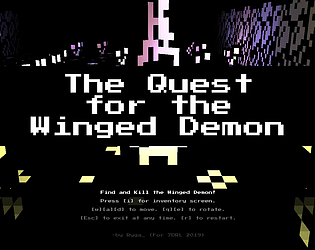
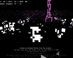
This strange... thing... in the center of screen is player character, I suppose? So, it's some kind of third-person dungeon crawler? Would be nice if PC wouldn't be covered by other objects...
Whaa, wait! It's enemy? Or just element of decor? I see that something attacks me, but I'm not sure what...
Ouh, it was monster indeed. Time to loot! Copper ring, and sword +1.
Oh. My. God. I don't see how I'm supposed to do in inventory menu.Whaaat, I died? How? Why? I didn't see it coming...
Message to the dev: make visuals clean. Sprites and menus. The Quest... may be nice stylish game, and I'd like to give it another try - but currently it's barely playable.
...I gave it another try already. It's not that bad when player is... prepared... But it remains hard to play and fatigues eyes very fast.
Completeness:
Complete game, but needs much more polish.Aesthetics:
Aesthetics of The Quest... is game breaker. It's the reason, why I stopped playing after five minutes at first. Even looking at screen is painful - trying to parse it is much worse. It's hard to tell if object is monster or, don't know, grass. It's a pity - the style is distinctive and I think that, properly implemented, it could be huge advantage of The Quest. Menuses are not better - their background is transparent and I can see message log under inventory instructions. It's a bit hard to navigate dungeon, because minimap rotate with player - rotating arrow as player icon on static map would help a lot.Fun:
I managed to cross few levels, but I was distracted by visuals. I don't know if I know enough to judge it, but I have. It's hard to separate "aesthetics" and "fun" here, thought...Innovation:
I always wanted to play roguelike designed in a classic dungeon crawlers way. It's similar attempt, I think. And... even if the result is tiring, art style is pretty unique.Scope:
Reasonable.Roguelikeness:
It's roguelike, especially for 7DRL standards.Nice proof-of-concept, has potential!
Successful or Incomplete?
Leave a comment
Log in with itch.io to leave a comment.


Comments
No one has posted a comment yet