Play game
Photon's itch.io pageResults
| Criteria | Rank | Score* | Raw Score |
| Audio | #964 | 2.530 | 4.000 |
| Graphics | #1180 | 2.530 | 4.000 |
| Game Design | #1390 | 2.214 | 3.500 |
| Overall | #1398 | 2.214 | 3.500 |
| Fun | #1475 | 2.055 | 3.250 |
| Innovation | #1481 | 2.055 | 3.250 |
| Theme | #1610 | 1.897 | 3.000 |
Ranked from 4 ratings. Score is adjusted from raw score by the median number of ratings per game in the jam.
In what way does your game fit the theme?
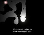
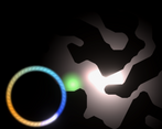
More lights you collect the brighter you get and get more strength to fight time.
Did you write all the code yourself and made all the assets from scratch?
we wrote most of the code ourselves, the boid behavior we got it from a open source project and modified to fit our needs.
Leave a comment
Log in with itch.io to leave a comment.


Comments
Agree with getting stuck near the walls. I like the idea of getting bigger while collecting other photons.
Maybe also some sound effect can be added when collected so player feels progression.
Overall nice approach, rated ;)
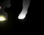
Very cool visual style! It was kind of difficult to tell the size of my hitbox and I felt like I kept getting stuck on walls but I really like the cave-like shapes of the levels.
Thanks. That hitbox point and getting stuck hit us too. We will try to make it more intuitive in next release.
One thing I can suggest that may or may not work depending on how your movement is set up is to add a physics material to the walls/player with super low friction so you can slide off them better
I really like the idea of your game. The gameplay is pretty fun, but the player acceleration feels a little slow, making it feel unresponsive. And I wish the player didn't get stuck on the cave walls so much.
Other than that, your game is great!
Graphics are nice, audio is nice and the main idea of the game is pretty cool.
Well done!
I'd appreciate it if you could check out my game, thanks.
Thanks. I agree the player was designed so that users can switch between Mouse point and Click & WASD as per their choice. But in the last few seconds, we forgot to push the UI for that. Will definitely improve in the next release.