Play game
Smiley :)'s itch.io pageResults
| Criteria | Rank | Score* | Raw Score |
| Innovation | #974 | 2.316 | 2.889 |
| Audio | #1029 | 2.138 | 2.667 |
| Overall | #1138 | 2.123 | 2.648 |
| Fun | #1146 | 2.138 | 2.667 |
| Game Design | #1166 | 2.138 | 2.667 |
| Graphics | #1229 | 2.049 | 2.556 |
| Theme | #1245 | 1.960 | 2.444 |
Ranked from 9 ratings. Score is adjusted from raw score by the median number of ratings per game in the jam.
How does you game fit the theme?
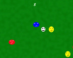
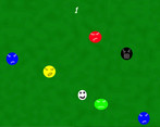
People are angry but Smiley is happy and if angry people hit the happy player, there is no happy people left in the world. So it is not real then :)
Did you write all the code and made all the assets from scratch?
I used Godot tutorial and I am learning and I made everything myself, I'm 12. This is my brother account
Leave a comment
Log in with itch.io to leave a comment.


Comments
its awesome that your learning how to be a game dev. the only thing I would change would be making it full screen. hope your able to play and rate my game.
Thank you ✨😊👍🏻
I will learn how to make it fullscreen
I believe we will see more happy people in the world as well ! I liked the simplicity of this game ! You did excellent job on it ! All the best
I have rated your game ! Also can you rate my game ^_^
https://itch.io/jam/brackeys-7/rate/1420467
Thank youuuu 😀
Happy People love Good people 🙂✨
Sure I'll check your game too 😊
Hey!
The game was really nice, great work. The fact that you are 12 makes it even great. You had good music, visuals and it was fun to play. I love the fact that you took time to animate those circles, I love the wiggle, it really adds to the game feeling.
If you are looking for some feedback, here's mine (I know you are at the beginning of your journey so I'm not gonna be hard on you ^_^ Just point out some things):
I think you should choose more carefully your colors. Instead of going for straight blue, red, yellow, green, you can find a color palette on the internet with 10 colors or so and use it. And you can choose whatever you like. This way you ensure that the look of the game is not hard on the eyes.
Another thing (and last) would be to zoom out the camera a little bit, so that the player is able to see the enemies coming.
Other than that, you really did an amazing job and you should be proud of what you did. Continue to improve and I'm sure you will get there! Congrats!
I would love to have you playing mine too, if you don't mind of course! ^_^
thank you I will create colors gooder next time thank you like it
Wow this was the music I was trying to go for in my game! Spooky, but clean. Great job and keep making games!
Thank You and I made the music :}
Show post...
cool game, it just needs to be polished a little, but you really nailed it,
can't believe you made a game at only 12, great effort, i've rated ;)
keep making games and i'll be waiting 4 the next one!
Thank You 😊
Ok I will try
Nice game, but a gameplay video on the game page would be great.
Thank You 😊
nice game
Thank You 😊