Indie game storeFree gamesFun gamesHorror games
Game developmentAssetsComics
SalesBundles
Jobs
TagsGame Engines
A jam submission

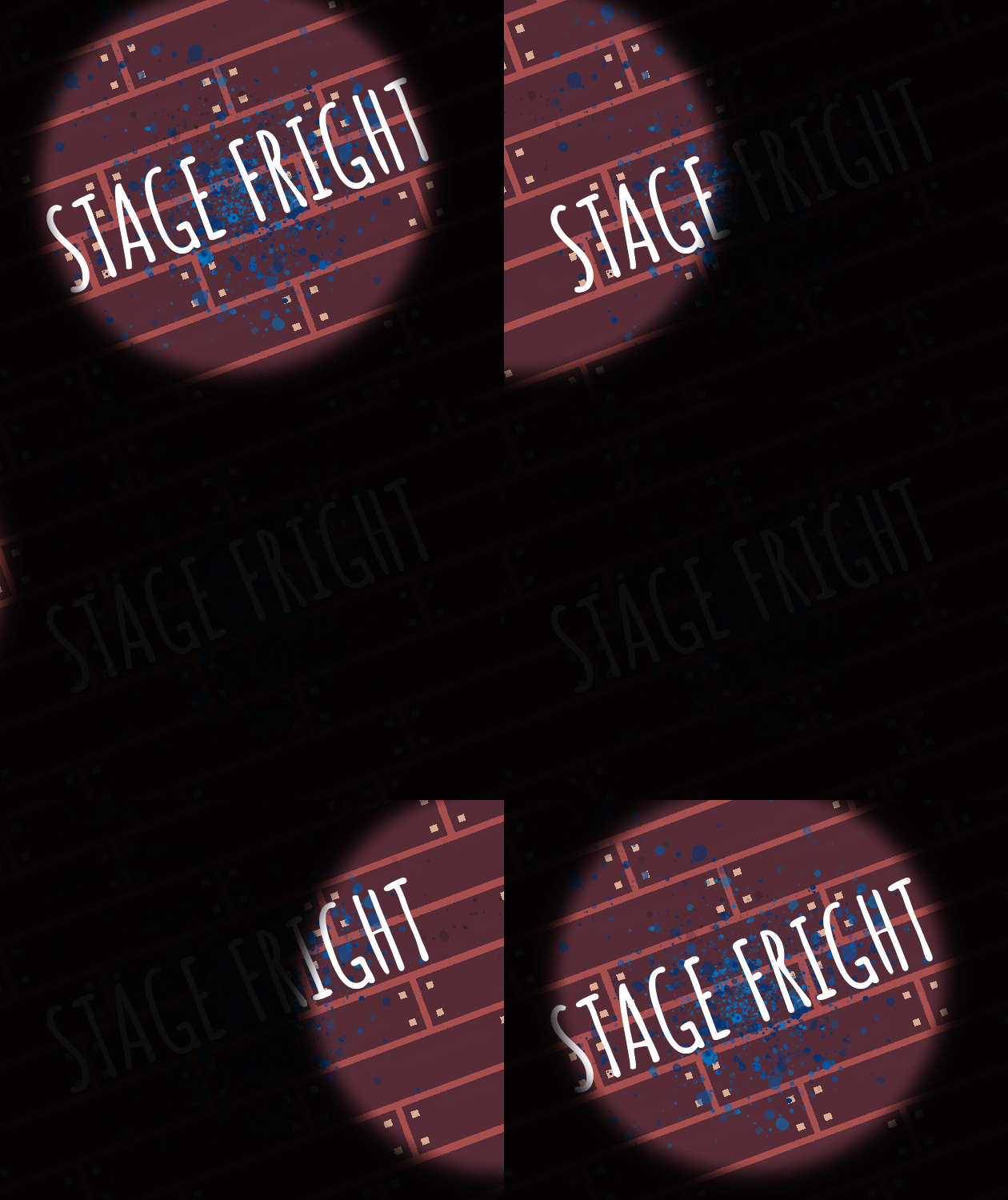
Stage FrightView game page

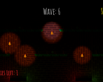
A simple wave fighter game made for the Brackeys Game Jam.
Submitted by MSSNG — 20 hours, 53 minutes before the deadline
Add to collection

Play game

Stage Fright's itch.io page

Results

CriteriaRankScore*Raw Score
Theme#233.7863.786
Graphics#303.5713.571
Overall#303.1313.131
Audio#313.0713.071
Innovation#382.9292.929
Fun#542.7142.714
Game Design#662.7142.714

Ranked from 14 ratings. Score is adjusted from raw score by the median number of ratings per game in the jam.

Judge feedback

Judge feedback is anonymous.

  • The game fits the theme very well and I haven't seen a game like this. However, a lot of things seem out of place. The art is well done, but then the hearts and the paint arent consistent with the background. There's just a huge gap of difficulty between level 4 and 5. I'm also not sure about the whole game together. 

Link to the game
https://missingtech.itch.io/stage-fright

Leave a comment

Log in with itch.io to leave a comment.

Comments

Submitted(+1)

it's quite hard, but I had fun playing it. Great job

Submitted

Nice entry, the game is totally in the theme. Since I don't see much menu good job for it too !
The ambience is pretty cool with those graphics & music, it feels like a horror mansion =3
The gameplay is simple but fun, it would have been nice to add some new mechanics over the waves (other way to spend our money) since it feels a bit redundant after some waves or maybe punctual power up / events.
I think lowering the mouse speed could help to avoid player doing the "swiping no justsu".
A small feedback when you missed an enemy could be a nice adding (like a small red blink or ...).

Great job for your entry !

Developer

Thanks for the feedback, will definitely improve upon in future entries!

Submitted (1 edit) (+1)

Pretty good! The UI design is terrific, gameplay simple yet fun, theme fits perfectly..

The candle thing probably isn't as intuitive as you thought but it adds well. Well done!

Submitted(+1)

Very good-looking, passable sound, fits the theme, a settings menu!!! However, it's a bit unclear where the enemies are pathing and where they spawn from, so I often found myself dragging my cursor in circles and having it work without really trying or understanding what was happening. With some more clarity of interaction this could really shine (no pun intended).

Developer

Haha! Enemies always spawn at the top of the stage and make their way to the bottom - probably should've made that clearer. I tried to counter the mad swiping tactic with candles that you can place to illuminate an area for 40 seconds.

Submitted(+1)

I like! Took me a moment to figure out what is going on and what I am supposed to do, but overall, nice!

Developer

Thanks!