Play failure
Movement Test's itch.io pageResults
| Criteria | Rank | Score* | Raw Score |
| Innovation | #975 | 0.873 | 1.333 |
| Fun | #978 | 0.873 | 1.333 |
| Theme | #980 | 0.873 | 1.333 |
| Audio | #987 | 0.655 | 1.000 |
| Game Design | #1016 | 0.655 | 1.000 |
| Overall | #1017 | 0.764 | 1.167 |
| Graphics | #1025 | 0.655 | 1.000 |
Ranked from 3 ratings. Score is adjusted from raw score by the median number of ratings per game in the jam.
Leave a comment
Log in with itch.io to leave a comment.


Comments
This is a pretty boring game. The controls don't really work(at least not for me). There is no music and the story aspect was almost none. My advice to you would be to focus on a smaller project and really polish that idea!
Nonetheless, I liked the idea for the game and the level design was okay!
I think you'll do even better next time
- It's true I didn't get to add incentives to playing more carelessly, also it's probably not fun at all when you play alone since it's supposed to be played by two people
- Okey there should be more polish on the values probably
- Yep time constraints and I tried to have working controls first :l
- Definitely, but it's still tough for me to assess how much time I need for a particular thing
- Thanks! I did the level design at the last minute so it's nice to see it's not too bad for you
I tried to play it with my little brother but as I said, unfortunately it didn't work at all. I do think you did your best and I hope you enjoyed making it!
Maybe some playtesting or help by tutorials on youtube will help you on your next project
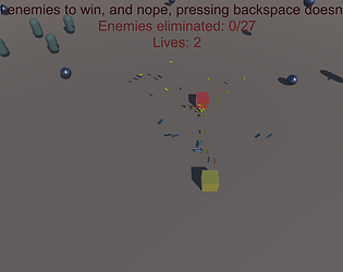
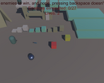
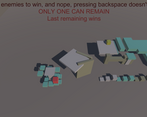
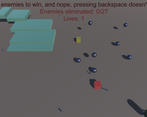
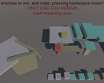
There is no graphics to the game, almost everythin is just primitives and no actual models, I couldn't hear any sound too, I also couldn't unserstand the controls, how do you aim without moving? I don't have a numpad, and many laptops don't. couldn't understand what I am doing, there was no feedback for anything, the text was cut even though I ran the game in 1920x1080 full screen which is standard. it wasn't the least fun game, because the physics playground is cool on its own. sorry for this negative review, but this is how you learn
- I wanted to make simple models for the players but I did things in order of importance and I was alone with limited time (parents...) so I kinda had to stick with these crude shapes
- same thing :/
- you have to move to aim, it's supposed to make it riskier and more skillful to attack enemies but their small hitboxes didn't actually fit really well with that idea unfortunately
- I tried to find somewhat ergonomic settings and assumed the starting window generated by Unity would be enough to choose other controls in case of need, that's not the case apparently and I'm taking note of that
- I'm not that good with Unity yet so I never used sound or particles yikes
- I tested the game with the "maximize on play" button on quite a bunch and I apparently must have missed the text cuts upon trying the built version (I was in kind of a rush)
- I like the fact you enjoyed the toy aspect of the game, that's a good retribution on the fact I spent most of the development time on that
- It's ok, I have no issue with criticism that makes sense, and yours does, you're 100% right, and feedback is important. I'm a beginner and it really helps a lot to have a detailed list of issues so thanks :) And thanks for taking the time to play it