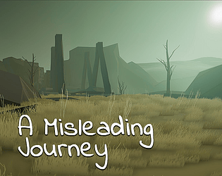
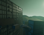
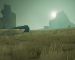
Wow, you really worked yourself off with creating all that art! Movement seemed a bit unstable, maybe because some places are super tight and some jumps are pinpoint, plus, the up-down wobbling of the camera after each jump seemed a bit too much (maybe 120% much). Couldn't find the patience to finish your game (after aquiring wallride), maybe with checkpoints it would be less punishing. Otherwise I'm amazed by your effort and this game should be played by more!
Play game
A Misleading Journey's itch.io pageResults
| Criteria | Rank | Score* | Raw Score |
| Graphics | #56 | 4.071 | 4.071 |
| Game Design | #137 | 3.429 | 3.429 |
| Audio | #338 | 2.786 | 2.786 |
| Overall | #355 | 2.881 | 2.881 |
| Innovation | #554 | 2.357 | 2.357 |
| Fun | #595 | 2.357 | 2.357 |
| Theme | #632 | 2.286 | 2.286 |
Ranked from 14 ratings. Score is adjusted from raw score by the median number of ratings per game in the jam.
Comments
The graphics are quite nice, but it runs like an asthmatic hippo. I found the mask of truth, but it didn't seem to do anything. Perhaps you can also add some ambience.
Nice environment and good sound design, but I could'nt figure out what to do.
A bit of indication to help the player would have be nice.
I wish there was a web version or osx. Hate to give "screenshot reviews" - but this looks like you've managed to make a *really* nice atmosphere and themee. Great use of textures and color! Would love to try this out as a game..
Graphics and atmosphere are well made. However, with such an ambitious project you mutliply the problems quickly. From escaping the world, to getting stuck in geometry, to falling from a high ledge because the game didn't register an input you as the user think you've entered correctly. The game is a kettle of bugs.
Audio fits the ambience. Except the character's jump moan that only has one sample, so it's very repetitive.
I found the glasses right away, so for me the game became an exercise in follow the blue shiny bits, which wasn't particularly challenging or immersive. I can appreciate indicating where to go is a difficult thing to do in this genre (see Mirror's Edge's red paths), but yeah, I didn't find it interesting to follow cyan.
Now, the thing that ruined the experience for me was the very rudimentary collision management, coupled with the natural level design. The collision system is pretty basic, so it's prone to error and it doesn't help users navigate. On top of this, your level design is "random", so it feels more organic and natural. This inherently makes figuring out how to take this next jump in front of me much more tricky. And the 5th or 6th time you fall off of the same ledge, with no consequence and no checkpoint... well, game over for me.
I don't see how the theme was followed. The first and only fall to death pit is there. You do it once, OK move on. It's somewhat deceptive I suppose, but I don't see that as sufficient to meet the theme.
Interesting game concept, possibly, but an impossibly ambitious project to do any degree of justice to in just one week.
The setting is stunning! Unfortunately it was a little bit hard for me to understand what to do next but great job overall!
I found it very difficoult to play, but really enjoed the settings and the overall mechanics!


Leave a comment
Log in with itch.io to leave a comment.