Play asset pack
Wandering Knight's itch.io pageResults
| Criteria | Rank | Score* | Raw Score |
| Research + Development | #10 | 4.082 | 5.000 |
| Creative Development | #11 | 4.082 | 5.000 |
| Technical / Workflow | #20 | 3.266 | 4.000 |
| Overall | #22 | 3.429 | 4.200 |
| Project Documentation | #24 | 3.266 | 4.000 |
| Final Presentation | #42 | 2.449 | 3.000 |
Ranked from 1 rating. Score is adjusted from raw score by the median number of ratings per game in the jam.
Judge feedback
Judge feedback is anonymous.
- Submission title: Wandering Knight Student name: Yunice Liao Challenge tier: SFAS Assessor name: Caleb O’Brien - Junior Character Artist @Firesprite Research & Development The project is supported by strong research which has clearly fed into the final outcome. Initial concept and theme have been analysed into key words to find the essence of the character which is then supported by your own sketches/concept. It’s great to see you taking the time to give yourself a really strong foundation to build upon. A lot of work has been completed on the characters background which helped solve potential problems and inform creative decisions at an early stage in development. Also, it’s a nice bonus to see you thinking about how players will interact with your character, showing your focus is on creating an interesting character for a game setting. Technical Art / Workflow Clear demonstration of knowledge for industry standard workflows and software. Game mesh Successful game mesh that captures the forms and silhouette of the high res well. Reasonable poly count which feels in budget for a character in this style. The mesh features clean and evenly spaced quads with consistent poly flow, particularly in areas between two separate meshes that overlap each other (Chest armour and should piece for example) If I were to be really critical, the short branches/growths from the head look quite dense and could be optimised/reduced down very slightly. Also, with the details of the mouth sculpted out beautifully in the high res I would expect the shapes of the lips to be better supported in the game mesh with poly loops around the mouth etc. This would support an opening in the mouth that would allow deformation/speaking if the character we’re to be animated in an industry setting. Rig Really nice that you’ve created a rig for your character, and I like that you experimented with different rigging methods for each pose. Engine set-up Good use of packed textures and the maps and are authored at appropriate resolutions for the style, which would be efficient within a game setting. I love how you've presented your texture maps, visually demonstrating the textures resolution in context to one and other. Consider showing the UV wireframe over these to better demonstrate how your UVs have been packed. Creative Art Sculpt Fantastic work on the treatment of the wood! The stylisation is consistent across the character with interesting flowing primary forms supported by finer detailed wood grain, making for a really pleasing visual aesthetic. The character has a tonne of visual appeal overall! I really like that the flow of the wooden forms echoes the once human anatomy/muscle structure of the character. You’ve also done a great job at balancing the details across the sculpt with densely detailed sections that are supported by areas of rest. One minor criticism would be that the final character could benefit from slightly more asymmetry, most notably in the lower legs. I think the silhouette break in the shin is a really nice touch, but due to the fact that this element is mirrored makes the symmetry easy to spot. The mirroring of the arms has been broken well with the asymmetrical vine detail on the left arm. There seems to be some asymmetry in the sculpt which was when translated into a game res mesh, perhaps for time reasons which is understandable. The green/vine details are lovely, with the vine growing out of the nose being an especially nice touch. Texturing Textures are successful and support the stylisation of the sculpt. You’ve created some really nice variation in the material read between the different elements of the character which all add to the overall appeal. I love the subtle hint of skin tone blended with the wood in the face, It’s great to see your story and inspiration seeded into every aspect of your characters development. It would have been nice to see this textured transition supported within the sculpt to really enforce the idea that the wooden/nature aspect is slowly infesting and creeping its way into the knight. The wood texture treatment is lovely and helps support the visual read of the sculpted forms. There’s also a really nice balance of wear and tear across the character which helps add to the wider story. In future you could consider using subtle gradients as a way to create focal points. For example, a gradient from top to bottom slightly lightening the face to draw the viewers gaze could help with the overall read, especially if this character were in a top-down 3rd person game setting. Don’t be afraid to bring some AO and subtle baked lighting into the diffuse colour, especially in more stylised pieces such as this one. This can really add depth and help with the read from a distance. Overall, I’d love to have seen a bit more greenery on the character like is evident in the concept. This could even be done in the texturing phase to help break up the larger brown wooden sections. Pose Excellent work creating two varied poses walk/Idle and run/fighting stance. The poses strongly support the background and personality of the character and give a good impression of the characters presence in a game setting. Documentation Pre-production It's clear that lots of work has gone into the pre-production stage in order to find a strong direction for the character. Inspiration has led to in depth research into the theme along with essential mood board/reference gathering to help inform the creative process. There is a clear flow to follow through your development of the character with a strong final piece that beautifully represents the themes explored in the initial stages. Great work! Production Very thorough documentation. Clear evidence of each stage of production supported by images and informative text commentary. There is some clear evidence of creative decisions being evaluated during production in order to settle on the right look. For example, during the head sculpting phase multiple variations have been experimented with in order to find the most successful direction. Post-production Really strong final renders echoing the theme with consistency between each image. You’ve created an awesome stylised character which would feel right at home within a game setting. The documentation is capped off nicely with a brief conclusion of the project discussing the experience. Final Presentation Overall you’ve created some really nice final renders that show off the character in a clear and effective way. Good use of lighting and fog to create a strong atmosphere and feeling of wandering through a dark forest. In order to push the lighting further I think the overall brightness could be lowered with some more intense lights used to strengthen the contrast and support the moody effect. To achieve this perhaps some lighting that emulates a strong full moon lit night would help to further highlight the characters silhouette whilst tying nicely into the setting. A darker scene could also draw more attention to the lovely details of the mushrooms and spores with a subtle emissive glow highlighting the face. The final composition could be enhanced with a simple ground plane featuring some scattered foliage (similar to the grass on the characters head) to help support the narrative of a woodland setting. A basic shadow under the feet would also help to ground the character in the scene as it feels like it’s floating in a void. Even a quick Photoshop shadow done in post would work here. I love the render with the character in ‘A-Pose’ with 4 turnaround angles featured in one image. I’d love to have seen an image like this with the wireframe mode overlaid over the final render to give a really clear look at your game mesh. Also, some nice renders of your high res sculpt from multiple angles would be a lovely addition to your final shots for your portfolio. Check out the Darksburg characters such as this one on Artstation below for some good examples of lighting and presentation. www.artstation.com/artwork/XBBe8w You've created an awesome stylised character with this project, and you have clearly learnt a lot in the process! It’s great to see you reflecting on the project as a whole, discussing your learnings and how you can apply this to future projects. Really looking forward to seeing what you create next and best of luck! Feel free to reach out to me if you have any questions or would like any further feedback.
Challenge Tier
Search For A Star
Leave a comment
Log in with itch.io to leave a comment.


Comments
re-posting feedback with spacing, hopefully this is a bit easier to read through!
Submission title: Wandering Knight
Student name: Yunice Liao
Challenge tier: SFAS
Assessor name: Caleb O’Brien - Junior Character Artist @Firesprite
Research & Development
The project is supported by strong research which has clearly fed into the final outcome. Initial concept and theme have been analysed into key words to find the essence of the character which is then supported by your own sketches/concept. It’s great to see you taking the time to give yourself a really strong foundation to build upon. A lot of work has been completed on the characters background which helped solve potential problems and inform creative decisions at an early stage in development. Also, it’s a nice bonus to see you thinking about how players will interact with your character, showing your focus is on creating an interesting character for a game setting.
Technical Art / Workflow
Clear demonstration of knowledge for industry standard workflows and software.
Game mesh
Successful game mesh that captures the forms and silhouette of the high res well. Reasonable poly count which feels in budget for a character in this style. The mesh features clean and evenly spaced quads with consistent poly flow, particularly in areas between two separate meshes that overlap each other (Chest armour and should piece for example)
If I were to be really critical, the short branches/growths from the head look quite dense and could be optimised/reduced down very slightly. Also, with the details of the mouth sculpted out beautifully in the high res I would expect the shapes of the lips to be better supported in the game mesh with poly loops around the mouth etc. This would support an opening in the mouth that would allow deformation/speaking if the character we’re to be animated in an industry setting.
Rig
Really nice that you’ve created a rig for your character, and I like that you experimented with different rigging methods for each pose.
Engine set-up
Good use of packed textures and the maps and are authored at appropriate resolutions for the style, which would be efficient within a game setting.
I love how you've presented your texture maps, visually demonstrating the textures resolution in context to one and other. Consider showing the UV wireframe over these to better demonstrate how your UVs have been packed.
Creative Art
Sculpt
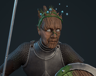
Fantastic work on the treatment of the wood! The stylisation is consistent across the character with interesting flowing primary forms supported by finer detailed wood grain, making for a really pleasing visual aesthetic. The character has a tonne of visual appeal overall! I really like that the flow of the wooden forms echoes the once human anatomy/muscle structure of the character. You’ve also done a great job at balancing the details across the sculpt with densely detailed sections that are supported by areas of rest.
One minor criticism would be that the final character could benefit from slightly more asymmetry, most notably in the lower legs. I think the silhouette break in the shin is a really nice touch, but due to the fact that this element is mirrored makes the symmetry easy to spot. The mirroring of the arms has been broken well with the asymmetrical vine detail on the left arm. There seems to be some asymmetry in the sculpt which was when translated into a game res mesh, perhaps for time reasons which is understandable. The green/vine details are lovely, with the vine growing out of the nose being an especially nice touch.
Texturing
Textures are successful and support the stylisation of the sculpt. You’ve created some really nice variation in the material read between the different elements of the character which all add to the overall appeal. I love the subtle hint of skin tone blended with the wood in the face, It’s great to see your story and inspiration seeded into every aspect of your characters development. It would have been nice to see this textured transition supported within the sculpt to really enforce the idea that the wooden/nature aspect is slowly infesting and creeping its way into the knight.
The wood texture treatment is lovely and helps support the visual read of the sculpted forms. There’s also a really nice balance of wear and tear across the character which helps add to the wider story. In future you could consider using subtle gradients as a way to create focal points. For example, a gradient from top to bottom slightly lightening the face to draw the viewers gaze could help with the overall read, especially if this character were in a top-down 3rd person game setting. Don’t be afraid to bring some AO and subtle baked lighting into the diffuse colour, especially in more stylised pieces such as this one. This can really add depth and help with the read from a distance.
Overall, I’d love to have seen a bit more greenery on the character like is evident in the concept. This could even be done in the texturing phase to help break up the larger brown wooden sections.
Pose
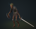
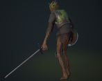
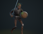
Excellent work creating two varied poses walk/Idle and run/fighting stance. The poses strongly support the background and personality of the character and give a good impression of the characters presence in a game setting.
Documentation
Pre-production
It's clear that lots of work has gone into the pre-production stage in order to find a strong direction for the character. Inspiration has led to in depth research into the theme along with essential mood board/reference gathering to help inform the creative process. There is a clear flow to follow through your development of the character with a strong final piece that beautifully represents the themes explored in the initial stages. Great work!
Production
Very thorough documentation. Clear evidence of each stage of production supported by images and informative text commentary. There is some clear evidence of creative decisions being evaluated during production in order to settle on the right look. For example, during the head sculpting phase multiple variations have been experimented with in order to find the most successful direction.
Post-production
Really strong final renders echoing the theme with consistency between each image. You’ve created an awesome stylised character which would feel right at home within a game setting. The documentation is capped off nicely with a brief conclusion of the project discussing the experience.
Final Presentation
Overall you’ve created some really nice final renders that show off the character in a clear and effective way. Good use of lighting and fog to create a strong atmosphere and feeling of wandering through a dark forest. In order to push the lighting further I think the overall brightness could be lowered with some more intense lights used to strengthen the contrast and support the moody effect. To achieve this perhaps some lighting that emulates a strong full moon lit night would help to further highlight the characters silhouette whilst tying nicely into the setting. A darker scene could also draw more attention to the lovely details of the mushrooms and spores with a subtle emissive glow highlighting the face.
The final composition could be enhanced with a simple ground plane featuring some scattered foliage (similar to the grass on the characters head) to help support the narrative of a woodland setting. A basic shadow under the feet would also help to ground the character in the scene as it feels like it’s floating in a void. Even a quick Photoshop shadow done in post would work here.
I love the render with the character in ‘A-Pose’ with 4 turnaround angles featured in one image. I’d love to have seen an image like this with the wireframe mode overlaid over the final render to give a really clear look at your game mesh. Also, some nice renders of your high res sculpt from multiple angles would be a lovely addition to your final shots for your portfolio.
Check out the Darksburg characters such as this one on Artstation below for some good examples of lighting and presentation. www.artstation.com/artwork/XBBe8w
You've created an awesome stylised character with this project, and you have clearly learnt a lot in the process! It’s great to see you reflecting on the project as a whole, discussing your findings and how you can apply this to future projects. Really looking forward to seeing what you create next and best of luck!
Feel free to reach out to me if you have any questions or would like any further feedback.