Play asset pack
Hermes's itch.io pageResults
| Criteria | Rank | Score* | Raw Score |
| Final Presentation | #4 | 4.500 | 4.500 |
| Project Documentation | #13 | 4.000 | 4.000 |
| Overall | #13 | 3.900 | 3.900 |
| Technical / Workflow | #14 | 3.500 | 3.500 |
| Research + Development | #17 | 4.000 | 4.000 |
| Creative Development | #20 | 3.500 | 3.500 |
Ranked from 2 ratings. Score is adjusted from raw score by the median number of ratings per game in the jam.
Challenge Tier
Search For A Star
Leave a comment
Log in with itch.io to leave a comment.


Comments
(Unofficial) Industry Feedback.
Tristan McGuire:
Character Artist at Airship Interactive.
https://www.artstation.com/tristanmcguire
Research and Concept:
I love how you came up with your concept. It is great that you chose to make your character fit into an existing universe, as this is a skill you need when working in a studio. However, it is necessary to show examples of the existing art from that IP, because it’s hard for someone to judge whether your model looks like it is from Apex Legends if you don’t show a pic of Apex Legends! Remember that not everyone has played the same games as you.
High Poly:
It’s great to see that you know how to reshape a basemesh to work towards making a likeness, but next time make sure to really double check all of the structures. The lips seem very tense and flat, as if they are not curved with the shape of the jaw. And the way that the light hits the philtrum area isn’t quite right. Next time you do eyes, make sure that the eyelids feel convincingly thick and that they feel like they are really wrapping around underneath the eye. It’s good to see you added tertiary details, but would have been nice to see a close up shot of how you achieved that.
Using the double layered fabric and panelling has worked well in MD. Nice work. I just think that some of the extra small folds added in Zbrush haven’t helped the look of the model. Next time, either get the tiny creases in MD by doing a final simulation with a very low particle distance, or be more delicate when sculpting them manually. They just look a bit rushed compared to some of the other details.
For a cleaner look on the leg armour, try experimenting with using different subtools for each panel. However, with time constraints considered, the use of dam standard makes sense.
Your expression blend shape is a really nice touch and you executed it well. It’s good to see not just the mouth movement but also how the rest of the face is affected by the snarl! Would have been even better to see the left eye closed a bit too.
Props:
Excellent attention to detail in making the gun fully functional. You seem confident in your prop modelling skills, which is great.
Low poly:
Great that you thought about getting the loops in the right places to allow for deformation. Would have been better to show the whole low poly in this section, so I didn’t have to scroll throughout the document. The tri count is good, but you could have gone a bit higher to capture some more of the cloth silhouette. Facial topology is awesome, but I would add some more loops around the shoulders, just because that area has quite a large range of movement.
UVs:
Your UVs are really nicely laid out within the UV space. It is great to see use of aligning the edge vertices with the grid. Though it is not a problem that you have put your teeth on the same sheet as the head – these are often on a separate smaller texture in games. So next time, feel free to put them separate.
These are definitely some of the best UVs I’ve seen from a student, so you definitely get my thumbs up here!
Groom:
I have not used Fibershop before, but it looks great, so if it’s faster than Arnold and gives you good results that is fine by me. In industry, you will likely use Xgen or even custom in-house tools for this task. So as long as you know a bit of Xgen then you will be all fine.
Next time that you design your hair textures, break them down into more tiers of density. All of your cards are quite dense here. You can get really beautiful results from having quite a lot of cards on your texture (think 16-32 individual clumps) and making sure that there are lots of them with big patches of negative space so the lower tier cards will show through from beneath. (Do not use my portfolio for examples of this – I did not know much about that when I was a student. This is a skill I have developed whilst at Airship).
Using Zbrush to place your hair cards has worked well. Not seen that method before.
Textures:
You mention that the textures deserve a document of their own – so it would have been great to see a deeper breakdown of the process. Some closeups of the skin and clothes would have really helped to judge the model!
Would have been good to see the roughness and metallic maps too. But from the final renders I can see you’ve got some nice variation in the skin. I would just push that even more to add some greens and blues. The roughness splotches on the leg armour work great, but I think the jacket could do with some more finesse in its material definition. So next time you do a project, just have an extra think about making each material look very distinct from its neighbours to really make the model pop. The overall purple and black colour scheme is nice.
I know from experience that it is very hard to get ‘Kiroshi’ type eyes to look “natural”, because of course they are not natural at all. But I do think she looks a bit wide-eyed and it starts to tread the line where the characters starts to look creepy. Adding an occlusion mesh on top of the eyeballs to add a fake shadow under the top lid could possibly solve this issue. Or closing the eyelids slightly more (particularly in the snarl pose). This would help to sell the idea that even though the eyes are manufactured, they are still well integrated into her body.
Rigging:
I can’t fault the rigging. I use the same plugin and it is boss. So great stuff!
Unreal Implementation:
So nice to see that you managed to get your work into engine – this is something we love to see! Materials are solid and it’s good to see you understand material instancing. Lighting setup is well informed and great choice to use the render movie queue option.
Final presentation:
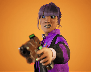
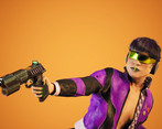
The two poses are great and the additional idle pose is perfect for presenting the turnaround of the model in a very professional looking way. The depth of field in the snarl pose works well to draw the eye of the viewer to the face and not the gun. Could have been nice to see the dash pose rendered as the full body and also the close up, but that’s only a minor note.
For the technical renders, it is a bit hard to see the blue wireframe on the grey render and the lines on the UVs are very thin. This is nit-picking, but it would be great to see those elements re-rendered to just be a bit easier to read. If you render out the UV snapshots at a lower res and then scale them up, that tends to work for getting the lines a bit thicker, or you can probably just thicken them in Photoshop.
Really nice final presentation overall. Just an extra tip – I would add your name and contact info onto every image, especially on your ArtStation project. That way, if a hiring manager has ended up with just one of your images, they still know how to get to you. Sometimes images get reposted to Pinterest or found via Google Images, so the studio may not always be directly on your ArtStation page.
Final thoughts:
This is a very strong project and I really hope you are proud of what you have achieved! You have tackled many technical pipeline steps like groom, rigging and facial shapes. This shows you are really knowledgeable of the whole pipeline. I would advice that for your next steps as an artist, look back over this project and self-critique it, then also read through any of the notes and pointers I included in this feedback and work out which areas have more room for improvement. Then in your next project, make sure to spend some extra time on those areas. I have no doubts in the potential of your art skills if you keep pushing yourself. So just keep really pushing and don’t slow down!
I look forward to seeing where you go in the future. Feel free to look on my ArtStation for examples of graduate level work (Silverhand was my FMP, so everything from that point and backwards in time was on my graduate portfolio). And don’t hesitate to reach out in the future.