


Play asset pack
Aztec Guardian's itch.io pageResults
| Criteria | Rank | Score* | Raw Score |
| Creative Development | #3 | 4.500 | 4.500 |
| Technical / Workflow | #4 | 4.500 | 4.500 |
| Overall | #10 | 4.100 | 4.100 |
| Final Presentation | #15 | 4.000 | 4.000 |
| Research + Development | #17 | 4.000 | 4.000 |
| Project Documentation | #19 | 3.500 | 3.500 |
Ranked from 2 ratings. Score is adjusted from raw score by the median number of ratings per game in the jam.
Challenge Tier
Rising Star
Leave a comment
Log in with itch.io to leave a comment.
Comments
Posting written feedback in comments as assessment period has ended. Feedback requested by student via Discord.
Submission title: Aztec Guardian
Student name: Donald Careme
Challenge tier: Rising Star
Assessor name: Caleb O’Brien - Junior Character Artist @Firesprite
Love your choice of concept. It’s great to see you tackling such an ambitious design and following it through with an awesome piece of character art.
Working from a concept can be useful as it lets us dive right into the character creation process with a strong design to work on from the get-go. With that being said don’t be afraid to experiment around a chosen concept and put your own spin on things.
I’d suggest taking some time to iterate on a concept by blocking things out in 3D with super rough 2D paint overs on top to help settle on a strong silhouette that looks great from multiple angles. Often times in industry there is back and forth between 2D and 3D to settle on the best final result, so be sure to spend a bit of time in the ideation phase in future. You may even find that you can solve creative and technical problems early, saving you time later on in development.
Great that you’re showing your reference and inspiration and I like how you’ve separated these out for different aspects of your character. I can see some evidence of this in your mood board, but it would be awesome to see you breaking down the concept into different material properties used such as stone and metal with some solid reference of what you hope to achieve with your materials.
Documentation
Good overview of your process here. Would be nice to see you diving a bit deeper into your process and decision making throughout the project. Showing more rough block outs and getting in some self-reflection would give some great insight into your thinking and how you put together your character.
Sculpt
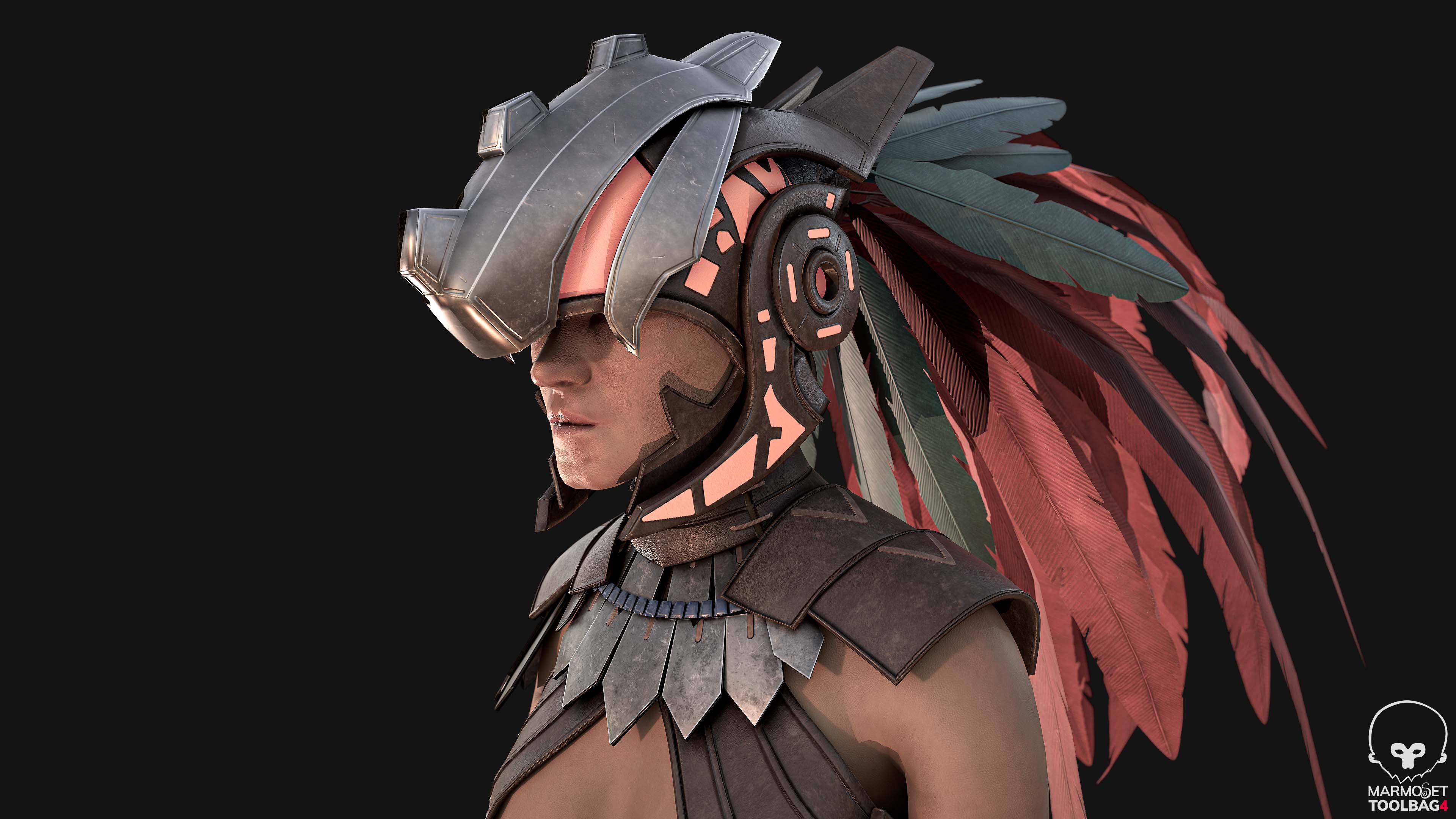
Great work on your sculpt a brilliant job overall here especially with all the hard surface elements.
Some minor feedback I’d suggest is bringing in some subtle asymmetry into your sculpt. This could be the last step in the sculpting phase where your taking some time to subtly tweak and a move your final pieces to break up the symmetry and introduce a bit of randomness. This is great to help get a bit more of a natural feel into your characters especially when there are lots of repeated armour pieces.
I think you’ve done a really solid job with the head and body anatomy as this is often a really tricky area. It looks like you’ve grabbed a lot of anatomy reference which is a good move, I’d highly recommend continuing to practice your anatomy and organic sculpting, spending time studying your reference and checking proportions. Anatomy takes a lifetime to master so stick at it, you’ll see big improvement from each character project to the next. Anatomy4sculptors have some great resources for anatomy, including this cool 3D viewer. https://ecorche.anatomy4sculptors.com/muscle-man
Game mesh
Your game mesh looks really solid overall. A clean and evenly quadded mesh with supporting loops around areas of deformation.
If I we’re to be really nit-picky, I think there is room for reductions and optimisation as the mesh feels quite dense in certain areas. Some easy wins could come from collapsing loops in the backs of panel /armoured sections especially where there will be little to no deformation. Don’t be afraid to introduce some triangles here and there to allow you to collapse loops and reduce down the density of the mesh. Triangles are totally acceptable in a game mesh, just avoid using them too heavily in areas of deformation.
It might help to consider the type of game you may expect to see your character in, and what role they may have. This can help inform decisions like where to focus more detail on the game mesh to make sure certain areas hold up when the player gets close. For example, if you know the player will mostly see your character from the torso up, focusing on the head, then you can make sure you’re throwing a few more polys around there to support the high-res details within the game mesh.
Neatly packed UVs with efficient use of space. Nice work grouping your mesh into texture sets as different shaders would likely be applied in engine for cloth, skin etc. I think 4k is a little overkill for some sections, especially the feathers. I’d expect to see some of those texture resolutions capped in game, most likely at 2k or lower. Just something to consider for pieces on your portfolio as it’s a great exercise to introduce some limitations into personal projects to encourage you to stay within budget. These days it’s often textures that are optimised first over polys so it’s great to get into the habit of packing textures and authoring them at appropriate resolutions.
Pose
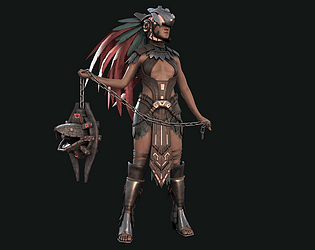
Great work with your poses. I love that you’ve created 2 poses as it really helps give a good impression of what the character might look like in a game setting with animation applied etc.
I love that you’ve taken inspiration from the concept for your 1st pose, however I feel the pose could be pushed slightly further in order to better match the concept and achieve some dynamic gesture. The thing I feel is lacking most in this pose is that there is no movement or angle change in the hips or shoulders which results in a slightly stiff feeling pose. I think it would really help if you introduce some contrapposto, adding a subtle offset between the angles of the hips and shoulders might help to loosen up the pose.
Really study the concept here for subtle weight changes and angles. It may also help to find some solid reference of badass poses with legs stood far apart, angled hips and shoulders etc. just to get a bit more of a dynamic feel into your characters pose.
Pushing the asymmetry of the pose may also have some benefit, for example turning the head further to one side and shifting the angle of the neck or even having one knee slightly bent and the other straighter, this would naturally push a stronger angle in the hips too.
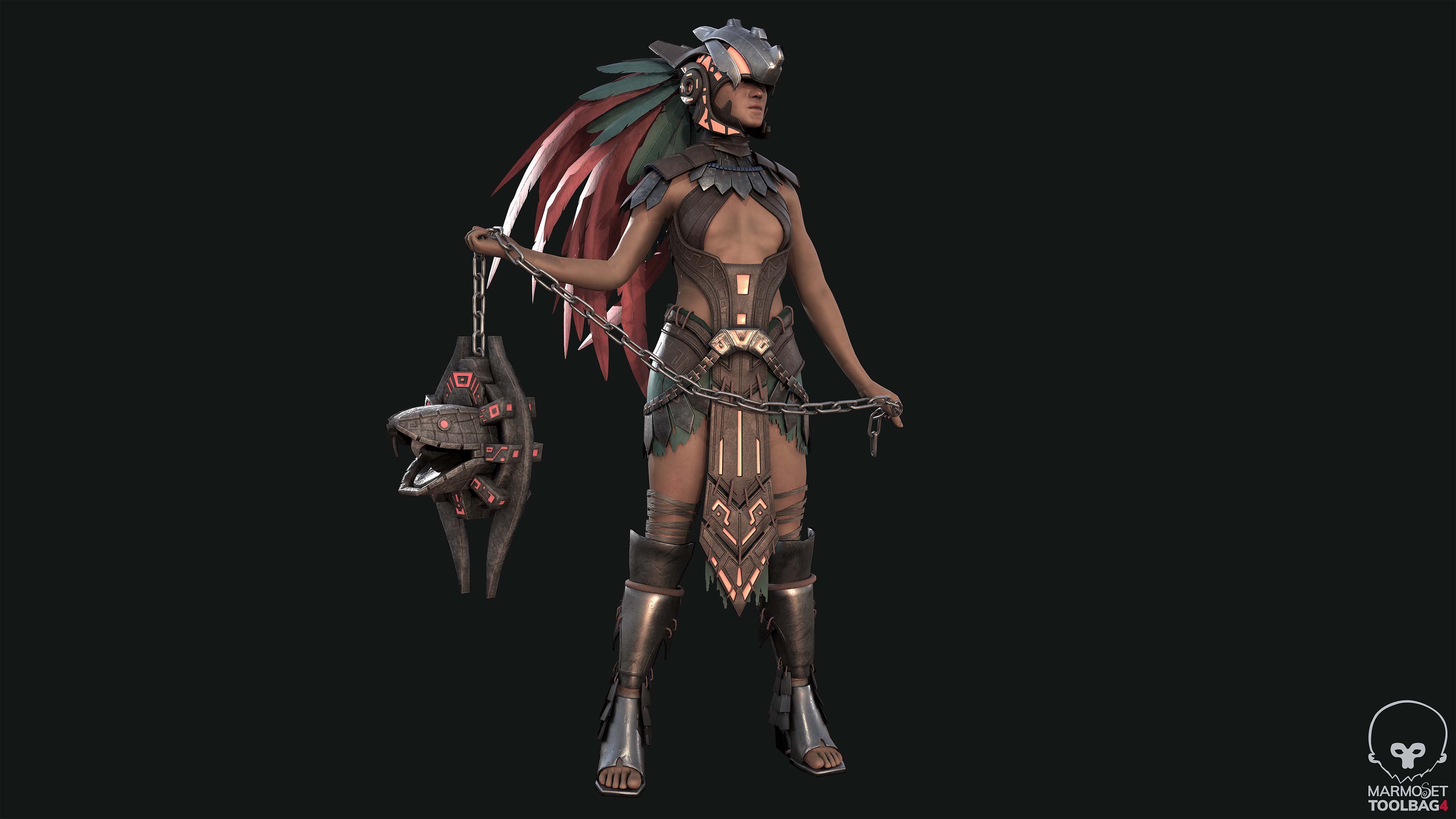
2nd pose is great; I really like that you’ve created your own unique pose separate to the concept which helps to give us more insight into the personality of the character and tells a bit of a story. I think you’ve nailed it here, my only suggestion would be to lower the head slightly further, as if they are looking down deeper in thought like they’re about to go into battle. This would also give us a nice view of the helmet and could create an interesting shape with the feathers rising above breaking the silhouette.
Texturing
You’ve done a great job on the texturing overall, however one area that stands out to me the most is the skin. I think the skin would benefit greatly from some breakup in the colour. It’s missing some warmer tones and varied skin hues, feels quite monotone and flat overall. You could try using grunge masks to introduce some noisy colour breakup into the skin, as well as making use of your thickness map to bring in some more saturated tones. I’d recommend taking a look at images of scans for reference such as 3dscanstore, 3d.sk and texturingxyz. There is quite a lot of skin on show with this character so lots of room to add visual interest here.
The feathers could do with a little more colour variation and breakup. They feel slightly flat and one tone. Grab some solid reference here and study the concept as there are some lovely yellow hues within the quill/stem which bleeds into the veins of the feather. Some darker dirtier colours might help to introduce a bit of breakup and variation.
It would be great for you to show the different channels of your textures applied to the character such as metal rough so etc. I’d suggest bringing in some grunge and breakup into the roughness of the leather and metal sections to create an interesting response with the lighting.
I think with the weapon there’s room for you to add some interesting material variation between certain elements. One great example and an easy win here is making the fins/blades of the weapon metal rather than stone. Currently the weapon is all one stone like material, whereas in the concept the blades have a lovely metallic treatment. This might help the weapon feel more lethal and you could even add chips and scratches to show they’re battle worn. You may need to reduce the width of the blade edge slightly within your game mesh in order to sell that it is a sharp object.
Perhaps bringing in an emissive channel into the orange patterned sections on both the armour and weapon could be an interesting touch. You may have added this already, and if so, I think it could do with really bumping up in the strength in order to bring these details out. This will also help to achieve more of that vibrancy in the colours as seen in the concept. Even some emissive glow in the weapons mouth to suggest fire might look awesome too.
Your texturing is really strong overall so nice work here. It looks like you’re going for realism and your textures are working well to support that.
Lighting and final presentation
Overall the colours feel quite desaturate and cold. Perhaps this is due to your lighting or HDRI set up. It would be great to see the blues and orange hues pushed further to bring back some of that interesting contrast seen in the concept. Try playing around with your lighting set up and HRDI’s and don’t be afraid to revisit the colour values off your textures to make them more vibrant.
Something I’ve found really useful is finding good examples of presentation on Artstation and saving them for future reference. Artstation has a great ‘Collections’ feature which is perfect for this. I’ll share a couple of examples here of ones that I feel do a really solid job of presenting their characters. Some things to consider are of course lighting, composition, use of background etc. Also consider how many images there are, what are they highlighting within the image and any interesting breakdowns or under the hood type stuff is great too.
Great presentation overall here: https://www.artstation.com/artwork/wJOQ8g
Hazel Brown has some great examples of things to include alongside your renders, like wireframes etc.: https://www.artstation.com/artwork/lxnwVe
Something as simple as a shadow beneath the feet to help ground the character into the scene will really help. At the moment, in your renders the character is floating in a void and not connected to the floor in any way. Adding a simple shadow will really help to ground your poses and sell a sense of weight.
Honestly, you’ve done an absolutely amazing job on this character overall, especially considering the time frame you managed to complete this project in. I feel like it’s just lacking that final 10% of polish to really hit the ball out of the park.
I’d strongly suggest taking a week or two to revisit this project when you can find the time, just to push everything that last little bit leaving you with a super solid portfolio piece. Perhaps just focus on the pose/texturing phase onwards to wrap this up nicely. No need to be too destructive with tweaking topology and UV’s etc. as these are areas you will keep improving on as you work through your next characters one after another.
Here is a hit list of areas of improvement, of course this is just my opinion so take from it what you will. I’ll briefly summarise here what I’ve covered in the rest of my feedback. But I think improving in these few areas will greatly increase the quality of the overall project.
- Skin variation/colour breakup
- Colours need to be warmer and more vibrant across the board (textures and lighting)
- Add/increase strength of emissive glow on the orange pattern sections (armour and weapon)
- Add metal to the weapon fins/blade on the outer sides.
- Poses can be pushed slightly further, more gestural, and dynamic
- Lighting needs to be moodier and more contrasty. Feels quite studio diffuse lit at the moment and doesn’t support the themes of the character
- Add a shadow beneath the characters feet to ground them on the floor plane
- Show more breakdowns such as wireframe overlay, high poly zbrush render, PBR channels like metallic and roughness etc.
Thanks for reaching out for feedback and best of luck! Please give me a shout if you have any questions.