

Play asset pack
Forsaken God's itch.io pageResults
| Criteria | Rank | Score* | Raw Score |
| Technical / Workflow | #20 | 3.266 | 4.000 |
| Final Presentation | #23 | 3.266 | 4.000 |
| Research + Development | #30 | 3.266 | 4.000 |
| Overall | #33 | 2.939 | 3.600 |
| Creative Development | #45 | 2.449 | 3.000 |
| Project Documentation | #47 | 2.449 | 3.000 |
Ranked from 1 rating. Score is adjusted from raw score by the median number of ratings per game in the jam.
Challenge Tier
Rising Star
Leave a comment
Log in with itch.io to leave a comment.
Comments
(Unofficial) Industry Feedback.
Tristan McGuire:
Character Artist at Airship Interactive.
https://www.artstation.com/tristanmcguire
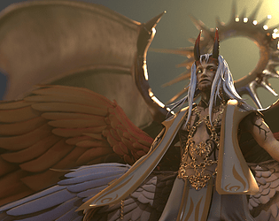
Research and concept:
Love the idea you came up with. It’s great that you did a bit of research into the symbolism of angels and demons. Would be great to have done a breakdown of what these symbols represent from an art perspective. Not just stating the symbols, but describing how they make the viewer/player feel and what they communicate.
Same goes for the concept art. It’s awesome to see a 3D artist who can also do 2D, but that aspect of your presentation could be stronger if you explained why you made the changes that you did. Describing artistic choices at a fundamental level (like discussing colour and shape theory) shows that you understand the theory behind what you are creating and are not just kit-bashing together existing imagery.
High poly:
Your anatomy sculpt is strong in the torso area, but next time take a closer look at the size and shape of the hands. Look for rhythms where straight lines oppose curves. These appear naturally in human anatomy and can also be exaggerated to create ‘idealised’ realistic forms. For example, look at how the tops of the fingers should be flat, but the undersides are curved. Your character’s hands don’t appear to be slim and angelic, nor gnarly and demonic – they are a bit too puffy. Next time, add the finger nails too – they actually help a lot in the appearance of the hands more so than you might expect.
Without a clear closeup shot of the face, it is difficult to critique. Some more detailed shots would really help to see all the hard work you did. Next time you present a project, make sure to show images of the fully completed sculpt too, not just individual aspects. For example, show the whole thing from the front diagonal and back diagonal views. As well as closeups of detailed areas like the face.
The approach taken to the feathers is nice. Would have been nice to see some more definition to the shape of each feather though. Like a line running down the centre and some more sharpness at the edges. These ones look like an in-between of realism and stylised. Not enough detail for realism, but not exaggerated enough to be stylised.
Low poly:
41k for a character with three pairs of massive wings is very low for a AAA standard of character. Feel free to go higher on the tri count in your next models. Tri counts always vary dependant on the project and platform, but anywhere from 50-100k would be fine for this model. For your portfolio, as long as the edge flow and tri distribution are good, you are fine to go for the higher end of tri counts.
The facial topology is really nice, but just a touch uneven. For example you can add another loop over the nose and cheeks, but remove some of the vertical ones on the forehead.
Some areas of the body are overly low poly like the shins and the toes. In the future, check that the silhouette of the high and low poly models match closely. The stubby toes will break the immersion of the player, but adding a few more edgeloops so that the toes are fuller won’t break the tri-count bank.
It’s great that lots of the edgeloops of the feathers line up. This is necessary for rigging to work well. Just would have been good to have seen more of them lining up. But it seems like you understand this theory but just perhaps ran out of time to finesse all of the loops.
There is an issue when viewing the demon wings from the back, due to how they are formed of just one layer of polys. So the bones are inverted in the back view. The feathers work great from some angles but not from others. So just make sure to constantly check your model from all angles next time.
The clipping between the cloth and the wings would pose an issue for rigging, so make sure to keep things apart in the bind pose.
I notice you didn’t show the UVs. It is best to show them so that assessors don’t think you are trying to hide them. (If something is omitted, we will assume it is bad).
Texturing:
Interesting choice to use UDIMs. In my personal experience, games have always used texture sets and not UDIMs. So make sure you are also familiar with the texture set workflow. It would have been useful to see a breakdown of exactly what the smart material did, vs what you added manually. Smart materials are great in a studio environment if you need to make something in a hurry or need to match a very specific style, but for portfolio projects it is beneficial to do as much as you can ‘from scratch’ to prove that you know what you’re doing.
When presenting your textures, show the un-packed versions of the AO/roughness/metallic. It’s hard to tell what’s going on when the map is fluorescent green. Just the greyscale ones are fine. The way you showed each texture set beside the relevant part of the mesh works well though.
The finished textures would benefit from more material breakup. Ambient occlusion on the wings would really help too. The white wings being lighter in the crevices and darker in the light is confusing for the eye. Even if doing a stylised gradient, opt for a darker value in the crevices.
Presentation:
Would have been nice to see this in Unreal, rather than just Marmoset. (I don’t know if that was a requirement for the challenge this year or not). It just helps to see that you know your way around an engine.
Posing the character would have also helped the storytelling.
It’s nice that you played somewhat with camera angles and effects in your final renders (the depth of field is great). But it is hard to escape the stiffness of a character in its bind pose.
And in your document, it would have been really helpful to have better technical renders, so the work can be more accurately assessed. Take a look at the portfolios of recent graduates or industry artists who still have some uni work on their ArtStation – look at how their tech renders are composed and then you have a good idea of what employers are looking for in a technical breakdown.
Final words:
This is a great project and VERY ambitious with those wings. I can see you thought about the storytelling in your concept, but unfortunately this didn’t all make it into the final model due to the lack of posing. The art style is not quite defined enough – next time make it super clear whether you’re going for fantasy realism, or fully stylised. On the technical side, this is really promising for a Rising Star entry! This is an impressive project and I hope you feel proud of what you have achieved.
Remember that all the crit I gave is to help you grow and get to the industry level when you graduate. The project is already great, I’m just here to show you how to make it even better.
Best of luck for the future and feel free to reach out for more advice.