

Play asset pack
Mara - Cyber Warrior (Speed Demon and New Faith)'s itch.io pageResults
| Criteria | Rank | Score* | Raw Score |
| Creative Development | #24 | 3.266 | 4.000 |
| Technical / Workflow | #42 | 2.449 | 3.000 |
| Final Presentation | #42 | 2.449 | 3.000 |
| Project Documentation | #47 | 2.449 | 3.000 |
| Overall | #56 | 2.449 | 3.000 |
| Research + Development | #63 | 1.633 | 2.000 |
Ranked from 1 rating. Score is adjusted from raw score by the median number of ratings per game in the jam.
Challenge Tier
Search For A Star
Leave a comment
Log in with itch.io to leave a comment.
Comments
(Unofficial) Industry Feedback.
Tristan McGuire:
Character Artist at Airship Interactive.
https://www.artstation.com/tristanmcguire
Research and concept:
You are right in pointing out in your document that it is a mistake to not use or create concept art. This is because a very important part of being a character artist at a studio is your ability to translate 2D concepts into 3D models. It is hard to judge how successful your model is without knowing what it was meant to look like.
However, I can see from your text that you have thought about the world that your character exists within and where they fit into it, which is great. Would just be beneficial to analyse some images from the cyberpunk genre and explain your chosen themes. Not to go off on a tangent here, but the cyberpunk genre is pretty vast and has a lot of subgenres, so it is best to explain more specifically what you’re going for. (okay, cyberpunk nerd moment over :p).
High poly:
Love that you showed a breakdown of your process. I would suggest sticking with a grey material in Zbrush though, the default red wax one is a nightmare for incorrectly exaggerating the crevices in the model and making it harder to evaluate the forms. A popular one is the one called ‘basic material’ found in the bottom part of the material palette.
There’s a nice amount of detail in the anatomy, but next time make sure to really double check your proportions. For example, the thigh bone should be the longest bone, but your character’s lower legs look longer than her upper legs.
For the face, it’s a good start, but I would have done a final pass to check that everything anatomically makes sense. Check the eyeballs are the right size (info on human eyeballs can be found on Google), then check that the eyelids are convincingly wrapping around the eye. Some areas still feel a bit lumpy and would benefit from you pulling some of the angular planes of the face back into the forefront. The thin neck also makes the head look a bit cartoony, where the rest of the features look more realistic. Make sure to keep the style consistent.
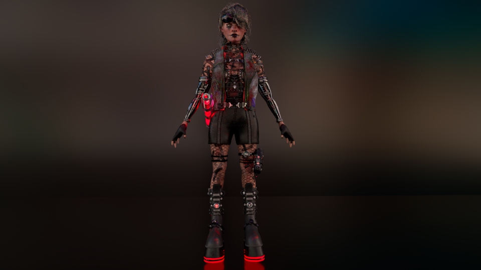
Would have been beneficial to see the finished high poly with the clothes and the hair close up. Unfortunately, the small screenshots make it really hard to evaluate the quality. I would suggest looking up images of folded cloth – look for the sharpness of the folds. The sculpted boots seem very soft, as if made of something that is melting down, rather than a firm material like leather that strongly holds its creases.
Low poly:
It’s great to see that you are starting to put the edge loops in the right places to allow for optimum deformation, however there are multiple areas where the density of the quads is quite inconsistent. For example on the side view of the face there are some large rectangular quads along the jaw, but in the front view there is a very dense patch running over each eye and under the chin. Next time, think about keeping the spacing of the vertices more even and only make them denser in areas where a lot of deformation needs to happen (eg the lips).
Due to the small images, it is hard to judge the topology of the clothes, but it is clear that they are too high poly. I am thinking that a lot of this may be Zremesher. Always do manual retopology and make sure your mesh is adequately optimised.
In future, make sure to show a clearer breakdown of every asset. I can see you made some cyber arms, but without any closeup shots of them, I can’t see the hard work you did!
UVs:
Before making your next character, take a look at the UVs of other models made by industry professionals. The islands need to be packed very tightly into the square due to the tight texture budgets we have in game development. A UV unwrap with all that wasted space would not be accepted in a studio environment unfortunately.
However I am glad you made an attempt to do some of the UVs manually, rather than them all being automatic.
Groom:
I am interested to see that you referred to hair cards as obsolete and instead used Xgen. In the industry currently, we very much do still use hair cards for the majority of situations. Xgen is the new up-and-coming thing. But make sure to also learn the card method. Unfortunately it is hard to judge the quality of the hair clumping without higher res images. The overall look is great though and knowing Xgen will be advantageous in the long-run.
Texturing:
When presenting the textures, it is easier to understand what you are looking at if you show the both the 3D model and the 2D textures. But from the 2D images, I can see you added lots of nice details like stitches and you thought about varying the colour of the skin on the face. Next time just look to add many more colours to the skin like blues and greens. Your texture has a very samey ‘pink’ hue.
Also, for games, you should be using normal maps not height maps. Height maps require the mesh to be subdivided/tessellated at runtime, which is not what happens in game characters. You must use the retopologised mesh as-is and simulate the additional lighting information with a normal map.
Rigging:
Joint rig looks good! Nice to have some knowledge of rigging so that you can pose your characters. But as character artists do not typically have to also rig once in the industry, I wouldn’t worry too much about any rigging issues. Just a shame that you couldn’t showcase the final poses – they would have really helped the storytelling.
Presentation:
It is a shame to not see the model in a game engine – next time make sure to allow enough time to troubleshoot any technical issues so that you can get it into Unreal.
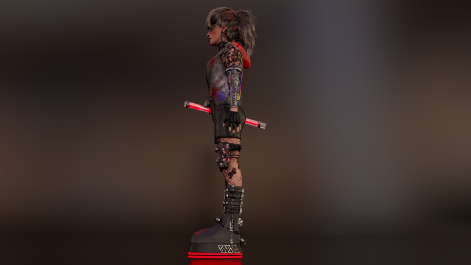
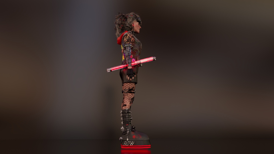
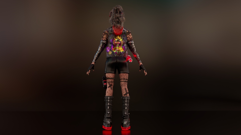
Your renders do a good job of showing the model as a whole. Also try doing some images with more dramatic three-point lighting. With a cyberpunk theme I am surprised to not see some bold rim lighting!
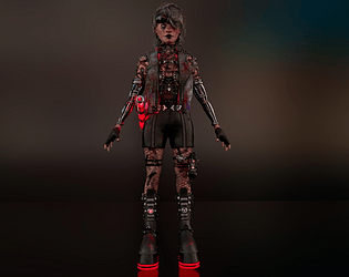
Even though you did not pose the model, it would still be best to do some renders from non-orthographic angles. Look at the portfolios of industry professionals and look at how they do not present their models in this style, but instead opt for more aesthetically pleasing angles. And as I said before, please do much larger renders. 4k at the least. I want to be able to give more helpful feedback on the model, but I just can’t see it!
Final thoughts:
The presentation is the main thing that lets this project down. So next time you complete a project, do some nice big renders and look at ArtStation for inspiration of how to pose your model for turnarounds. Also do some technical renders where you really show off your wireframe, UVs etc rather than just showing viewport screenshots.
You mention in your document that you might keep tweaking the model. I would advise against spending lots of time adjusting this model and dedicate more time to making a brand new model that uses all the skills you’ve learned to make something ever better. Perhaps pose this one and do some additional renders for your ArtStation, but I wouldn’t adjust the model itself any further.
You have made a great start at doing each part of the character pipeline and you should be happy with what you know so far! Just do a bit more research into current techniques used in the game industry to make sure that your technical knowledge is all relevant. Then apply this to your next project. I’m sure you will be amazed at how much improvement can be made from one project to the next, so please do not be discouraged.
Feel free to look at my ArtStation for reference, as I post technical breakdowns on most projects. And feel free to reach out in the future for any further guidance.
Best wishes for the future!