Play game
Rusted Century's itch.io pageResults
Criteria | Rank | Score* | Raw Score |
Adherence to Theme and Creativity | #9 | 4.320 | 4.667 |
Overall | #11 | 3.549 | 3.833 |
Technical Execution and Presentation | #13 | 3.086 | 3.333 |
Gameplay Innovation and Enjoyment | #13 | 3.240 | 3.500 |
Ranked from 6 ratings. Score is adjusted from raw score by the median number of ratings per game in the jam.
Judge feedback
Judge feedback is anonymous and shown in a random order.
- A game a bit too complex for its own good. Needs work on the basics. Controls are clunky. The feedback is unclear. The screen is hard to read. But a promising debut nonetheless!
- The backstory and concept in this are both fantastic. However the shooting controls are difficult and hurt gameplay. I'd love to see the controls and sprites improved and then try it again because the strategy of exploring for resources while downgrading stats in order to reach the end is brilliant.
- Really cool ideas here ! And for a first game I'm super impressed- I found aiming a little hard . But other than that- really interesting project here . I loved figured it out
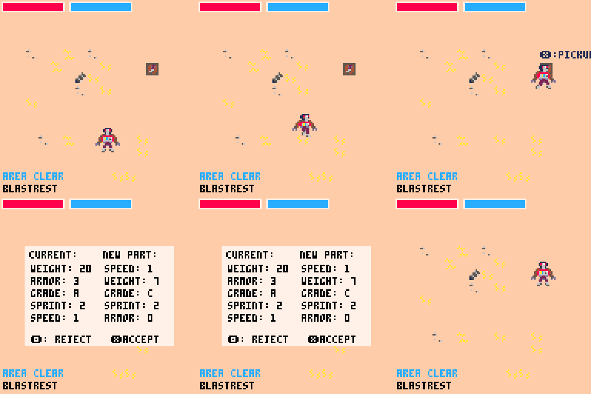
- Adherence to Theme and Creativity: 5 You are a robot that has to scavange around for WORSE parts that you already have. Really nice spin on the classic power journey of roguelikes. Gameplay Innovation and Enjoyment: 4 Off screen machinge gun enemies, off screen walkability, wall passing bullets, and the random nature (I guess, went east and found nothing) of the final goal are all little things that add up together to slightly irk me. Otherwise I have no issues with the game. Some hardy found way to pinpoint the mcguffin would be a nice touch so I don't throw my fate into rng-s hand over the dunes. Technical Execution and Presentation: 4 Alread expressed a few technicality issues of mine above, presentation wise the game is on point, I just need a background track and a sorted part window, with a little splash of better looking menu!
Leave a comment
Log in with itch.io to leave a comment.
Comments
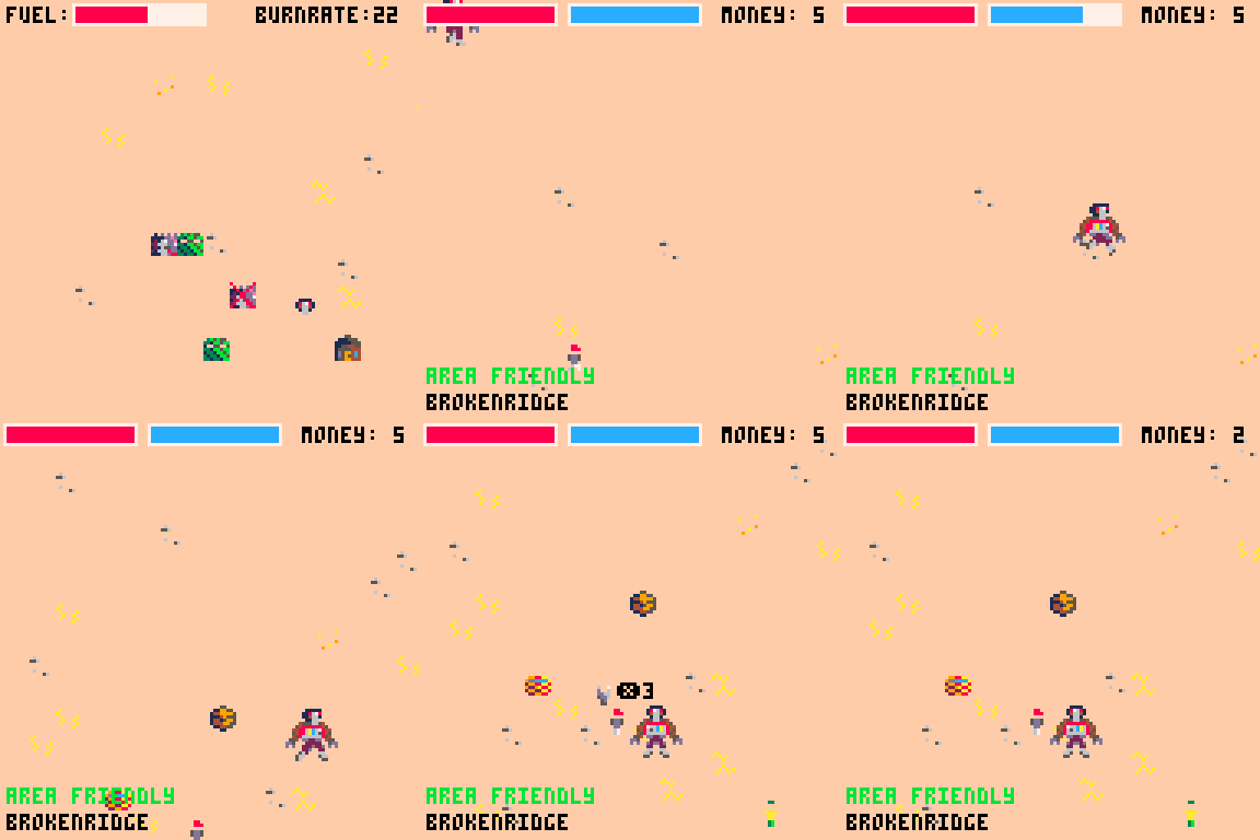
Congratulations on making your first game in Pico-8. It's not easy making your first game, and even harder trying to make it for a jam. So kudos to you! The shooting gameplay felt a little bit clunky, the collision code probably needs tightening up, it would be nice to have some more sound effects too, like confirm/cancel sound effects on the downgrade menus. That's the (minor) negatives out of the way.
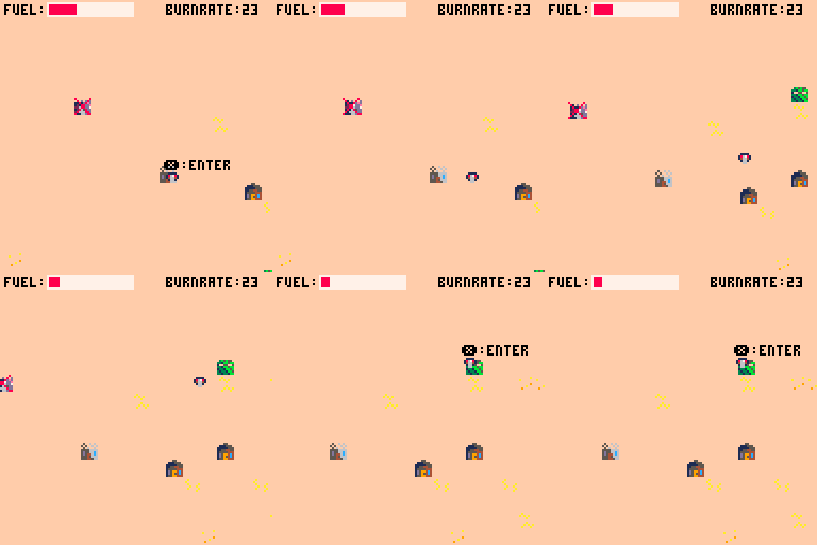
I loved the idea of making the robot more fuel-efficient whilst lowering performance, really cool way of linking progression with increasing difficulty--something a lot of RPGs struggle with. I loved the lore of the game, the idea of being some old, forgotten robot stomping around the wasteland after the war is over is just great.
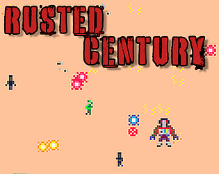
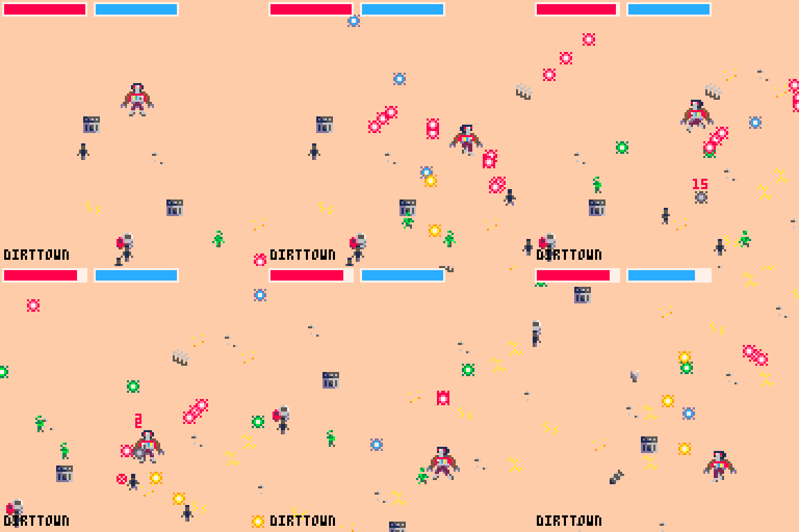
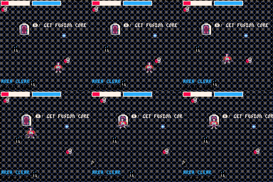
The graphics were really nice, I liked the little enemies running around and the different animations/poses of the player character. The design of the player character was really cool.
Awesome first game, and awesome jam entry. Respect!
Thanks for the feedback! I appreciate the additional information on the livestream, as well.
I love the idea of downgrading, and the scale of the battles is quite epic. Only the aim I find to be a little bit too difficult. Maybe changing the crosshair’s initial position to the last direction of the movement would make it slightly easier.
Thanks for the feedback void! After seeing other people playing the game, I decided to make the crosshair start at either 90 or 270 degrees, depending upon which way the player is facing. That will allow players to still spam the shots while moving, but will fix the flip bug.