Play asset pack
Is it pain to remember, or home?'s itch.io pageResults
| Criteria | Rank | Score* | Raw Score |
| Creative Development | #19 | 3.000 | 3.000 |
| Technical / Workflow | #23 | 2.667 | 2.667 |
| Overall | #27 | 2.800 | 2.800 |
| Research + Development | #31 | 2.667 | 2.667 |
| Project Documentation | #31 | 3.333 | 3.333 |
| Final Presentation | #37 | 2.333 | 2.333 |
Ranked from 3 ratings. Score is adjusted from raw score by the median number of ratings per game in the jam.
Judge feedback
Judge feedback is anonymous and shown in a random order.
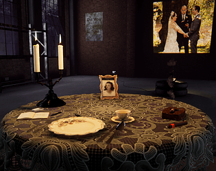
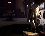
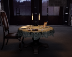
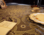
- Hi Oliver, You have some fantastic assets here - but I feel like the final scene lets them down. Some areas I'd strongly recommend yo focus on here are the floor, wall and lighting. 1. The floor, for how much of it is on-screen in some shots is very plain. You've done so much great material work here, that it feels like a disservice to leave it so barren. Have you tried some set dressing a bit with the props you have? I see you have a couple of areas where you blend vertices but it's hard to tell with the current lighting. 2. Those posters are very distracting - I would spend some time on creating them in the world's context - right now they read very much as a generic text box in Photoshop, with some grunge overlaid. 3. I'd love to see you play a bit more with lighting here - what if the overhead light was off somewhere else (like above a door?) and the main light source was just the candle light and projector? What if it was just the moonlight and a dim candle light? Overall - very good material work and some lovely props - I'd love to see this pushed as a scene!
- Hi Oliver, good job on your environment work! I was impressed by your determination to learn new techniques and create many assets and textures from scratch for this project, and I feel like you are heading in the right direction. For your next project (or if you were to revisit this one) I would suggest spending a bit more time developing (or finding) a main concept to work from, from your comments I can see what you were going for but, just looking at the final renders, the narrative doesn’t come through as strongly and I almost feel like all the elements that you built are being forced into the frame, with no room for interpretation. A great deal of what makes environments interesting is what you (as the director) choose not to show, it might seem like a waste of resources but it would help make your scene come to life. Best of luck in your future, keep pushing!
Challenge Tier
Search For A Star
Leave a comment
Log in with itch.io to leave a comment.


Comments
No one has posted a comment yet