Play asset pack
Nostalgic Bedroom's itch.io pageResults
| Criteria | Rank | Score* | Raw Score |
| Project Documentation | #21 | 3.500 | 3.500 |
| Research + Development | #35 | 2.500 | 2.500 |
| Final Presentation | #40 | 2.000 | 2.000 |
| Creative Development | #45 | 2.000 | 2.000 |
| Overall | #45 | 2.200 | 2.200 |
| Technical / Workflow | #62 | 1.000 | 1.000 |
Ranked from 2 ratings. Score is adjusted from raw score by the median number of ratings per game in the jam.
Judge feedback
Judge feedback is anonymous.
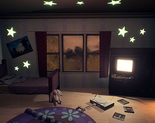
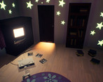
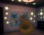
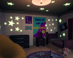
- Hi Louise, A bedroom a is great project to tackle - as there lots of interesting compositions and shapes you can use to your advantage. There are some areas here I'd you to focus on if you choose to push this project further: 1. Scaling: There are some strange scale issues here, intentional or not they do come as distracting. The handles for the drawers are very large in diameter, compared to other parts of the scene - like the curtain rod in particular. The PlayStation also seems pretty large compared to the door and so on. I'd definitely revisit some of these, even going as far as to using a measurement / unit scale in your 3D package to make sure things are setup correctly. This might seem fairly tedious - but it'll help in the long run when you start set dressing 2. Set Dressing: I'm seeing a lot of assets floating around or not properly placed - it's noticable in the crown modeling where you can tell it's hovering off the wall, and you can see it in the door as well. 3. Lighting: I like the idea you're going for here, but you have two very bright objects fighting for attention. I'd maybe reduce the glow from under the door and let the TV be the main source of light here. This will help bring more contrast in the scene and can let you fill the rest of the room with a very dim, soft blue light that will those stars pop out even more! 4. I'd spend some time fleshing out the room a bit - instead of sticking the door in front like that, maybe build out a door frame and inset where the door can sit in nicely. Currently it's very noticebly popped in front. I'd love to see some kind of floor trim as well. 5. I'd recommend reivisting your UVs - the rug and the warddrobe look very low res, and I don't think you're necessarily using the UV space well here, and it shows in the final resolution of the asset.
Challenge Tier
Search For A Star
Leave a comment
Log in with itch.io to leave a comment.


Comments
No one has posted a comment yet