

Play asset pack
Overlord (2018) Lab Scene's itch.io pageResults
| Criteria | Rank | Score* | Raw Score |
| Final Presentation | #12 | 3.667 | 3.667 |
| Creative Development | #19 | 3.000 | 3.000 |
| Overall | #27 | 2.800 | 2.800 |
| Technical / Workflow | #30 | 2.333 | 2.333 |
| Project Documentation | #44 | 2.667 | 2.667 |
| Research + Development | #46 | 2.333 | 2.333 |
Ranked from 3 ratings. Score is adjusted from raw score by the median number of ratings per game in the jam.
Judge feedback
Judge feedback is anonymous.
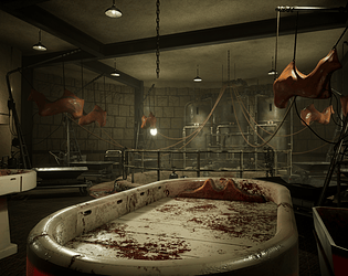
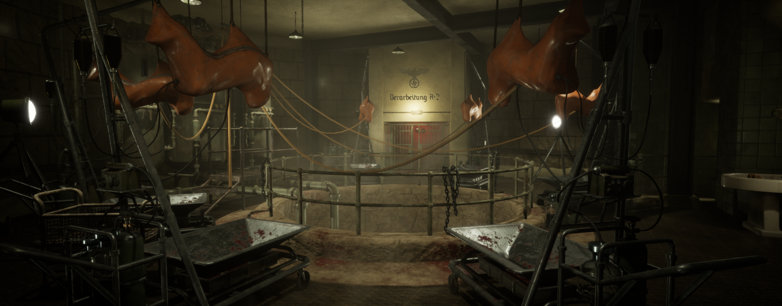
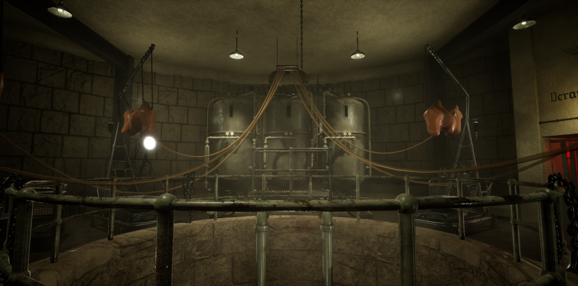
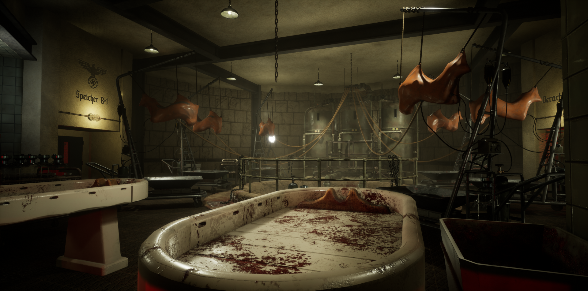
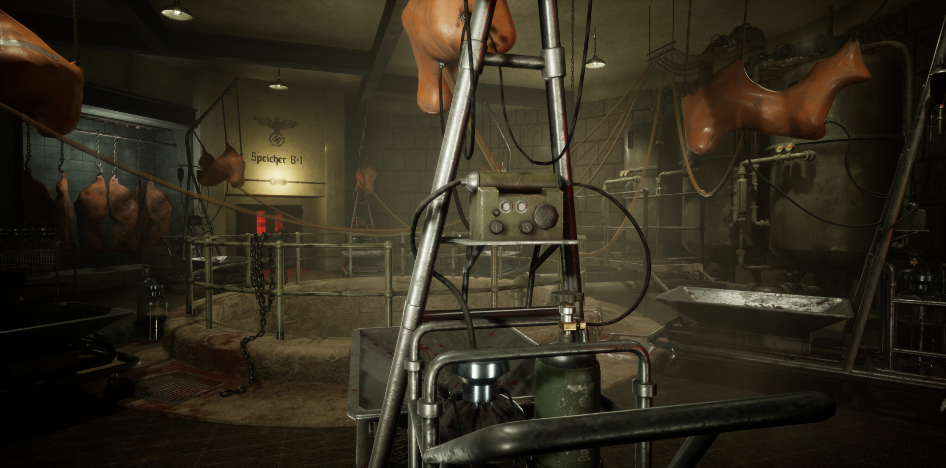
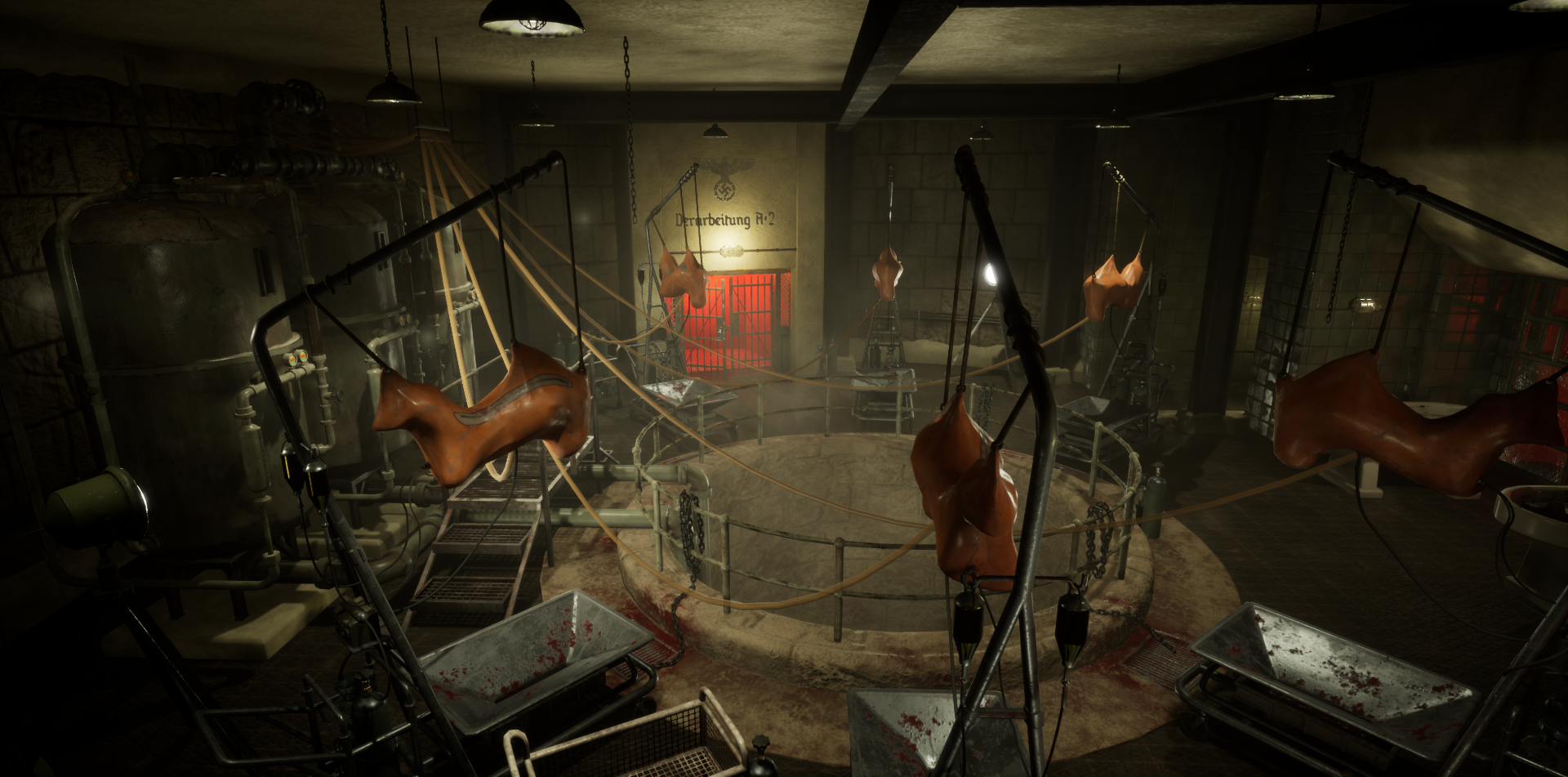
- Hi Tom A great horror themed piece. Overall, I think this is pretty well done - but I have two main areas for feedback which I hope can help you bring this to the next level. 1. Your main materials: the wall tiling, the flooring and the stonework could use some extra love. I feel like the floor material gets very noisy with the normal detail and doesn't read super well. I like that you're trying out displacement / tesselation with the stonework on the walls - but it detracts from a pretty solid material and seems very, very lumpy for what we have here. I'd also like to see the edge wear toned down a bit for the tiling on the walls. You've done a great job with your props, and I think some slight tweaks to these materials can really bring the place together. 2. Your lighting: There's a bit too many lights for what we have here - and they're killing any points of interest or contrast you've spent creating. My suggestion here is to nix most of the ceiling lights and focus on the physical spotlights as your light sources - get those spotlights creating some interesting shadows and shapes and from there, use some less intense pointlights (not spotlights!) for those wall lights you have around the doors. You have a lot of opportunity of really selling the mood by using those physical spotlights to create areas of interest - try it out! With the all those lights gone, you can lead the eye away from less interesting areas (the ceiling) and more on spots you've fleshed out. I like that you're using decals here, but I'd love to see more on the walls for grunge or even discoloration. Good job with this project. With a few tweaks I think you can really make this shine.
Challenge Tier
Rising Star
Leave a comment
Log in with itch.io to leave a comment.
Comments
No one has posted a comment yet