Play game
Mine Clearance's itch.io pageResults
| Criteria | Rank | Score* | Raw Score |
| Creativity | #15 | 3.000 | 3.000 |
| Gameplay Implementation | #19 | 3.000 | 3.000 |
| UI/UX Consideration | #20 | 2.000 | 2.000 |
| Overall | #22 | 2.250 | 2.250 |
| Features & Additions | #23 | 1.000 | 1.000 |
Ranked from 1 rating. Score is adjusted from raw score by the median number of ratings per game in the jam.
Judge feedback
Judge feedback is anonymous.
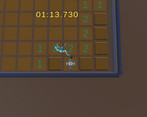
- Hi Fate, my name is Clemens, I am a programmer and I hope I can provide you some useful feedback for your game “Mine Clearance”. I understand that you had some troubles with the brief and that you had to change some elements of the game last minute in order to fulfill the requirements. Misunderstandings can happen at any time and it will not be the last time that something like this happened to you, but I want to stress on a very positive thing here: You showed your game to a friend and asked for feedback. This was a super valuable step to do. Let’s talk about your game. I like the idea of running around on a mine filed to see if you can survive while clearing the field. However, the game is raw and I found a lot of bugs while playing it. Some of these may be things, that you could not fix because you run out of time. Others may be things, that you did either not discover or design properly. By design, I don’t mean how it looks, but how it is supposed to work. As you are a programmer, I will not talk about the visual appearance of your game. Although this is important, I understand that this was not your focus. The main menu doesn’t work very well. Pressing space to activate a menu entry does not work always and it seems to be random when pressing space activates a button and when not. (The input was accepted, I could see the character digging, but the button was not activated.) This is annoying for a player. Apart from the technical aspect, I wonder if you asked yourself if you can design this differently. To give you an example option: When you start the game, controls are visible in a smaller area on the screen at all time (while the player is in the start screen), [Escape] replaces the Quit Button. And digging a hole anywhere on the field just starts the game (and hides the controls). The controls could be made visible while pressing [tab]. This is just an example, but it would have been a more interesting way to design your main menu / start screen. (That said, it was a nice approach to have the main menu as part of the game, instead an ordinary “mouse clicking menu”.) Another design question, you need to ask yourself is: In your current implementation, how is the player supposed to know, how to enable the “Controls” button, if they don’t know how to control the character and that [space] activates the button? (A player should not need to guess how to use a menu.) Also, the escape button doesn’t not work. It neither brought you back from the game to the main menu nor did it close the application. Another issue with your UI is the timer. In general, it is totally fine to have this in world space, however, it was not visible at all times. If a player finishes the game, they only know how long it took them, if the last field was close to the clock. A HUD timer would have worked better in your case. The camera is tightly bound to the player character. This leads to unwanted camera shakes when you change the character’s direction. Smoothing the camera is easy to do and makes the game feel better. One thing, that could have been implemented very quickly and would have made a big difference in your game from a game design perspective, is if you “celebrate” when the player wins. In your case, finishing the game triggers the death of the player and the exploding mine sound effect. A player only knows that they have one, because the last element was not a bomb, but a number. Changing this to a winning melody and maybe a UI text that says “you win!” would have been sufficient for a project like this. The take away for you is: Make winning feel good. Also, the first field a player uncovers should never be a mine. This can cause frustration for a player. (That said, you can make the first field a mine, however, you need to design it in a way that it is still fun and enjoyable.) Sometimes, the numbers of an uncovered field changed when digging into the next field. I also saw already uncovered fields that became covered again while digging into another field. All in all, you have had a good idea and made it into a working game. You were able to submit your project within the given time. Your documentation and itch.io site presentation looks nice. I am sure you learned a lot and I hope my feedback triggers some thoughts that improve your future projects. Best regards, Clemens Scharfen
Challenge Tier
Search For A Star


Leave a comment
Log in with itch.io to leave a comment.