Play asset pack
Shadow Orb VFX's itch.io pageResults
| Criteria | Rank | Score* | Raw Score |
| Research & development | #1 | 4.500 | 4.500 |
| Documentation | #1 | 4.875 | 4.875 |
| Presentation | #1 | 4.000 | 4.000 |
| Creative | #1 | 4.250 | 4.250 |
| Technical | #1 | 4.500 | 4.500 |
| Overall | #1 | 4.425 | 4.425 |
Ranked from 8 ratings. Score is adjusted from raw score by the median number of ratings per game in the jam.
Judge feedback
Judge feedback is anonymous and shown in a random order.
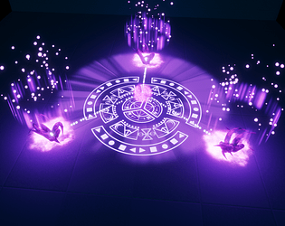
This is a really impressive submission! Clearly a lot of thought has gone into this, I'm impressed with the technical aspects of the effect (and the consideration for how this might need to be broken down/hooked up in a game as opposed to just creating a pretty effect).
The asset quality could certainly be improved but the candidate acknowledges this in their documentation, and evidently that was down to time constraints - and the candidate focused their time learning some of the more complex aspects of VFX which is commendable in itself.
I think the timing could be tightened up too; it feels a little bit slow in the build-up but in an actual game, I'm sure the the audio would "fill" this empty space.
Without having read about the "good/evil" aspects of the effect, I don't think I would have felt that. I just don't get a sense of "evil" during the sequence but in a real game development process this is something we would have identified early in the process and I am convinced the candidate would be able to act on this.
Really well created animation which manages to capture the animated style of World of Warcraft and specifically the Shadow priest's spell types well. What I would have loved to see more of, was the mix between holy and shadow. Because the two colors contrast well with each other the effect would have benefited from a healthy mix of both. The timing on the initial delay phase seems very slow and loses some of the interest while shown. I am not sure whether this is intended to show it's an activatable spell but for the sake of the presentation it would benefit from speeding up. Overall a great animation which would work amazingly in a fantasy game.
Good luck, you have a bright future ahead in this field.
Tibor Papp
Pixelwarp Studios
Great, loving the design, colours and the overall feel to the effect, a little slow to load the project files.
Excellent work all round. Love the amount of blueprint work in there and the overall effect stands up very well. It's obvious that a lot of time has gone into this.
In terms of improvements, you could look at various small things such as having the tentacles pop up through the ground with some rock rubble being thrown up instead of just appearing. Perhaps adding more impact to the appearing using a post process to bloom out the screen a bit more as they appear. Also the mesh cylinders with the lines on them that appear could be made to look less like cylinders using more variation in the material or the mesh.
These are all just small suggestions though really and overall an excellent effort.
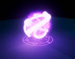
Nice effects overall, well done work. The rotated shapes around the sphere can be better blended if you play more with particles that can match with the two effects and "save" your effect for more effort.
As Vfx artist you went through the many not all the significant parts to explore the way to create an effect from scratch till the presentation. I would prefer better camera movements and positions, so you can create an atmospheric look of your effect and focus on specific points you prefer to show more.
Great work, keep walking and feel free to ask any of us of any questions.
I enjoyed your process and discipline. It was good to see how you tried to excel yourself by formulating and developing the animation and pace overall. It didn't disappoint.
From mood board, concept, development, I felt connected all the way through the end.The amount of particles dedicated, the usage of different angles overtime, cinematically speaking, shadowing, floor displacement, camera movement are there.
1min 53 is a great moment!.
I would just say that if you cut shorter the animation it wouldn't hurt. Personally I don´t feel you need this much length.
Good job overall!Very strong documentation and development process, thorough research and well illustrated. The breakdown of the component graphs, description of challenges and solutions really helped to see how the final look was achieved.
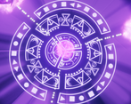
Technically complex with realistic use of resources and great use of 3D animated elements. These elements add a good sense of detail to the effect but I would have liked to have seen them integrated better, maybe brighter texturing and some chaotic particles around the base would have helped. Overall I would have liked to have seen better integration between elements: the component parts are often too easily perceived to feel really magical. I like the runic elements but would have really liked the 'expanded circle' to be circular: the overall curvature of the translated circular sections break the 'magical metaphor'.
The calm yellow build up is very hard to read and doesn't show enough detail, using some non additive elements would bring out the details that are there. The impact of the main burst is strong and the best example of timing from the overall sequence, the flash of the final disappearance is also good.
Well presented documentation, but the effect could have been shown in a more realistic environment. The interaction of effect colours against the background is key to the visual impact of the effect (this effect would only work against a completely flat surface - is that realistic for this game?)
Great piece here, love the motion within the effect.
Here's a couple of things that stood out to me that might be worth considering to further improve the effect.
First of all, I believe in your documentation you said that you intended to contrast the first stage to be a healing effect from a disc/holy priest and the second stage to be a shadow priest. Whilst I think you achieved the overall intended purpose you were aiming for, personally, I feel like the healing stage is far too empty. Considering how long the effect persists for, it might be worth adding more to the start of the effect as currently the effect is only visually impressive or clear in the shadow stage. How about considering something like pulses of light emitting from the center orb to signify that the area around the orb is, in fact, creating some sort of healing.
You've also said that when an opponent enters range, the heal orb changes to a AoE damage orb, whilst I like the way the swirling speeds up and it feels more chaotic, I would say that the charge-up period takes too long. Taking into mind if this was implemented into a game, an attack like this would be far too easy to dodge as the crowd control tendrils only come in later after the orb is already charged up. Perhaps look at speeding the overall effect up, it'll be far more visually impressive to 'view' if we don't have to wait 17 seconds for something unique to start happening.
The transition of it charging to then finally release seems a bit off to me, but I can't exactly put my finger on why. Something about the way that the Release just 'pops' out so rapidly. The tendrils popping into existence also appears a bit strange to me. This might end up being a random suggestion, but how about considering adding in an implosion in between the Charge Up and Release?
I think you could look to add more power and impact to the final explosion at the very end when the magic circle finally collapses. At the moment the final stage feels a bit empty in comparison to how full and powerful the shadow charge-up and release was.
Keep up the good work and don't hesitate to contact me if you would like critique in the future. https://www.artstation.com/fakado
Challenge tier
Final year & Masters students
Leave a comment
Log in with itch.io to leave a comment.


Comments
No one has posted a comment yet