Play game
Higher Together's itch.io pageResults
| Criteria | Rank | Score* | Raw Score |
| Style | #3670 | 2.835 | 3.750 |
| Overall | #3952 | 2.740 | 3.625 |
| Creativity | #3965 | 2.835 | 3.750 |
| Enjoyment | #3989 | 2.551 | 3.375 |
Ranked from 8 ratings. Score is adjusted from raw score by the median number of ratings per game in the jam.
How does your game fit the theme?
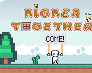
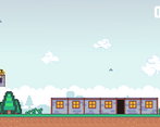
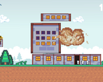
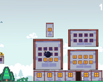
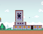
Because in our games the player must build a building by changing the size of the pieces
Development Time
96 hours
(Optional) Please credit all assets you've used
DEVELOPMENT -
AN ORIGINAL IDEA OF MIC
LEAD DEVELOPER:
IKUWANNE
DEVELOPER:
BY MIC, AMIZY, LAMASTRONOTE
GRAPHICS -
CLIENT:
BY PENZILLA
TILEMAP:
BY KENNEY ASSET STORE
PROPS:
BY MIC, AMIZY, LAMASTRONOTE, IKUWANNE
AUDIO -
SFX AND MUSIC:
BY LAMASTRONOTE
OTHER MUSIC:
ROYALTY FREE
FONT -
SILMON:
BY TOM TOR
DAYDREAM:
BY DOUBLEGUM
MARIO-KART-DS:
BY DAVID
SPECIAL THANKS -
A GAME FOR THE GMTK GAME JAM 2024
Leave a comment
Log in with itch.io to leave a comment.



Comments
Wow, it was so funny. I love this game!
I'm glad you liked it :D
The concept is very original. I'm not entirely sure why everything exploded sometimes, but it was still fun. The fact that the buildings were difficult to scale properly and needed careful placement was interesting, and overall, it's a great game!
Thank you, we worked a lot to make this game, it’s great to get feedback like that.
Wow, it's unexpectedly fun and addictive, I enjoy playing it and my best score is 72! I liked the smoothness of dragging and camera movement, and the music fits the gameplay perfectly.
Thank you so much
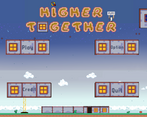
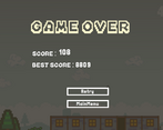
I don't really understand the scoring system, it also took me a minute to understand the premise, but it looks nice. I would scale the UI to be larger for fullscreen display next time
Thank you very much for the feedback, I admit that the scoring system is quite complicated, I should have simplified it