Play game
SwapBox's itch.io pageResults
| Criteria | Rank | Score* | Raw Score |
| Innovation | #336 | 2.750 | 2.750 |
| Theme | #358 | 2.750 | 2.750 |
| Overall | #378 | 2.500 | 2.500 |
| Feel | #410 | 2.250 | 2.250 |
| Aesthetics | #477 | 1.750 | 1.750 |
Ranked from 4 ratings. Score is adjusted from raw score by the median number of ratings per game in the jam.
How does your submission match the theme?
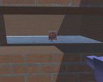
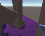
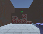
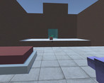
The core mechanic of the game is swapping position with boxes. Any box you click on moves to where you were, and you move to where it was. This can accomplish two things: you can move great distances instantly, often to places you could not normally reach, and you can move the boxes to different places in order to help you solve puzzles. The game revolves around this duality.
Third-party resources
SwapBox was made with Unity. Free textures acquired from Textures.com.
Contributors
Nathan Powless-Lynes
Leave a comment
Log in with itch.io to leave a comment.


Comments
Really enjoyed the level designs, especially the one towards the end that is nearly a repeat of an earlier level, but with a great twist.
I got a bit motion sick trying to play the game. The sensitivity was insanely high. The mechanic was cool but I kept getting lost and confused by the repeated textures and the insanely sensitive look speed.
Weird, the look sensitivity is perfectly normal on every computer I've played it on. I'm sorry to hear it wasn't working. But yes, I wish I had would've had time to have more than a few textures, better lighting, and aesthetics in general, just to make the game more readable.
That is odd. I was playing in the browser. Not sure if I can do a windows application. With the time frame, the aesthetics being lack luster makes sense. Maybe some small textures on the walls to indicate the difference between left and right, like a torch texture or something just to make it different so when I'm looking around so it's easy to orient myself. I'll try the game again though since you said you didn't have problems before.
I played it again and full screened it and lowered my mouse sensitivity settings and it was less painful. I updated my ratings to match. Though I still felt the sensitivity was too high, but I typically play FPS's at low sensitivity.