Play game
the snowball war of 1982's itch.io pageResults
| Criteria | Rank | Score* | Raw Score |
| Music | #4 | 3.571 | 3.571 |
| Gameplay | #10 | 2.429 | 2.429 |
| Theme incorporation | #12 | 2.429 | 2.429 |
| Lighting/Graphics | #14 | 1.857 | 1.857 |
| Art | #15 | 1.857 | 1.857 |
| Overall Score | #15 | 2.286 | 2.286 |
Ranked from 7 ratings. Score is adjusted from raw score by the median number of ratings per game in the jam.
Leave a comment
Log in with itch.io to leave a comment.


Comments
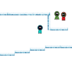
The music is really fun, I like it! I like the map design, where you have to walk around the map to get to levels! I also think the levels themselves are pretty interesting, although it is a bit difficult to discern where you need to go to reach the next part of the map at first. Also, I wish you could shoot in more directions than just left or right.
- I can access only the big iglu, shooting feels iresponsible(should be aiming for mouse point), the art doesnt fit it self, not incorporation of organized chaos, its not very fun
+ Nice music
Overall - Nice music but not fun and not good mechanics 2/10
thanks for the feedback, you can access the other levels you just need to scroll the screen, I know the game never tells you that or makes clear where to go. (I am not really good with direction) And can you elaborate on how the art doesn't fit itself. And I will try to do better in the future
For example :
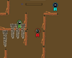
1. On your 4th screenshot(the not snowy brown level) there are some light brown piles of dirt that have white outline, then the player has black outlines and the wood has no outline. You need to choose what outlines will you be using and use them at everything to make it easier. Or just outline the important stuff.
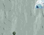
2. The hud : The background is upscaled too much = blurred distracting background. Also the hud is made top dow(camera is looking from top) and the iglus are made for not topdown 2D games(you can tell by the cut at bottom of the iglus)
And dont make the background 1 single color(never white, white hurts your eyes), it could have been a bit darker white with some grey circles or add some texture.
Definetly keep making games and art, it will be always better than the game you made before.