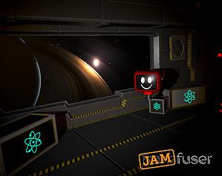
Lovely graphics, neat game. I included it in my Jamfuser compilation video series, if you’d like to take a look. :)
Play game
Dodge n' Leap's itch.io pageResults
| Criteria | Rank | Score* | Raw Score |
| • Audio | #1 | 4.500 | 4.500 |
| • Commercial potential | #9 | 3.333 | 3.333 |
| • Fun | #10 | 3.333 | 3.333 |
| Overall | #12 | 3.500 | 3.500 |
| • Visuals | #12 | 3.667 | 3.667 |
| • Innovation | #13 | 3.167 | 3.167 |
| • Strong connection to the theme | #24 | 3.000 | 3.000 |
Ranked from 6 ratings. Score is adjusted from raw score by the median number of ratings per game in the jam.
Judge feedback
Judge feedback is anonymous and shown in a random order.
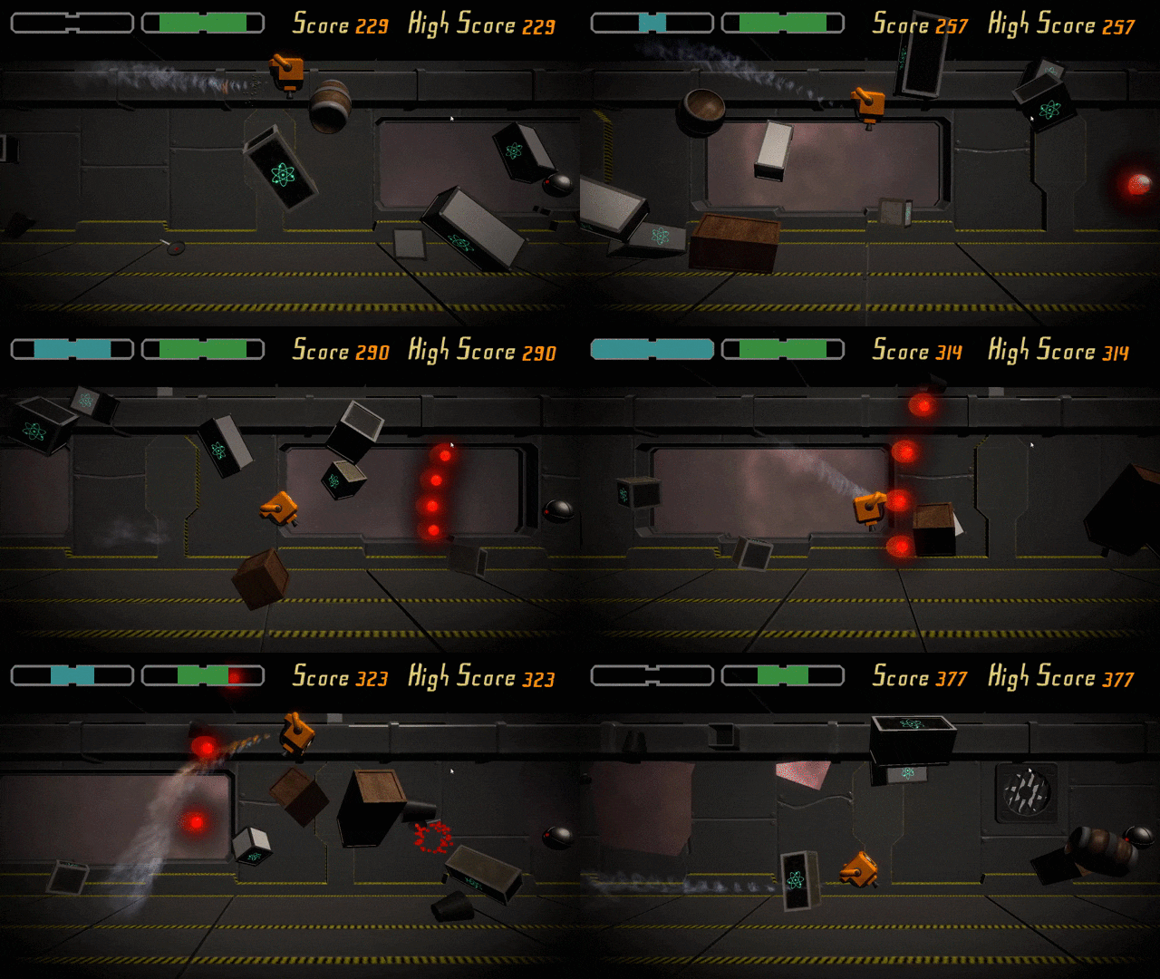
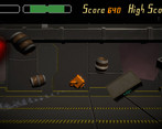
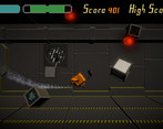
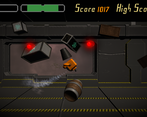
- Really well put together game, especially for a jam. Audio is great, with nice music, enemies telegraphing their attacks, and the robot making little reactionary noises when hit. Visuals are great, the robot has great character, there's smart use of a few simple assets, the UI is functional and fits the game's theme, and the gameplay is readable - my only feedback is that the background objects are a little noisy (maybe move them further back, or apply a depth of field blur, so it's more obvious what is definitely a foreground object I have to dodge) and that it could be hard to see enemies on the edge/in the corner of the screen (reducing the vignette a little would help this). Enemy attacks can be hard to dodge and there are a few contributing factors to this. Firstly, the controls are a little floaty - the boost button helps, but often this means players sacrifice momentum in order to do a full up/down boost, which can give the experience a jerky stop/start cadence. The enemy projectiles move in screenspace instead of worldspace, meaning that sometimes when it feels like you should slow down in order to dodge around one, you still get hit, because it's coming at you at the same speed onscreen regardless - this is disorienting, and means players need to rewire their inbuilt world/space logic in their head when planning how to dodge. Finally, the hitboxes on the robot/projectiles are a little big - making them smaller would make the gameplay more forgiving and generate more cool super-near-miss moments. These are pretty minor points though, and not at all surprising for a jam game. The use of physics is really nice, and as a player you end up using the debris as a shield, which can be really cool regardless of whether you do it on purpose or accidentally. The core hook is strong, and I could easily see this expanding into a full game, with different enemies, more levels, new mechanics. It doesn't have to be an infinite runner, it could have distinct levels where you're judged on time, or amount of health remaining at the end. There could be health pickups. The robot can build up quite a lot of momentum, maybe this could be used to fuel new gameplay, like racing other characters, or letting the robot reflect attacks if it boosts into them, etc. There's definitely lots of dodging, not so sure where the leaping is, cheeky. But overall, great game, great effort, well done.
- A nice, unique take on infinite runners. I liked being able to shield myself using the objects that are around, plus being able to stop brings up some interesting tactical questions around whether stopping is the better choice. I wanted a bit more to happen, maybe more enemies, or maybe powerups, breakble items, new levels etc. You've got a nice basis of a game (I'm not sure how much the boost counts as a "leap" mind), it just needs more layers to give it that real depth of gameplay.
- After 10 mins on this I realised I was addicted to the point where I messaged my friend to get him to play along with me so we could try and beat eachothers score. However it blue screened his PC twice when he launched, if you decide to come back to this in the future and want his system specs im sure the organisers will help you reach out to me. Overall though I loved your game, thought you married alot of interesting mechaincs together in a very effective way, it was similar to games I have played in the past, but I genuinley preffer this one. Gonna keep it on my PC and jump on it every now and then. Great work!
- A strong entry to the jam! This game was very fun to play, and I'm disappointed with myself that I couldn't beat the highest score that had been posted in a comment on your game's page! The sound was great, with the robot feeling very alive from all the blip-bloops and warbling they'd spit out when crashing into debris and boosting your way through the space station. The thruster mechanic was fun, and it gave the player a lot of control over trying to avoid obstacles and bullets. However, the movement and fast-paced gameplay was hampered by the lack of clarity as to which debris was on your plane, and which was just background decoration. This worked both ways, as I often crashed into stuff I didn't expect to, and I often got hit by bullets that I expected to be blocked! I would suggest using a filter of some kind, whether through colour or a visual effect, to better help the player see which objects they can interact with and which ones are sat in the backdrop. The bullets provided some nice tension, as you could try and predict where they were going to target you and you could make sure that you had some debris to hide behind. The bullet mechanics tied in nicely with the movement. However, it felt like the speed I was moving at had no relation to the speed that the bullets were moving at, so I couldn't outrun or move towards them to try and avoid them more easily. They seemed to exist in their own space, and it made it a bit unpredictable as to how they were going to move in relation to the environment that I was in. Though, I can see how the relative speed of the bullets could become very fast if I was to boost forward, then do a u-turn and boost backwards. Perhaps this is why you made this design choice. The UI did the job well, and tied up the game into a nice little package and a solid entry for a 72 hour jam. I'm really impressed with this game, and I look forward to seeing what you make next!
- Visual style is really nice. The gameplay felt a little too easy, would've liked more of a challenge overtime. It also wasn't inherently clear what the blue bar at top left of the screen represented. Solid entry nonetheless.


Leave a comment
Log in with itch.io to leave a comment.