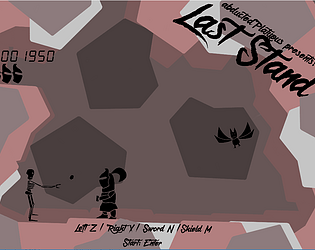
Play game
Last Stand's itch.io pageResults
| Criteria | Rank | Score* | Raw Score |
| Winner | #10 | 2.245 | 2.750 |
| Gameplay | #10 | 2.245 | 2.750 |
| Sound | #11 | 1.837 | 2.250 |
| Graphics | #13 | 1.837 | 2.250 |
Ranked from 4 ratings. Score is adjusted from raw score by the median number of ratings per game in the jam.
Leave a comment
Log in with itch.io to leave a comment.


Comments
I really enjoyed this one, the mass amount of monsters made the challenge enjoyable, while keeping me on my toes and 'in' the game.
One more thing I just thought about: It would make for more visual candy if the sword strike would go from overhead: if you made the helmet-tail smaller you could easily fit the two arms for both animations in, and they could share one sword? You could either start with the sword position like it is now, or holding it already overhead... Because now the strike is just a bit too small IMO.
Great game! Very cute graphics! Gameplay has lot of variation and the different enemies work good together, but I would suggest to split it over time rather than having all attacking at once. You could start with 2 enemies and by varying which enemy/boulder appears for a given 'level', and the attack speed, make a really long and challenging gameplay! It also deserves more detailed backgrounds IMO, hand-drawn rock-walls and so on!
One thing, and it should really be the first rule of all game jams: using Z and Y as controls is a poor choice because many languages have them switched on the keyboard, so imagine me playing: x .. right move, y ... left move!! But I did solid!
Thanks for the feedback, here are some comments if you're interested.
I spend most of my time on the different enemy designs (both game and art wise), great that it shows up. I did test some split enemy attacking patterns, but it was to slow (for me, and a testing friend at least).
I actually spend some time trying to figure out how to properly support AZERTY and QWERTZ, but I couldn't find a way to check if it worked the way I wanted. (I hoped people with non QWERTY would have the habit of checking the controls before testing :P) I think Xbox Controllers do work though, but again I could only test it with emulation. How do you non qwerty-guy do this in Unity? Just changing the keyboard layout in windows didn't seem to change the things I needed)
The background was a quick 1 minute (20 actually) before time backup thing when the actual thing didn't work. (I think I screwed up a shader). I hoped it wouldn't be that bad, but alas. I wanted to added, some effects (shadow, like a few others, but also the little fade when turning a LCD on/off and a bit of noise that old LCDs have). But it appeared I used a new DirectX or ShaderModel on the development laptop xD. That being said, adding some more interesting colour was not part of the original plan
I don't think there was space for something overhead. But given you commented with the helmet changes it's safe to assume you checked. Might again be due to some last minute changes.