Play game
Dark Planets's itch.io pageResults
| Criteria | Rank | Score* | Raw Score |
| Creativity | #1 | 3.500 | 3.500 |
| Presentation | #2 | 3.000 | 3.000 |
| Theme Integration | #2 | 3.000 | 3.000 |
| Entertainment | #3 | 1.500 | 1.500 |
| Overall | #3 | 2.750 | 2.750 |
Ranked from 2 ratings. Score is adjusted from raw score by the median number of ratings per game in the jam.
Leave a comment
Log in with itch.io to leave a comment.



Comments
There might be an interesting idea behind it, but it's very hard to tell for me because it's too confusing and I don't know how to play the game.
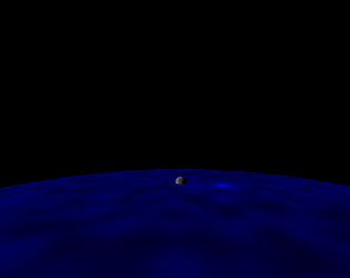
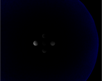
It's visually confusing because there is no frame of reference and the planet you are controlling is not visually distinguished from the other ones. Because of this visual confusion, it is also very hard to judge the effect of the keyboard controls, which had me doubt in the beginning whether the controls were actually working. This also made me motion sick, so that I had to stop playing.
Having a sky background and/or have your own planet be visually distinguished (maybe a glowing atmosphere) would maybe have helped the orientation.
Without glowing atmosphere it's darker ^^
But I don't get the problem, that it's visually not distinguished from others. In many games, other objects (enemies or other players for multiplayer) look like the controllable object. When not sure, just press a button, and see, if it moves. When you look at the texture of the planets, which rotate or move, you see, that the motion is working.
The reference of how to control things etc. is written in the README.md
Yes, but enemies in multiplayer games usually aren't rotation-invariant objects. They face you and you face them, which is a clear visual indicator. However, that the planets aren't visually distinguished is only really a problem for me because the planets also tend to lump together and move so irregularly and rapidly. This makes it very hard to detect the effects of your input.