A note about my judging: My rating scale starts at a baseline 3/5, anything good done raises a score, things that are less good can lower a score. Genre is rated generously. As a game-developer I know that when giving feedback, while I can give suggestions, it's up to you as the developer to determine what accords with your vision.
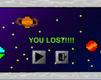
Enjoyment 2/5: I spent a few minutes wandering around a map, then I lost abruptly after failing to collect something that looked like a pill-shaped power-up. Not entirely sure how though I assume something damaged me.
I do not believe I found any secret moves,
I realize 2/5 is a pretty unfortunate rating and I want to offer a couple of humble suggestions:
1. Seriously rethink the level design and consider a much, much smaller level with much more intuitive goals for the player. Consider a faster jump (up and down) and faster movement speed--though if you can you might also think about a vertically "shorter" jump arc of similar overall time up and down, since it does, at present, feel at least in keeping with the space theme and I wouldn't want you to lose that thematic tie.
2. Make the controls much much more obvious; put them on the itch page if nothing else.
3. More substantively communicate the player's goals; what am I looking for?
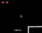
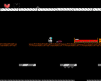
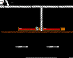
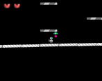
Execution 2/5: The jump feels competent enough. The player, even when not slowed, still feels very slow. The level is vast, but seemingly not for much reason, and a number of jumps feel overly tricky or even impossible to make without taking damage. Collisions are set up inconsistently and you sometimes "catch" on a collision box when walking in what feels like it should be a straight line. DougDevs suggested a tile-map below and I think that would probably help you out a lot here.
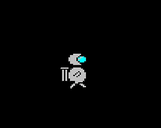
Sensory 2/5: The graphics are fairly basic but communicative. That's a good baseline for any game game. The only sound I noticed was a somewhat unpleasant (to my ears, sorry!) piece that seemed to have some musical complexity, but it only played in the settings menu. (I realized later it would come back on after re-accessing settings in-game.) In addition to what I said about it being communicative, I agree with DougDevs about the sprite work being cute. Generally I'd lean into cute sprites a bit more, the bugs and various items around the station were a nice touch.
Metroidvania 2/5: There is jumping, and some exploration, both generally traditional genre staples. But if there's any particular ability-gated progression, I never figured out where.
Overall: I get the impression the creator of this project is getting a grasp on the fundamentals. Test, test, test, and in particular, have people test who aren't good at platformers.
To be clear, if there are controls I'm missing (say for interacting with terminals) and you can let me know which--then if I have time before the jam's end, I will try this one a second time and look at my ratings again.



Leave a comment
Log in with itch.io to leave a comment.