Play game
Color Run's itch.io pageResults
| Criteria | Rank | Score* | Raw Score |
| Concept | #237 | 2.806 | 3.000 |
| Use of the Limitation | #257 | 2.138 | 2.286 |
| Overall | #280 | 2.171 | 2.321 |
| Presentation | #305 | 1.871 | 2.000 |
| Enjoyment | #305 | 1.871 | 2.000 |
Ranked from 7 ratings. Score is adjusted from raw score by the median number of ratings per game in the jam.
Team members
Just me
Software used
Unity
Use of the limitation
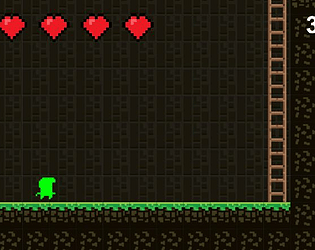
Everytime you change color you lose some health.
Cookies eaten
2
Leave a comment
Log in with itch.io to leave a comment.


Comments
Hello,
Really interessting ideas.
Too bad it was short.
You'll do better the next time.
Also I don't know if it was intentionnal but when the player already has a color/ability and press the corresponding key for that same color/ability again he lose a heart.
Anyway it was a good little game.
Have a nice day.
Cool idea, cool color switching mechanics implemented, took good advantage of the theme
I switched color once to get blue. I thought it was impossible until I saw the description.
Also if you switch to the same color, you still get hurt.
I realized the same color problem but didn't have time to fix it. (I know its an easy fix but i also had bigger bugs to deal with)
I liked the mechanic of different colours giving you different abilities. Though I'm not sure about the loss of health as a cost.
It can work, but with the level design here, I'm essentially forced to use one particular one each time, so it doesn't feel like a choice I'm making to get an advantage, but rather a limitation placed on me by the design of the level. Ergo, it feels like it's about figuring out the correct sequence more than about getting an advantage by sacrificing HP. (Maybe that's the idea?)
I would have liked to have a vertically stable camera. Locking it to the character meant that jumping between platforms in the blue form made my landing spot go out of view, which isn't ideal. I think there was enough space that you could have moved it only horizontally.
Also, "F" was a problematic button for me for this, since I'm already holding "D" to move right. I ended up bringing my left hand in and crowding the left side of my keyboard. If you're using WASD for movement, maybe consider moving the action buttons a bit right so the right hand can press those while leaving the left hand free? (E.g. roundabout H, J, K.) It also would have been nice to have an on-screen reminder for what each colour does / what button it uses. Maybe some icons showing that?
Anyway, overall not a bad game; an interesting concept, if a bit crowded by other mechanics.
I got the idea for the color switching mechanic and losing health but I didn't have that much time to implement a well polished level. I focused to much on the main idea and didn't focus that much on the level which was a bad idea on my part but hopefully I will do better next time. And I understand your other suggestion and will be implementing them if I ever work on this game or if I make a similar game.