Feedback in the style of other jams:
Audio: I had to begin here. You have my unlimited respect for making the music acapella. I've recently been making acapella music in my game jams (not this minijam unfortunately) and I can tell you had fun making it. Honestly, I wish I could just talk about the acapella music for several paragraphs, but there's some more important feedback to address.
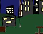
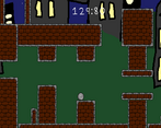
Graphics: Let's focus on the camera. Issue number one: Blind Jumps. Look at this screenshot and tell me, what's below the player?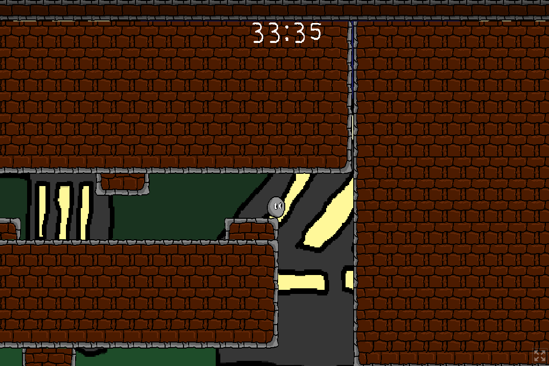
As the developer, you probably know where this is. You know what's down there, because you made it. In hindsight, I know there are no hazards that would kill the player, but on my first playthrough I was doing everything in my power to avoid falling down pits, assuming the worst: Instant death and restarting the game. Sure- the game doesn't have any of that, but how would I know? Blind jumps are one of the biggest mistake I see in new game developers. Make sure the player always can see where they are trying to go.
With the comments on the camera aside, I'll also mention that the artwork itself could be improved. The background is simultaneously darker than the foreground, with glowing windows that are brighter than the foreground. Try and keep the background and foreground at different levels of brightness/saturation. It's tricky to balance making the background pretty without it distracting the player from the foreground, though it's very important that you find the right balance.
Final notes on the graphics, I loved the cutscenes!
Mood: One of the greatest comments I ever received on any of my game jam games was "It is impossible to play this game without a huge stupid grin!" and I believe that applies here as well. It's so silly. Mostly due to the acapella music, but the story, the art, it all creates an atmosphere of "Just have fun".
Fun: Speaking of... yeah- this is fun. Once I finished the game, I replayed it many times just to try out the other items. There's a lot of interesting combos, and it's impressive how much content this game actually has!
Theme/Limitation: You are a hero, you get two items. I love how more items exist, but you have to pick the two to use. It's a great use of the limitation.
Overall: It's a lot of fun, and I think with some changes to either the camera or the level design, it could be even better. It has a couple issues that stand out as very teachable lessons in game design, though that's what game jams are for, right? Learn something new every time. Great work, fun game, bravo!
Play game
Superball Sprint's itch.io pageResults
| Criteria | Rank | Score* | Raw Score |
| Enjoyment | #4 | 4.000 | 4.000 |
| Overall | #7 | 3.813 | 3.813 |
| Use of the Limitation | #8 | 4.083 | 4.083 |
| Concept | #13 | 3.667 | 3.667 |
| Presentation | #14 | 3.500 | 3.500 |
Ranked from 12 ratings. Score is adjusted from raw score by the median number of ratings per game in the jam.
Team members
Mippy109
Software used
Game Maker Studio 2
Use of the limitation
You can select 2 abilities when you start the game.
Cookies eaten
Hmmm... Too many :)
Comments
What did I just play? How do I review this? I'm giving you a decent rating, I'm just not sure why. There were good elements, but I've been driven crazy by the 'boing'.
Submitted
Heroic Survivors

Leave a comment
Log in with itch.io to leave a comment.