Play game
Cardflation's itch.io pageResults
| Criteria | Rank | Score* | Raw Score |
| Fun | #4 | 4.000 | 4.000 |
| Gameplay/Design | #25 | 3.500 | 3.500 |
| Overall | #33 | 3.250 | 3.250 |
| Graphics | #40 | 3.000 | 3.000 |
| Audio | #55 | 2.500 | 2.500 |
Ranked from 2 ratings. Score is adjusted from raw score by the median number of ratings per game in the jam.
What would you like feedback on?
Card design, also would like to know your opinion if amalgam is good or bad design
What did you update?
amalgam design, early game should be a lot less boring, and now you can navigate through a map
Name of updated upload (if downloadable)
[PostJam]Cardflation-Win.zip
Leave a comment
Log in with itch.io to leave a comment.


Comments
The card design from a gameplay standpoint has a lot of potential. In my first run, I could already see synergies between some the cards. I would like to see a greater proportion of cards that affect other cards, or maybe even some that affect or react to enemy cards?
The amalgam mechanic is interesting, it feels like a cross between Inscryption and Dungeons and Degenerate Gamblers.
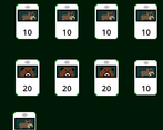
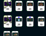
At first, I didn’t understand how to get to the isolated cards on the map, until I realized you could place cards to connect with them. Maybe I missed it in the tutorial, but I think that mechanic should be made clearer.
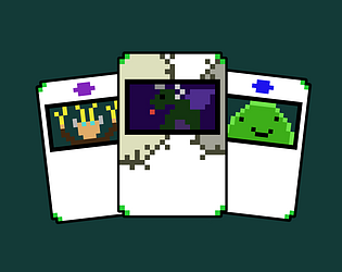
I like the card design, the animals are great but maybe your starting cards are too weak to start - too many beavers!
Especially since I didn't find a way to remove them?
The only card that might need the art improving on is the key, I couldn't tell it was a key.
The animation is a little too slow when mousing over, and it should probably be a bit bigger, I found them hard to read.
The amalgam design is cool, maybe you could get more cards that do more things to him, like cards that buff him specifically.
I would also have liked to find a priest so I could use them, they seem fun!
I really can't find much wrong with this game apart from some small things. It's a really cool concept and I like how simple it is to understand. I imagine with enough balance this could be a full game!
Hope you make more updates, let me know if you do <3
Aegis 🛡
Hi Aegis, a huge thanks for trying my game and giving such valuable feedback!
I just released an update fixing many of the problems you said, removing cards now is way easier, and now you get a ferret when you start the game! Oh and I also added a new priest card ;)
About the key art that needs improving, do you mean the small icon in the top right when you're on the map?
Thank you again for trying my game, I'm definitely not giving up with this game, I still want to add a lot of stuff like boss fights.
Cah
Ah I think it was these 2 that look a little off, the one at the bottom of the card looks fine but the contrast is a little low - so I noticed the bronze and the silver first and didn't know what it was.
Very very minor and now that I look at it again I can see it's a key but first time it wasn't so obvious
Good luck with the development <3
Aegis 🛡