Play game
Saw Girl's itch.io pageResults
Criteria | Rank | Score* | Raw Score |
GAMEPLAY | #8 | 3.024 | 4.000 |
ENJOYMENT | #9 | 3.213 | 4.250 |
USE OF THEME | #11 | 2.835 | 3.750 |
PRESENTATION | #14 | 2.646 | 3.500 |
UNIQUENESS | #16 | 2.835 | 3.750 |
Ranked from 4 ratings. Score is adjusted from raw score by the median number of ratings per game in the jam.
Did you work alone or with a team?
Alone
Did you make your own assets? (if no then add credits)
Yes, except some sound effects from Pixabay
In which way does your game fit the theme?
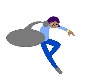
In the game your arm has been transformed into a circular saw. You have to use it to attack but it's dangerous so if you kill three citizens it's also a Game Over.
Leave a comment
Log in with itch.io to leave a comment.
Comments
facilito
It feels quite unforgiving but I'm bad at games, so maybe it's me. Given that, I'd have benefited a LOT from a checkpoint system or the style where instead of dying immediately, pitfalls only damage you and return you to the edge.
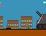
As far as playing the game went, hoo boy! It felt like one of those rage platformers where every few steps is another trial and error pass/fail test that teaches you how to play by killing you instantly. The 'citizens' (having been transformed into robots) looked like enemies and classic gaming instincts took over, attacking them and dying. The block that deals damage didn't look like a damaging object so I touched it and died. Some jumps were bigger than I thought they were and I died. And after every one of these I was sent back to the start to repeat the process - which, after only a few loops, became very tedious.
I have to admit I didn't finish the game because I ragequit after a few attempts, which given the design may have been the intention, but personally it wasn't the kind of game I wanted to see through to the end because the cost of "getting gud" wasn't paying off.
But anyway!
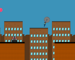
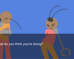
I like the saw arm mechanic, Serra feels very cool to play as a character, and I love the first frame of the cutscene and thumbnail. It's a minimalist but very cool design and I wish that art had been applied more to the game or the second cutscene image. Serra looks too good to be going up against an MS Paint square with a face or even pixel art. The parallax background was great though, that added a lot to the visual style.
From my perspective a lot of gameplay-specific nitpicks are also aesthetic, not out of appreciation but function. The citizens looked too much like real robots to read as people not to kill and the dangers weren't signposted enough - though this may all be from my taste. Again, this could have been a rage platformer for all I know in which case mission accomplished.
Still wish I could have reached some checkpoints tho lol
First, thx a lot for playing.
Second, the artstyle is used in all the cutscenes, also there aren't checkpoints because all levels are really short (like 1 minute at most). I originally wanted to add an easy mode for accessibility but didn't have time and didn't see it as a priority , I'll keep the importance of that in mind for the future.
Also it wasn't intended to be rage game, it has tight platforming but I tried to make it so it doesn't kill you unfairly (except the citizens that don't stand out enough , that's another problem).
Thanks a lot for the criticism and I'll keep it in mind for the future :).