Play game
Freedom Forest's itch.io pageResults
| Criteria | Rank | Score* | Raw Score |
| Aesthetics | #80 | 2.728 | 3.571 |
| Sound | #92 | 2.182 | 2.857 |
| Theme | #99 | 2.400 | 3.143 |
| Overall | #100 | 2.319 | 3.036 |
| Gameplay | #112 | 1.964 | 2.571 |
Ranked from 9 ratings. Score is adjusted from raw score by the median number of ratings per game in the jam.
Leave a comment
Log in with itch.io to leave a comment.


Comments
Cool game!
Hope you can play my game, too! -> https://itch.io/jam/scorejam17/rate/137957
Glad you like it :)
I've been super busy this week but trying very hard to check out what games I can, I'll make sure yours is on the list (along with everyone else providing me feedback).
The art style works really well congratulations on getting that 2D/3D vibe going on short notice! I will say my own lack of animal knowledge makes this game really hard as I'm not sure what is what but for a jam game this is really good! Great job :D
Thanks :) I'm a big fan of 2D/3D hybrids.
The plan was to have some info sheets in the game to teach people about the animals but hasn't made it in there yet.
For the moment I've posted a cheat sheet of the critters you need to be looking out for in the community forum if you are interested...
https://itch.io/jam/scorejam17/topic/1906334/freedom-forest-tips?before=3#post-5...
Awesome resource glad you were able to make it for the players :D
Really cool take on the theme. Not sure if you've ever played Poptropica but this really reminded me of a minigame on one of the islands. I think with a little polish this could be a total hit!
Hi there,
Thanks for the feedback!
I haven't played (or heard of) Poptropica but I'll certainly check it out :)
Really nice to watch, but the game aspect i didn't understood how the cam looks the animal or miss it. All me scores were negative so. But the theme of protect by witness nature is really senseful.
Sorry about that issue FFNasca :(
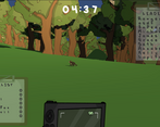
You have to get the animals in the center of the screen and ignore the hud image of the camera.
It was a poor UI choice in retrospect, it hadn't occured to me that it would be confusing, I guess I was too close to it. Think of the camera like it's a gun in Doom, purely aesthetic and you are really aiming with the center of the screen.
A couple of other issues are that if you photograph an animal that isn't on the check list the camera doesn't move and you get a miss, also if the animal is too far away (outside of camera range) you will get a miss which is an issue some times for animals in trees.
These things weren't obvious and clearly bad decisions in hind sight.
Ran out of time to play test on other people, this would have been caught instantly I think if I had done so.
If you are interested, keep an eye out for some updates which hopefully will come in the next couple of weeks which will fix a lot of these issues and also add some more flavour to the world itself :)
Hi! Love the artwork and your use of the theme is probably the most interesting out of any game I've seen. However, I found the placement of the camera to be a little confusing because it makes it seem like that is the only part of the viewport that will be in the photo.
Completely agree about the camera positioning, it was meant to be like you are carrying it in front of you but it just came out confusing.
I plan on doing an update soon which will fix a few usability issues like that, I also think the camera range is too short among other things.
Next update will have some kind of reticle to show you where you should be aiming the viewport, pitty it didn't make it in for the jam submission.
Thanks for the feedback!
Hi all,
I just thought I would point out that in Freedom Forest you have to take photos of the animals on your endangered species check list (bottom left of screen).
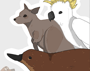
Attempting to take a photo of a non endangered animal, like a white cockatoo, will result in a miss.
Also, attempting to take a photo of an animal you have already photographed will result in a miss.
Another usability thing to mention (thanks Uppitydonkey57) is that you need to have the animal in the center of the screen to take a photo of it, NOT in front of the camera (at the bottom of the screen).
It was an aesthetic choice but really needed a reticle added to make it more clear.
This is by design but we ran out of time to make that more clear to the player.
Enjoy :)