Play game
Escape the CIA's itch.io pageResults
| Criteria | Rank | Score* | Raw Score |
| Gameplay | #4 | 4.000 | 4.000 |
| Overall | #6 | 3.667 | 3.667 |
| Features | #7 | 3.667 | 3.667 |
| UI & UX | #9 | 3.333 | 3.333 |
| Creativity | #10 | 3.667 | 3.667 |
Ranked from 3 ratings. Score is adjusted from raw score by the median number of ratings per game in the jam.
Judge feedback
Judge feedback is anonymous and shown in a random order.
Gameplay
========
Gameplay was pretty well implemented, no notable bugs were encountered during the playthrough. Game rules were clear and easy to interact with and some advanced concepts were used and generally well executed.
UI/UX
========
There was a good level of attention to detail on UI/UX with consideration for how to provide the clearest path through the application to the user. I suspect some mistakes here would be resolved with additional time but care should be taken to avoid overlapping UI elements such as the below.
Button ordering in popups perhaps wasn't exactly how I would do it though given the use cases presented it was a tricky problem to solve. For deleting progress the Delete action is negatively framed and Cancel is positively framed looking more like the default choice, whilst in the "You Died" popup Main Menu is negatively framed and Try Again is positively framed, this feels more natural but the connection between Main Menu and Delete feels weird.
It might be preferable to introduce a 3rd colour and have a "Positive"(Green), "Destructive"(Red) and "Neutral"(Blue?) option. Then Delete could sit on the right as the "default" choice but be coloured destructively whilst Cancel was Neutral, Try Again could remain positive whilst Main Menu becomes Neutral.
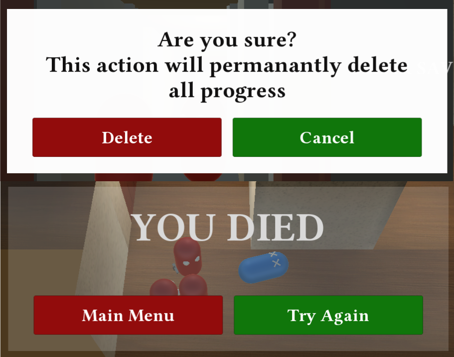
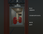
Care should also be taken to ensure the games UI functions under different aspect ratios, for example if the game is launched at 4:3 ratio it is unplayable as the title obscures the play button.
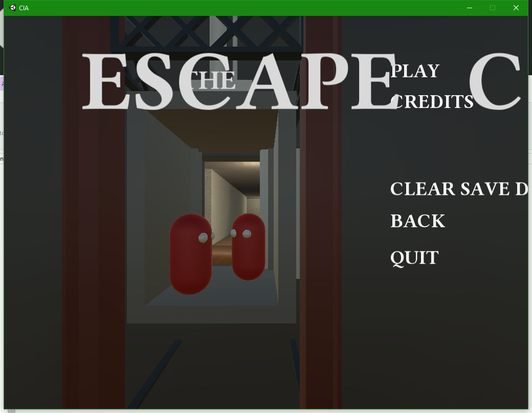
Unity UI can be a hassle to make work on varying aspect ratios but it's worth putting in the effort upfront to make sure it'll work 4k/1080p and 4:3, 16:9 and Ultrawide.
Features
========Implementations of most features provide a good starting point but could be further refined.
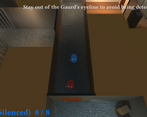
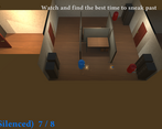
The pacing of the tutorial could be improved, I found occasions when I had already committed to other actions by the time the tutorial text came up.
AI was relatively simple, I found it quite weird chasing enemies around the room to stealth kill them bumping into them the whole way without them noticing.It may have been useful to provide some guidance for where the player is aiming when shooting it felt quite arbitrary.
The audio feature and extended usage in level 2 was nicely implemented however and it's good to hear that an advanced usage fell within the development time you reported for level 2.
Creativity
========For the purposes of this assessment documentation also falls under criteria and I suspect you may simply have run out of time to complete this elements of your submission. It's unfortunate that you weren't able to provide documentation of the editor tooling you built up as naturally this is missing from the final build.
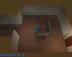
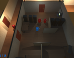
It seems like the base decision for the design was the need to meet the technical criteria of the competition, whilst this isn't a bad thing it would be nice to see how this base concept was explored in greater detail. Looking beyond the overall design the kitchen set piece was nicely implemented and the overall visual design was executed well. The care given to animation on the main menu was also a nice touch.
Love the death animation and using the RPG to take out a room full of enemies that topple and then roll around X X'd :-) By a narrow margin, probably my favourite entry of all - great stuff. The cutscene on the menu screen is a lovely touch. Well done.
Really love this one. Love the death animations with the ghost and the body rolling around with Xs for eyes. Big points for the visual/interactive tutorial, shows a lot of thought went into the game and just comes off as really polished. Main menu is great too.
I recommend making the UI/menus scale for different resolutions. I selected 720p from the drop down menu and I wasn't able to play as buttons were off screen. I had to opt for the highest resolution to resolve it.
I wanted more levels :)
Challenge Tier


Leave a comment
Log in with itch.io to leave a comment.