
Play character
SFAS 2024 Character Art - Zeelou's itch.io pageResults
| Criteria | Rank | Score* | Raw Score |
| Creative Development | #4 | 4.250 | 4.250 |
| Project Documentation | #4 | 4.500 | 4.500 |
| Research + Development | #9 | 4.000 | 4.000 |
| Overall | #10 | 3.950 | 3.950 |
| Final Presentation | #11 | 3.750 | 3.750 |
| Technical / Workflow | #20 | 3.250 | 3.250 |
Ranked from 4 ratings. Score is adjusted from raw score by the median number of ratings per game in the jam.
Judge feedback
Judge feedback is anonymous and shown in a random order.
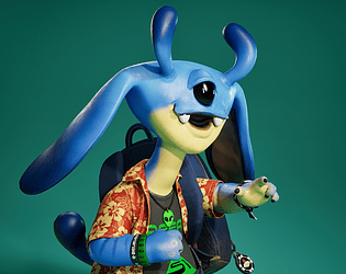
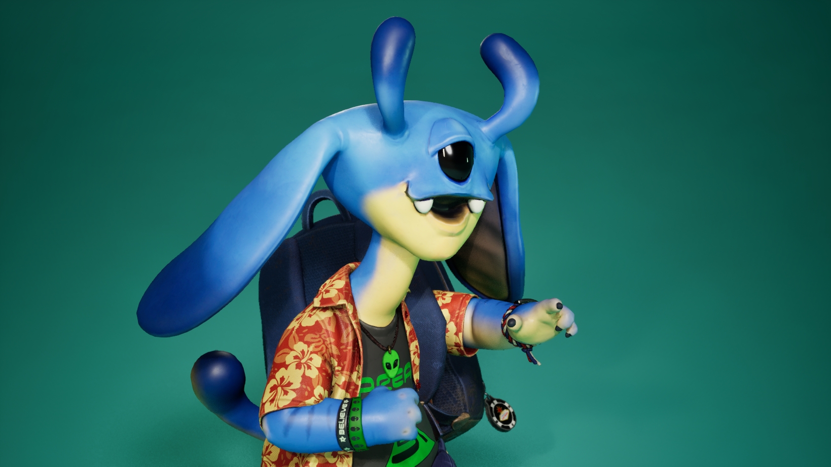
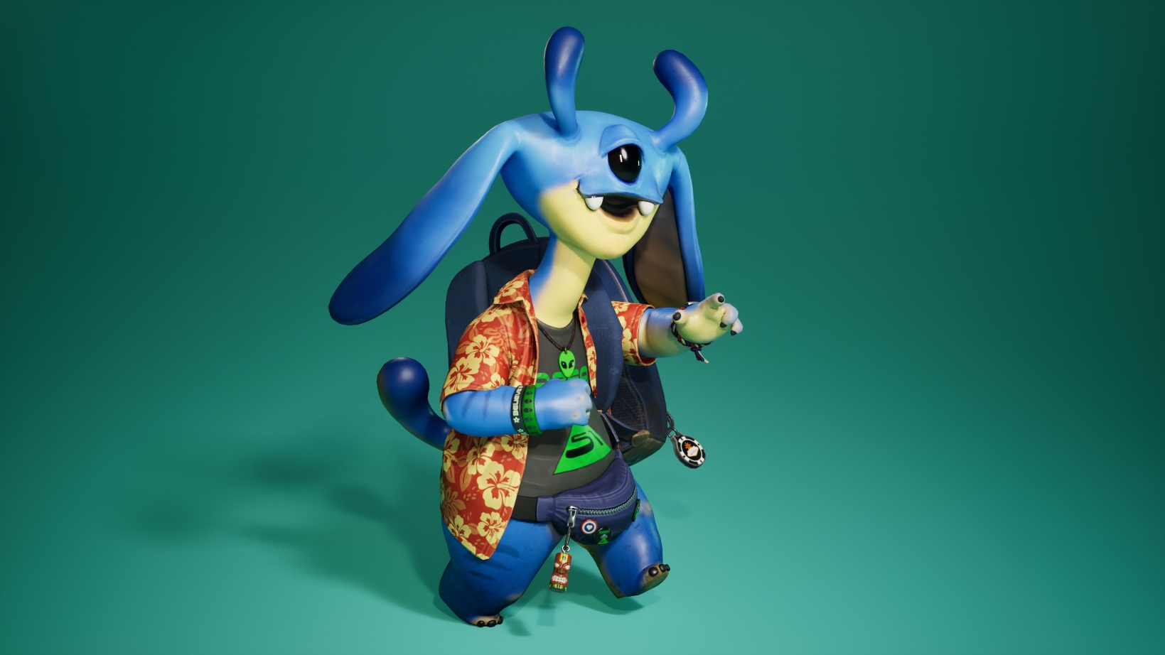
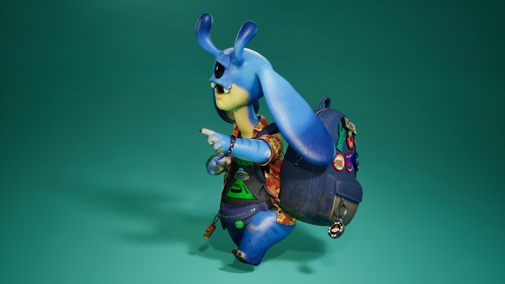
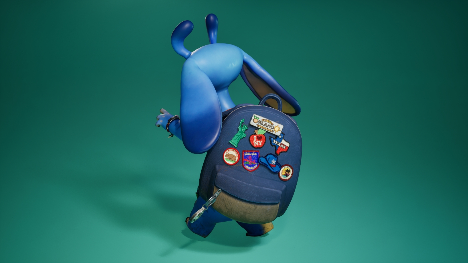
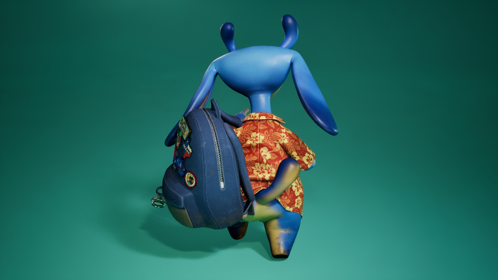
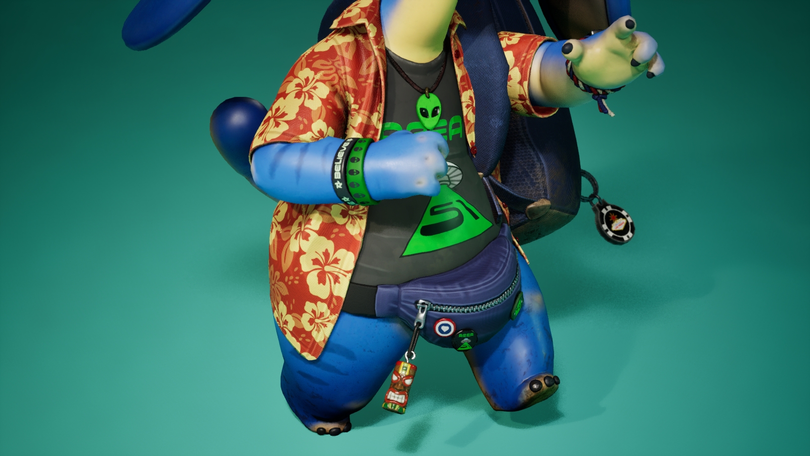
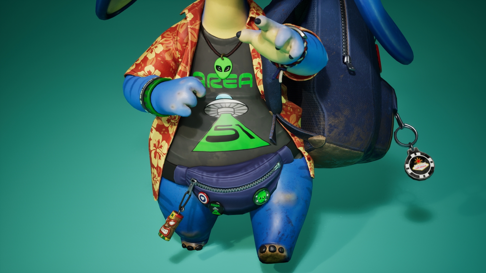
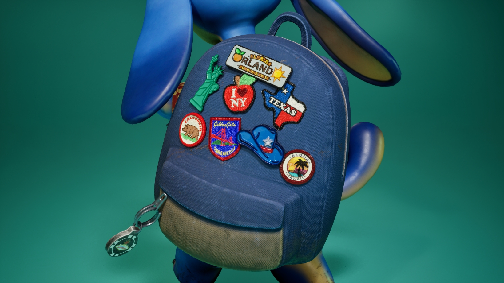
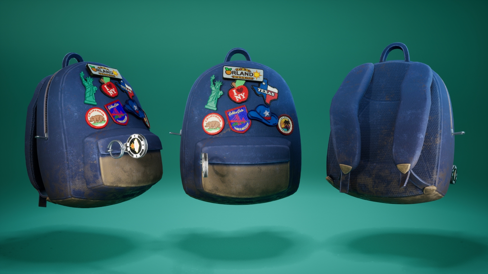
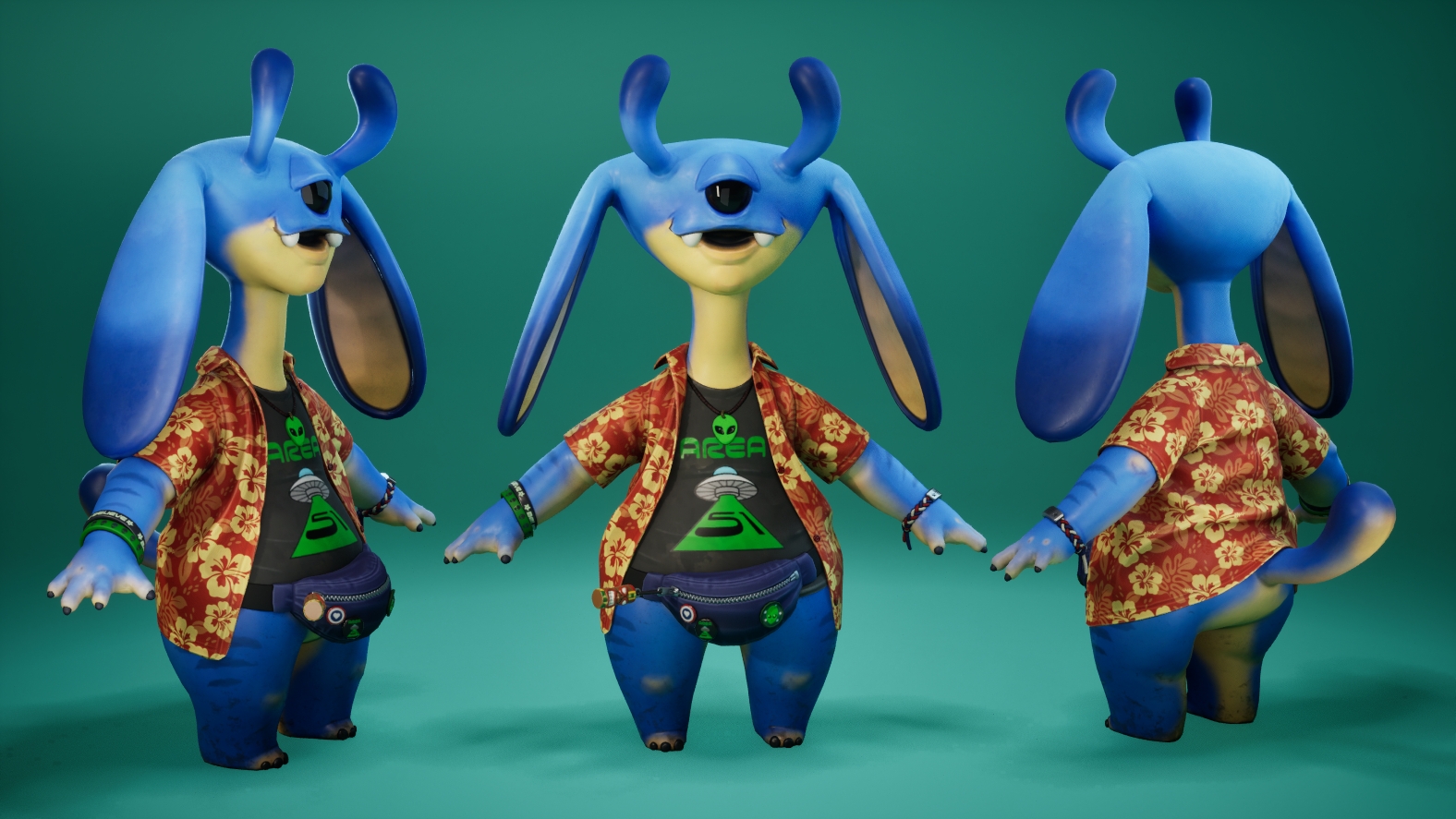
- Research + development: Over all very good and in-depth research. It would have been nice to see more evidence of visual reference analysis and break downs (e.g. drawing over your reference materials and taking learnings onto the final sculpt. Try incorporate more real world references - in this case animals would have been a great start for creature design. Technical/ Workflow - Love the lilo and sitch / monster inc vibe of the character and over all a lovely clean mesh with good use of UV space and well thought out from design to integration . I would have liked to seen a mouth system (inner mouth with tounge, teeth ext) and also subd 0 in zbrush could have been even lower to allow for future mesh changes (e.g when the mouth area had to be revisited). Creative dev - Very playful and fun submission over all with a great interpretation of the brief. Perhaps some nuance elements to the design would have added a inner/deeper level to the characters over all design e.g. moving away from the stereotypical tourist, what is your characters mythology. Final presentation -simple but clear presentation, everything reads well. The head could use more crisper bake (better use of topology in and around the mouth area) also use sss maps on the head to push past the plastic feeling head material. Project documentation - deep in depth documentation , clearly and methodically explained Very charming and playful submission, Great work!
- Hi there! First of all, congratulations on taking part in SFAS. Participating in a contest like this is always a challenge. Your submission looks pretty good. I really like the alien’s vibes :) Here you have some thoughts/feedback: Creative feedback: - Good proportions - Good use of colors - Good use of the DOTA art guide for color reference - The texturing is good but the dirty pass in the alien’s feet seems artificial. Some more work can be done. Technical feedback: - The character looks pretty good but I think it has some areas where the number of polys is too high. Areas like the buttons, the chain in the left wrist, the alien shaped necklace or the inside of the ears can be reduced. - The backpack is looking quite good to be honest and it adds a nice vibe to the character. - Good that you used MD as a starting point in order to model the clothes. - This is something that it’s different from one project to another but straightening the UVs is becoming more and more common nowadays. It’s a great way to make better use of the UV space. Clothes can be straightened. There are also ways in order to export the patterns from MD and use them as UV shells. - There is a bake issue happening in the corner of the lips. I think if you add extra geo it will be fixed. Really good work! Hope you keep improving and working on more projects! Jose Gonzalez
- Student: Monika Rak Challenge Tier: Search For A Star Assessor: Jessie Chan Hi Monika! I fell in love with this character’s design and I can feel the passion and care you put into this character through the documentation. Really well done on this project, here’s my feedback: 🌸 Excellent research into shape language of a character and their origins. It’s great that you drew inspiration from many different sources to inform your design. 🌸 Great critical thinking throughout the process that adds to the visual storytelling (ill-fitting clothing and a full black eyeball). 🌸 The workflow from MD to ZBrush is tricky, but there are multiple workflows that have been established to get over the triangulation. Personally, I would recommend the Maya attribute transfer method (there may be similar in different software) and this post breaks it down well. https://www.artstation.com/artwork/zZOOL . Outgang also has some great tutorials on MD to Zbrush. 🌸 Your final lowpoly could have used a few more customised adjustments. It looks like ZRemesher has created some unnecessary “stars” in areas where you wouldn’t want the deformation to be affected (immediately I can spot at the base of the ears, centre of the thigh, back of the shirt). It would have been better to redirect these so they maintain proper edge flow. 🌸 Also, keep in mind the topology density across the character (including their props). For example, the tail is lower in density and, as a result, the silhouette is a lot more blocky than Zeelou’s ears or antenna. You can also see this comparing the size of the quads from on the backpack too. 🌸 For shirts, we usually cut the UV seams down the sides and across the arm (where the seamlines would be) so there isn’t a large seam at the back of the shirt. I don’t think this is a huge problem on this character because the back is hidden with the bag, but something to consider for the future. 🌸 There are a couple really small islands on your accessories UV map (even some that look like one quad only?) try to avoid these by sewing edges or scaling them up as they can cause baking issues later on. 🌸 The patches in Sampler are excellent! The mix of metal and embroidered badges work really well next to each other. 🌸 I think your skin texturing for the character is fantastic, I believe the feeling of the skin and that there’s blood and a living creature behind it. Against this though, the textures on the backpack and shirt lack that same appeal. Particularly on the backpack, the dirt and discolouration feels a little “generated” and not built up like the skin is. I would have liked to see more variation in the wear of the backpack, like the size and placement of the dirt, variance in hues/saturation of wear, maybe scratches or areas where the material is starting to tear, things like that. Although it’s a prop, this tutorial changed how I thought about texturing and I would very much recommend it to any artist: https://www.artstation.com/artwork/OowyO6 Overall, you’ve created a fantastic lovable character that shows a range of skills, Monika. I can’t wait to see what you create next! Please feel free to reach out if you have any questions 👽
Challenge Tier
Search For A Star
Leave a comment
Log in with itch.io to leave a comment.
Comments
No one has posted a comment yet