Play asset pack
Dread-bite's itch.io pageResults
| Criteria | Rank | Score* | Raw Score |
| Project Documentation | #7 | 4.333 | 4.333 |
| Research + Development | #9 | 4.000 | 4.000 |
| Creative Development | #18 | 3.333 | 3.333 |
| Overall | #22 | 3.333 | 3.333 |
| Technical / Workflow | #25 | 3.000 | 3.000 |
| Final Presentation | #47 | 2.000 | 2.000 |
Ranked from 3 ratings. Score is adjusted from raw score by the median number of ratings per game in the jam.
Judge feedback
Judge feedback is anonymous and shown in a random order.
- Hi Pink, You have done some terrific work here that I feel fell flat on the final renders. Topology is good, texturing process is pretty close to how its done in the industry. Although substance designer would be used for smart materials plugged into substance painter. If you take a look at this image https://vicker.artstation.com/projects/1nLOlX you can see a possible beauty render you could produce that would highlight the work you have done more. Good look and keep the creativity flowing. Adam
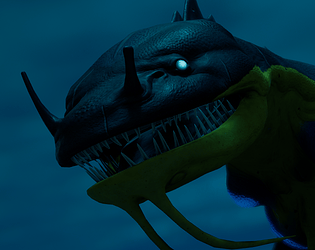
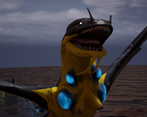
- There is a great collection of reference images and a thorough exploration of silhouettes, value, and colour to design a solid piece of concept art. There are good annotations of design influence and reasoning throughout, with some great end results. Some feedback: ∘ It would be good to see some planning for the final composition in the research and development stage ∘ instead of going back to tweak the base mesh in Blender when faced with incorrectly flowing edge loops in Zbrush, try using Zremesher and then working with subdivisions. It will need retopologised after but will allow you to have much more control over the high poly sculpt. ∘ the custom alphas are a great touch, good job creating those ∘ I see some great use of edge loop reduction flows, overall very good retopology here! The UVs are very neatly laid out so well done ∘ using generators in su stance painter such as ambient occlusion or curvature to accentuate the scales would look great. It would be good to see some more subtle transitions between the different colours. I wouldn't split off the poison sacks in the UVs as this makes it much harder to get a seamless texture ∘ making a custom rig goes above and beyond requirements so this is great to see ∘ some harsher / shinier caustics reflecting on the creature in the underwater shots would be good, and some god rays could help highlight certain areas to draw the eye. The underwater shots are definitely the most successful. Here is some inspiration https://www.artstation.com/artwork/29Vyag ∘ play around with the current focal length of the render cameras- a higher focal length can make the creature look much more intimidating Overall this project turned out really well and you should be proud of what you've been able to achieve! keep up the hard work. Feel free to reach out with any questions ~ Sasha Gallie, Character Artist at Double Eleven https://www.artstation.com/sashagallie
Challenge Tier
Search For A Star
Leave a comment
Log in with itch.io to leave a comment.


Comments
No one has posted a comment yet