
Play asset pack
Hyakkimaru - Dororo's itch.io pageResults
| Criteria | Rank | Score* | Raw Score |
| Technical / Workflow | #3 | 4.333 | 4.333 |
| Creative Development | #6 | 4.000 | 4.000 |
| Final Presentation | #8 | 4.000 | 4.000 |
| Research + Development | #9 | 4.000 | 4.000 |
| Overall | #9 | 4.000 | 4.000 |
| Project Documentation | #25 | 3.667 | 3.667 |
Ranked from 3 ratings. Score is adjusted from raw score by the median number of ratings per game in the jam.
Judge feedback
Judge feedback is anonymous and shown in a random order.
- Hi Joseph, This piece is brilliance. A very high standard of work. Keep it up and you will have no issue in the games industry. TIP – use a bent normal map as direction map, in the reflection anisotropic in he materials of marmoset. It will reduce the shine to have a more hair like appearance. You can make one by taking your hair card set, putting a bend on them, and backing that to itself. Adam
- Submission title: Hyakkimaru - Dororo Student name: Joseph Tagsa Challenge tier: Rising Star Assessor: Caleb O’Brien - Senior Character Artist @Firesprite Research & Development Extensive reference gathered, relevant and well considered. Nice to see you using PureRef and grouping images with annotations. Be wary of throwing too many images into your reference as it can get overwhelming when working. In many cases less is more, especially in an industry setting where you may present work alongside reference during reviews to give your lead or art director something to base their feedback on. If you have too many images it can create more work for yourself as you’ll be giving mixed messages, different people will have their own bias towards certain ref and could provide conflicting feedback. Be clear, concise and to the point with your reference. That being said feel free to keep a more general mood board for your own use that you can use as a sort of visual mind map of the character. Consider exploring character examples from existing games of which art style you’d like to hit to give you a clear path going forward. Also having a rough idea of the type of game setting you’d see your character in can help you stay focused and make informed creative decisions during production. For example, if it’s a 3rd person game where we mainly see the character from behind, we could consider adding visual interest to the back of the character like secondary animation. Technical Art Overall great job here, however some room for improvement on the distribution of polys across the model. Some areas are considerably denser than others. Try and maintain a consistent density of polys across the character. Of course, areas such as the face and hands are bound to require more attention, but for the body your density varies greatly. The density of the upper torso, belts, forearm looks decent so I’d suggest aiming for this consistency across other areas like the legs, feet and hanging skirt. UVs have been unwrapped cleanly and grouped into appropriate texture sets. Some UVs are sitting at odd angles which could cause stepping in the textures at lower resolution. In future consider taking the time to straighten out rectangular sections of UVs using the lattice tool and straighten features in maya. For the head UVs consider giving the face more UV space by compressing the outer sections like the back of the head and neck. At the moment the face is taking up a small section of the UVs and could cause a noticeable lack of detail at lower resolutions in game. Overall great job on the UVs, it looks like you’ve placed your UV seams at sensible locations. Having some cloth seams sculpted in can give you a nice natural place to add breaks to your UVs. Creative Art Excellent block out, nice to see you using poly paint to give an impression of the final look of the character. Industry standard approach demonstrated with Marvelous Designer. So good that you used time here to iterate quickly on the cloth based on feedback. It's excellent that you’ve used hair cards for this project with the results looking solid, great work! Hair in games is such a tricky area and can be a specialism in itself. Some advice for future would be to really pin down some solid reference of your chosen hair style from every angle, be concise and break down your reference to fully understand it. Also consider investing some time into a decent sculpted block out to the hair in Zbrush. This can be decimated and brought into Maya to give you a solid base/guide to work off when placing cards. Some flyaway hairs would be a lovely addition to this but fantastic work overall keep it up! Texturing overall is excellent I love the roughness/material contrast across the model. Particularly love the gritty feel and treatment of gore/blood it’s super effective! It would be awesome to see some worn/frayed cloth in the texture to further support the torn sleeves mesh, potentially even using alpha cards to break up the silhouette and push realism. Also watch out for texture seams, especially on skin where it can be more evident such as where the head meets the body. Documentation Clear and concise documentation with a solid overview of the character from idea conception to final piece. Perhaps you could have included some more details on texture resolution/packing of textures and insight into choices you made regarding performance/optimisation of the character. Also, I’d have loved to see a final round up section, touching on your experience with the project overall summarising the journey and highlighting any areas of improvement going forward. I’m sure you’ve got a super bright future ahead so it would be great to hear your thoughts and plans for growth. Final Presentation Nice work on the final renders. I love the dark and moody feel you’ve achieved using clever lighting choices. I feel the renders are quite dark, the character gets slightly lost in the background with it being a similar colour to the characters cloth and hair. Some finessing of your lighting set up could help break the character away from the backdrop and a shadow under the characters feet could also help ground them in the scene, giving them a sense of presence. Your creative skills and technical knowledge are evident. You’ve demonstrated a high level of understanding of industry practices covering the character workflow for games. Sculpting skills are strong, and I particularly love that you’re using Marvelous Designer and creating hair with cards. For your next project I’d suggest focusing on presentation and lighting, perhaps finding successful reference/examples out there to guide you during this stage. Consider things like composition of final renders, depth of field, posing and breakdowns. Considering this is a rising star project and you’re only in your second year I’m super impressed! Great job overall, you’ve created a very successful project here and I can’t wait to see what you work on next. Keep it up!
Challenge Tier
Rising Star
Leave a comment
Log in with itch.io to leave a comment.
Comments
reposting feedback as comment, itch doesn't respect formatting and makes it super hard to read.
Submission title: Hyakkimaru - Dororo
Student name: Joseph Tagsa
Challenge tier: Rising Star
Assessor: Caleb O’Brien - Senior Character Artist @Firesprite
Research & Development
Extensive reference gathered, relevant and well considered. Nice to see you using PureRef and grouping images with annotations. Be wary of throwing too many images into your reference as it can get overwhelming when working. In many cases less is more, especially in an industry setting where you may present work alongside reference during reviews to give your lead or art director something to base their feedback on. If you have too many images it can create more work for yourself as you’ll be giving mixed messages, different people will have their own bias towards certain ref and could provide conflicting feedback. Be clear, concise and to the point with your reference. That being said feel free to keep a more general mood board for your own use that you can use as a sort of visual mind map of the character.
Consider exploring character examples from existing games of which art style you’d like to hit to give you a clear path going forward. Also having a rough idea of the type of game setting you’d see your character in can help you stay focused and make informed creative decisions during production. For example, if it’s a 3rd person game where we mainly see the character from behind, we could consider adding visual interest to the back of the character like secondary animation.
Technical Art
Overall great job here, however some room for improvement on the distribution of polys across the model. Some areas are considerably denser than others. Try and maintain a consistent density of polys across the character. Of course, areas such as the face and hands are bound to require more attention, but for the body your density varies greatly. The density of the upper torso, belts, forearm looks decent so I’d suggest aiming for this consistency across other areas like the legs, feet and hanging skirt.
UVs have been unwrapped cleanly and grouped into appropriate texture sets. Some UVs are sitting at odd angles which could cause stepping in the textures at lower resolution. In future consider taking the time to straighten out rectangular sections of UVs using the lattice tool and straighten features in maya. For the head UVs consider giving the face more UV space by compressing the outer sections like the back of the head and neck. At the moment the face is taking up a small section of the UVs and could cause a noticeable lack of detail at lower resolutions in game. Overall great job on the UVs, it looks like you’ve placed your UV seams at sensible locations. Having some cloth seams sculpted in can give you a nice natural place to add breaks to your UVs.
Creative Art
Excellent block out, nice to see you using poly paint to give an impression of the final look of the character.
Industry standard approach demonstrated with Marvelous Designer. So good that you used time here to iterate quickly on the cloth based on feedback.
It's excellent that you’ve used hair cards for this project with the results looking solid, great work! Hair in games is such a tricky area and can be a specialism in itself. Some advice for future would be to really pin down some solid reference of your chosen hair style from every angle, be concise and break down your reference to fully understand it. Also consider investing some time into a decent sculpted block out to the hair in Zbrush. This can be decimated and brought into Maya to give you a solid base/guide to work off when placing cards. Some flyaway hairs would be a lovely addition to this but fantastic work overall keep it up!
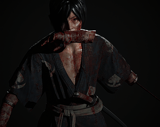
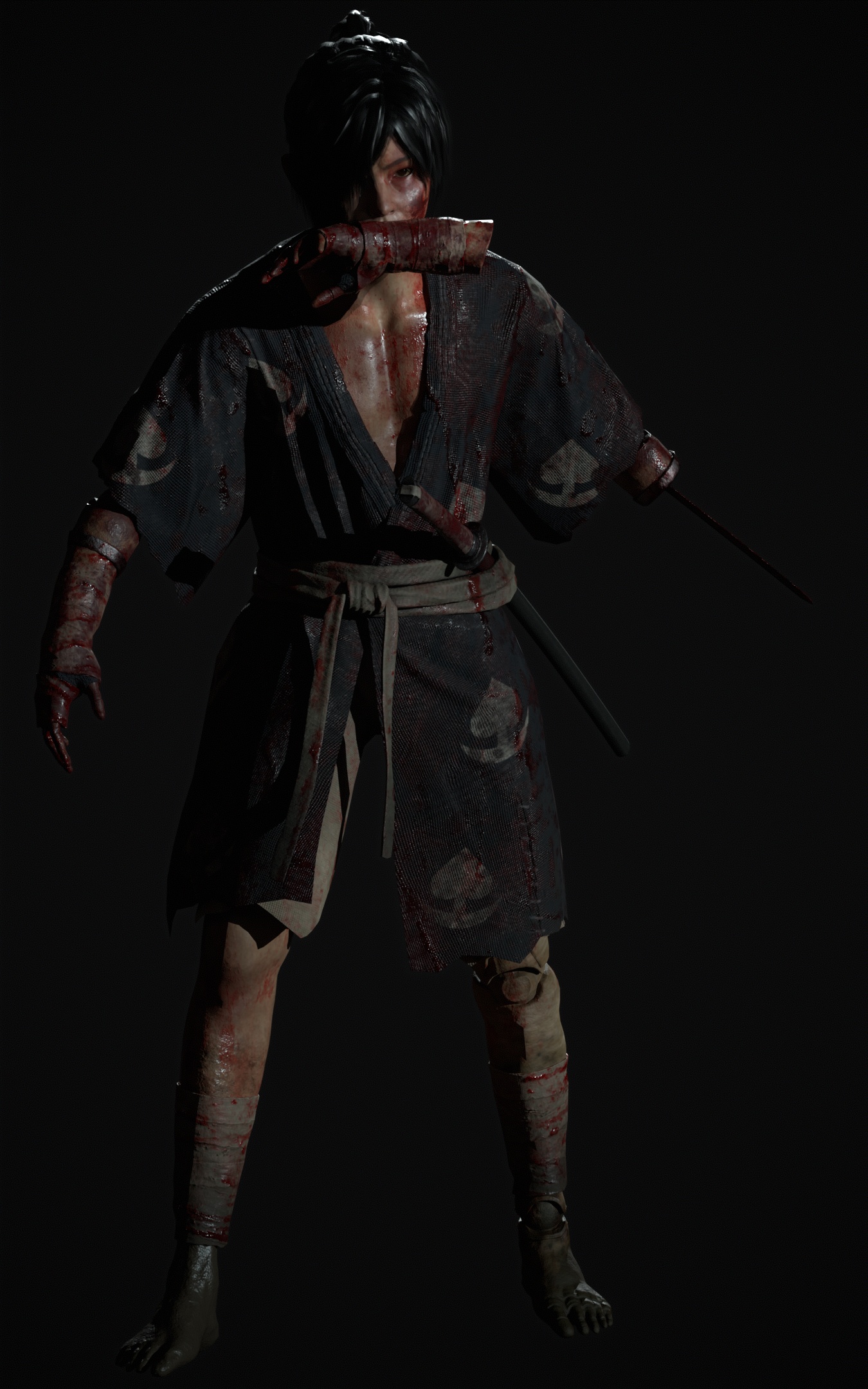
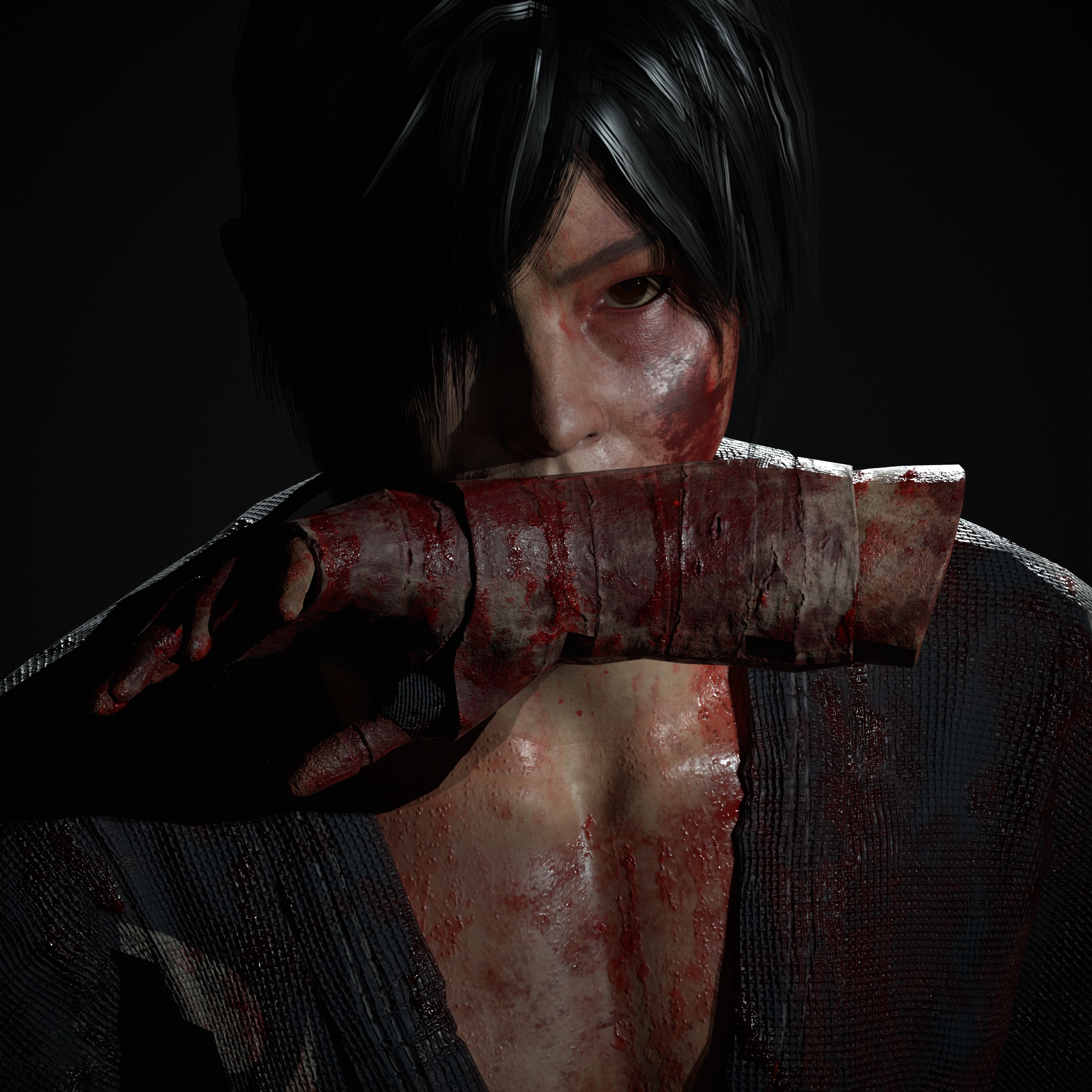
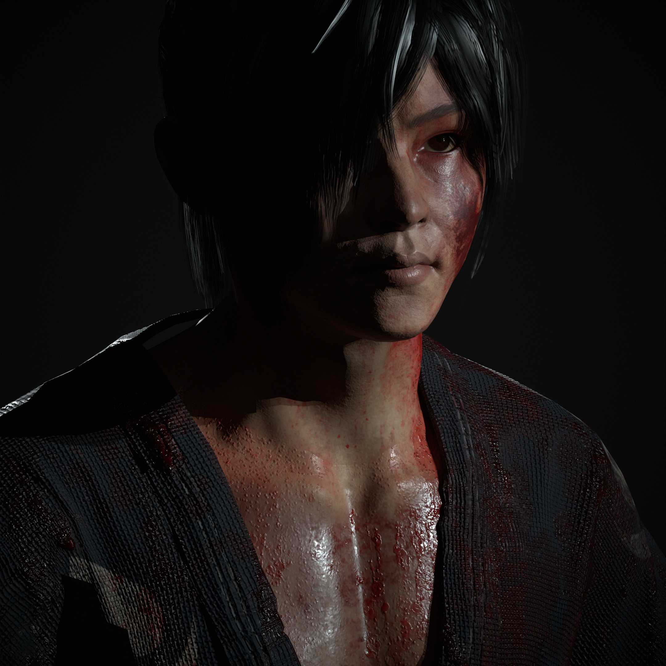
Texturing overall is excellent I love the roughness/material contrast across the model. Particularly love the gritty feel and treatment of gore/blood it’s super effective! It would be awesome to see some worn/frayed cloth in the texture to further support the torn sleeves mesh, potentially even using alpha cards to break up the silhouette and push realism. Also watch out for texture seams, especially on skin where it can be more evident such as where the head meets the body.
Documentation
Clear and concise documentation with a solid overview of the character from idea conception to final piece. Perhaps you could have included some more details on texture resolution/packing of textures and insight into choices you made regarding performance/optimisation of the character. Also, I’d have loved to see a final round up section, touching on your experience with the project overall summarising the journey and highlighting any areas of improvement going forward. I’m sure you’ve got a super bright future ahead so it would be great to hear your thoughts and plans for growth.
Final Presentation
Nice work on the final renders. I love the dark and moody feel you’ve achieved using clever lighting choices. I feel the renders are quite dark, the character gets slightly lost in the background with it being a similar colour to the characters cloth and hair. Some finessing of your lighting set up could help break the character away from the backdrop and a shadow under the characters feet could also help ground them in the scene, giving them a sense of presence.
Your creative skills and technical knowledge are evident. You’ve demonstrated a high level of understanding of industry practices covering the character workflow for games. Sculpting skills are strong, and I particularly love that you’re using Marvelous Designer and creating hair with cards. For your next project I’d suggest focusing on presentation and lighting, perhaps finding successful reference/examples out there to guide you during this stage. Consider things like composition of final renders, depth of field, posing and breakdowns. Considering this is a rising star project and you’re only in your second year I’m super impressed! Great job overall, you’ve created a very successful project here and I can’t wait to see what you work on next. Keep it up!
This is SO good!!