Play asset pack
Helios - Big Bad's itch.io pageResults
| Criteria | Rank | Score* | Raw Score |
| Research + Development | #9 | 4.000 | 4.000 |
| Final Presentation | #11 | 3.750 | 3.750 |
| Project Documentation | #12 | 4.250 | 4.250 |
| Overall | #13 | 3.750 | 3.750 |
| Technical / Workflow | #17 | 3.500 | 3.500 |
| Creative Development | #27 | 3.250 | 3.250 |
Ranked from 4 ratings. Score is adjusted from raw score by the median number of ratings per game in the jam.
Judge feedback
Judge feedback is anonymous and shown in a random order.
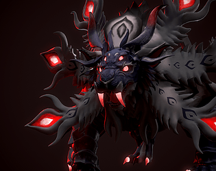
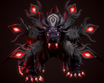
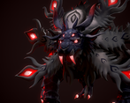
- Well done for completing this project! The documentation is very thorough with a wide range of references and research. You show strong modeling skills and the ability to receive and implement feedback is a really good skill to show as a game artist. ∘ there is an inconsistency in the texturing- parts like the alpha are really sharp whilst the glowing tips of the mane look painted with blurred edges. To keep true to the concept, keep transitions between colours sharp and precise. same with the emblem above the head, in the concept the outer edges are sharp and it blurs downwards ∘ there are some visible seams around the mane which generators in substance painter have probably caused, just watch out for these ∘ if the mane, nose and white markings around the face were brighter white it would make the character pop against the background in the final renders. This could just be due to the lighting set up ∘ There are some artifacts around the mane in the final renders, it looks like the low poly doesn't have smoothing groups in places or the shadow quality isn't high enough. I haven't used marmoset much so I'm not too sure. It would be good to see this in UE5 The retopology and posing were really successful and you've managed to come out of this challenge with an impressive piece! The composition and lighting were well considered and made for some really cool final renders. Keep up the hard work! Feel free to reach out with any questions ~ Sasha Gallie, Character Artist at Double Eleven https://www.artstation.com/sashagallie
- First of all, I want to thank you for the work you've done; you've done well with the task. I found it very interesting to evaluate your character. Thank you for your effort and diligence. I want to wish you good luck in the challenge and creative success! Denis Beletskii. 3D Concept Character Artist. Wargaming. Also, I would like to add some useful materials on working with characters and more. I hope they will be helpful to you when working on new excellent characters. Good breakdowns in my opinion: • Sin Nombre—Valerious by Kristina Perinska https://www.artstation.com/artwork/YBQrOX • Frostpunk Explorer: Character Design for Cinematics by Claudiu Tanasie https://80.lv/articles/001agt-frostpunk-explorer-character-design-for-cinematics/ • Game Res character by William Paré-Jobin https://www.artstation.com/artwork/oAonE4 • Yokai Breakdown by Anastasia Fomina https://www.artstation.com/artwork/OGOn06 • Creating a Strong Male Character by Annina Weber https://80.lv/articles/creating-a-strong-male-character-in-maya-zbrush-substance/ • Marilyn Monroe by Alexander Lyan https://gamesartist.co.uk/marilyn-monroe/ Useful literature: • Excellent anatomy books for sculptors. https://anatomy4sculptors.com/ • A book explaining the use of lighting for artists. https://www.laurenceking.com/products/light-for-visual-artists-second-edition • Anatomy for 3D artists. https://www.brownsbfs.co.uk/Product/Legaspi-Chris/Anatomy-for-3D-artists---the-essential-guide-for-CG-professionals/9781909414242 • Character design. https://store.3dtotal.com/products/fundamentals-of-character-design • Another book on lighting, but this time for portraits. https://www.ammonitepress.com/mastering-lighting-flash-photography/
- Research / development - Great analysis and breakdown of concepts and design principles. Also good mix between real world and artistic influrances and references but lacking detailed submission page. Technical/workflow - While the sculpt and design was great, what was lacking was attention to detail when it came comes to UV's which in this case had to be seams created in specific positions on the legs, body and head along . There could have been more thought into both the efficiency and final presentation renders for this creature. Good job tho, with the head and referencing real world animals to help solve how the anatomy would function in areas such as the head. Creative dev - Ambitious take on a creature but lacking a strong tie to the briefs themes , no original concept made for the brief. Final presentation - While the character is nicely made over all and well thought out , the final presentation could show the forms and structure of the creature more. Front on angles are less flattering and the lighting is quite dark considering the textures are dark in value. However i do like the accent colour of red. Perhaps using emissive that are glower and gradient from reds to orange on the talons and head feathers may help add a little life to the creature. Also ideally for a creature of this design, posing it or showing it (even useing a auto rig) would help sell the design further. Also including props to show the story and mythology around it. Great entry !
Challenge Tier
Search For A Star
Leave a comment
Log in with itch.io to leave a comment.


Comments
No one has posted a comment yet