Play asset pack
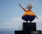
Pete the Pelican's itch.io pageResults
| Criteria | Rank | Score* | Raw Score |
| Research + Development | #23 | 3.333 | 3.333 |
| Creative Development | #30 | 3.000 | 3.000 |
| Project Documentation | #31 | 3.333 | 3.333 |
| Overall | #37 | 2.867 | 2.867 |
| Technical / Workflow | #38 | 2.333 | 2.333 |
| Final Presentation | #41 | 2.333 | 2.333 |
Ranked from 3 ratings. Score is adjusted from raw score by the median number of ratings per game in the jam.
Judge feedback
Judge feedback is anonymous and shown in a random order.
- This project has good reference and narrative building, and results in a really fun character full of personality! Some feedback: ∘ could explore more silhouettes and colours in the concepting stage ∘ UV unwrap in maya / blender and fill the UV tile to make the most out of the resolution ∘ Use generators in substance painter like AO or curvature to give the character more shape. feel free to use smart materials as a base to work from, even backward engineer them to learn how they are set up ∘ Great job creating your own rig! This is great to see The end poses look really fun and came out great, well done finishing this project! Feel free to reach out with any questions ~ Sasha Gallie, Character Artist at Double Eleven https://www.artstation.com/sashagallie
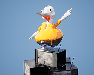
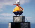
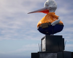
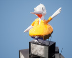
- Reading your documentation, you definitely set yourself a challenge with the time constraint so overall I think you should be very happy with producing this character in this time, especially having not had much Zbrush experience. I think this is a lovely project :) Here are some of my key takeaways: R + D Nice use of mood boards, Pinterest is a great tool for finding inspiration and it looks like you delved well into those key design areas of your character. I would say that having one final, focused board with your final decisions would help also, rather than separated boards with many similar images. For example, you could summarise the specific type of TV you want to use or annotate as to which specific pieces of clothing you want Pete to wear out of the images you chose. Having this more focused board beside you while creating your character down the line will help. Your concept work is great, it looks like you had a lot of fun with it and having the front and side view gave a really clear vision. I think with more time, you definitely would be able to add those final prop elements to bring Pete's backstory into his final model, like the lures and fishing rod you mentioned, but sometimes when time is short, it is necessary to reduce scope and focus on the main features. Sculpt The main area you need to focus on in character art is Zbrush, sculpting is just so key. But it is great to see you take this project as an opportunity to learn it (especially as it is not the most beginner-friendly piece of software). But the use of a low poly blockout in Maya for this project was smart, as Maya appears to be a strength for you. The sculpt you have done on the feet and belt has a lot of detail which looks awesome and the feather tufts are nice and readable. I really liked that you learnt how to create a VDM brush for this project, making a couple of different feather brushes to use more across the model would add lots of nice detail that is quick to apply. One of my favourite brush packs is this one https://www.artstation.com/marketplace/p/jdjO/15-stylized-fur-and-feather-alphas-brushes and you can see how the artist has spent time to sculpt these stylised brushes in a similar way to how you intended. It may take a little bit of time to make one of these, but once you have it, you can then add so much detail easily across your model which would definitely bring it to the next level. Try to explore more with using flatter sculpting brushes to really chisel in the details on your sculpt, especially around the shirt wrinkles. Also, a great technique in zbrush is to zoom out and check out the silhouette of your character. This will help make sure you have a good balance of large and small features to make your character more readable. Lastly, try to make each subdivision level in zbrush intentional. So try not to divide the model too much before refining the lower levels, or you will end up with lots of large shapes and tiny details without much in between. So on Pete's shirt, sculpting in some larger folds before moving into the tiny wrinkles would improve the silhouette of the overall mid-section. Textures I like the clear colour-blocked sections of your character uthat give it a cartooney style. Using a bright orange and complimentary, darker blue is a good choice and reads well visually. UV unwrapping is so key to a successful game-ready model and I would definitely not recommend Substance auto-unwrap outside of quick tests. But it looks like you recognised this afterwards. Luckily, there aren't any big issues that I can see in your final presentation due to using this, but don't rely on this workflow in the future. Having nice UVs down the line is a key skill! What would really improve your textures while keeping the colour-blocked look would be adding some simple gradients, such as having the bottom of the shirt go into a deeper shade of orange, or maybe a little blue to the wing tips and neck for example. It looks like your textures lack a defined roughness map in the final renders as it appears very shiny. Simply adding a few extra roughness values across the model would improve its final look a lot. Here is a nice example of a cartoon-style dragon I found https://www.artstation.com/artwork/PoQkg4 . You can see the colours are very simple, but adding that noise in the roughness and some nice gradients across the base colours really helps bring it to life. Technical Nice use of the Maya rigging, it looks like it worked really well on your model. Once again, it looks like you recognised afterwards the importance of retopology and I would agree that Maya's quad draw feature is really good for this and certainly something I would reccomend using. You want to aim for relatively even quads across the model, adding more detail in areas that define the silhouette and where the character's limbs will deform when rigging. This will help avoid the model looking sharp when, for example, the wing is bent at the elbow and there aren't enough edge loops to give it that nice smooth bend. Presentation Well done for getting both your character and the TV prop into UE4 with the working rig, this is a tricky stage! I'd love to see you take more advantage of the rig you made and give some movement to his head and legs to really bring him more to life, and also, using a few extra spotlights when rendering will help improve your render rather than relying on the skylight as much, which often gives only a simple lighting setup. I enjoyed reading your project and it seems you did a lot of learning while making this character, which you should be very proud of. You reflected at the end on where you would improve, namely on UV unwrapping and manual retopology and I agree that these are technical areas that would definitely be key to bringing your character to the next level. It is great that you recognised these processes. You have a great foundation in concept and design I think, so I hope you will continue to dig into industry workflows and how you can get those technical areas nailed down in your next projects, as I see a lot of potential! Well done :D
Challenge Tier
Search For A Star
Leave a comment
Log in with itch.io to leave a comment.


Comments
No one has posted a comment yet