Play asset pack
Zerek's itch.io pageResults
| Criteria | Rank | Score* | Raw Score |
| Final Presentation | #13 | 3.667 | 3.667 |
| Technical / Workflow | #18 | 3.333 | 3.333 |
| Project Documentation | #25 | 3.667 | 3.667 |
| Overall | #26 | 3.200 | 3.200 |
| Research + Development | #37 | 2.667 | 2.667 |
| Creative Development | #38 | 2.667 | 2.667 |
Ranked from 3 ratings. Score is adjusted from raw score by the median number of ratings per game in the jam.
Judge feedback
Judge feedback is anonymous and shown in a random order.
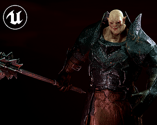
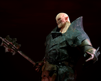
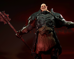
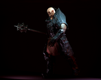
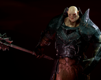
- Documentation Great use of mood boards, I like that you separated them into different areas of focus, including the key features you wanted your character to have such as the armour and the mace. I think you should take advantage of having a drawn concept here to accumulate all your ideas and be able to nail down exactly what it is that you are making as you go into the 3D process as sometimes trying to combine so many ideas at the later stage can be more difficult. Workflow Lots of companies will create base models to start the character workflow, so I thought this was a smart choice seeing as you haven't had much experience with 3D as mentioned in your documentation. I also think you did a great job of blocking out the layers of armour and using various Zbrush techniques to do so. It is good to see you are already thinking of how the final mesh can be optimised through polycount. I would suggest that during the sculpting stage, don't worry too much about deleting the backfaces of your model as this can be done later on when you retop :) Lovely skin detail on the orc's face! Those pores and wrinkles are looking great! The next stage to making this an even better piece would be studying facial anatomy and adding larger forms such as muscle and fat pockets that we see around the face, namely the larger forms around the mouth and eyes. This would add more depth to the face. Even with fantasy creatures like orcs, it is hugely beneficial to use human anatomy reference as a baseline that you can manipulate into the creature you are creating to give it a higher sense of believability. Take a look at this piece I found https://www.artstation.com/artwork/2xm0KJ . You can see those deep skin folds in the character's face that really bring it to life. I particularly like the stretched pores you added on the nose bridge with those little wrinkles - that detail gives your character a nice expression! Remember to make sure you are not losing the chiselled details of your armour when you add the roughed-up texture, this is so easy to accidentally do. Keeping those sharp lines would boost the readability of your final bake later on. Your use of nanomesh on the chainmail was a smart choice, and is not always easy to get right so this was awesome to see. I also liked how you used reference to make your angry facial expression, this looks very cool! A couple things I would suggest for improving your lowpoly would be: - Be careful around thin armour pieces, it looks like some of your plates are so thin that the backfaces are coming through to the front, for example on the shoulder. Luckily I don't imagine they will deform too much in a rig, but having faces so close together like that is a risk when skinning and when baking textures. - Try to keep a relatively even spread of quads across your model, except in areas of high deformation. What I mean is that you have very large polys across the main front chest piece and then much smaller ones on the one just below it. I'd be interested to see you explain which tools you used to do your retopology. I think doing it manually so you can really control the spread of polys would help you a lot to keep things even. - For your armour that will somewhat deform, e.g. on the abdomen, I would probably suggest trying to keep this as one mesh rather than many interlocking parts. When your mesh bends, having the separate pieces means that most likely the armour parts will start to intersect each other. I understand that your character has later on been posed without much bend to these areas, but keep this in mind for future projects. Considering stuff like this will make any riggers you ever work with very happy! :D Your UV maps look very thoughtfully laid out and you have used the space well. I can see you have some wiggly/stretched UVs in some of the armour pieces, especially on the shoulders which look like they have caused some noticeable texture stretching. For parts like this that are so visible, this is an area that should be addressed and fixed. The face UVS look particularly good. Back to what I mentioned in the low-poly part, having more combined meshes on your armour would help reduce baking issues, but I'm glad to see you saw a problem and came up with an informed solution that worked! Nice job with the textures, especially all the great detail you put into the face. Some texturing tips! - Try to tell a story through your textures! Make sure to add damage and dirt where appropriate, perhaps where your character has deflected a strike in battle, or fallen to their knees and dented the armour in a particular way. You can tell a lot of stories simply through your textures alone. - Roughness is so important to define in the armour. I can see that your armour has a lot of similar roughness, especially going from the leather to the metal, where the leather looks a little too shiny. Make sure to keep referring to those outfit references you collected earlier to give it that extra believability. Final Presentation Good use of an appropriate rig and for weight painting too. Especially on the face, this is an advanced skill and you did a really good job on this. Although you didn't manage to get the rigs working in UE4, I love the poses you chose, especially with that facial expression I can really feel the orc's powerful demeanour! Some of the lovely details of the armour get lost in the render where the lighting gets quite dark, and you have chosen a very dark albedo map that is a little too low value for PBR. This is an amazing site with real-world PBR values for different materials https://physicallybased.info/ . I think you would find it very useful. Doing this will stop your pieces from being too dark in the final lit renders. Especially with metallic materials. A few extra spotlights and rim lights would also add a nice final touch :) But overall, this is a great piece, considering you are so new to character art, amazing work and I can tell you have a keen interest in the more technical parts of the workflow which is awesome to see. Keep it up!
- really nice development of an idea with references and design inspiration. The character follows the theme well and has a lot of personality. Some feedback: ∘ some more exploration of body shapes, colour schemes, and development process of the final piece of concept art would be beneficial to see ∘ the metal in the high poly sculpt is too noisy and loses a lot of the shape, reference other 3d models of armour when sculpting. The addition of chain mail is really nice! ∘ UVs are unwrapped and layed out nicely ∘ the final renders frame the character well and make him look intimidating! Well done for finishing this character for the challenge and getting some great results, especially considering it's your first 3d character. Feel free to reach out with any questions ~ Sasha Gallie, Character Artist at Double Eleven https://www.artstation.com/sashagallie
Challenge Tier
Search For A Star
Leave a comment
Log in with itch.io to leave a comment.


Comments
No one has posted a comment yet