Play asset pack
SFAS 2024: Character Art - Scarlet Shadow's itch.io pageResults
| Criteria | Rank | Score* | Raw Score |
| Final Presentation | #8 | 4.000 | 4.000 |
| Project Documentation | #16 | 4.000 | 4.000 |
| Overall | #18 | 3.467 | 3.467 |
| Creative Development | #18 | 3.333 | 3.333 |
| Technical / Workflow | #25 | 3.000 | 3.000 |
| Research + Development | #33 | 3.000 | 3.000 |
Ranked from 3 ratings. Score is adjusted from raw score by the median number of ratings per game in the jam.
Judge feedback
Judge feedback is anonymous and shown in a random order.
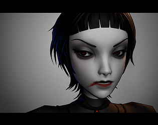
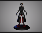
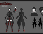
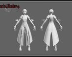
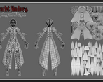
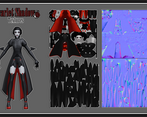
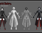
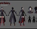
- Pros: + Very descriptive and visually appealing presentation, including model breakdowns. + Good approach to stylised hair, although it is almost perfectly symmetrical (explanation below). + Good retopology result, but the coat trims and vertical lines on the front of her shirt are unnecessarily dense and should have been baked into texture instead of geo. On the topic of polycount, there is no “correct” amount generally speaking. It really depends on what you want to achieve and the visual fidelity of your character. You can make a great looking character with 40k tris and uplift it through texture and shaders towards a specific style. Likewise, you can have a 200k character that looks very simple and doesn’t have a clear style. So the “correct” answer is use as little as you can to achieve your desired result while not compromising on quality. This is more of a “feeling” you’ll develop so don’t feel pressured to get it right. Personally I tend to go higher for portfolio pieces, while on the job you will be given a polycount budget. + Good attempt to optimise the UVs by overlapping, although I recommend cutting circular/cilinder-like meshes vertically and trying to straighten them into a line for better results. Cons: - Good concept development process, although I think the outfit could have been further pushed into the classic gothic aesthetic, since that’s what you were going for. To me it looks more like “goth” rather than “gothic”, which are two different trends. Also, the flower brooch in the initial sketches added to her personality and broke the symmetry, I think you should have kept it. Without that, your final design is completely symmetrical, overlooking the blood smear at the mouth. To add “character” to your design, symmetry should be avoided unless it has a good reason behind it. That’s because we rarely encounter symmetry in the real world when it comes to clothing and even when we do it is offset by things like folds or imperfections in the material. This should be taken into account even in a stylised scenario. - The brief was not respected as the character is not presented in two distinct poses (the A-pose you modelled her in doesn’t count) - The texturing process was briefly documented and the result can be improved. Mainly, the textures look very flat which is not a given if you go for a stylised look. There is no difference or variety between any clothing elements in terms of material and I don’t necessarily mean color. You could have still kept the black/red palette while making the materials more intricate. For this, I recommend doing more research beforehand and gathering a set of references used mainly for texturing, this can include stylised materials made by other artists but also primary reference to know the realistic counterpart of the material you are trying to convey. - The mouthbag is not connected to the lips, they should be one contiguous mesh. Overall, you’ve got an interesting idea for the character which can be improved if more time is put into the design and textures. You have a good set of fundamentals which you can build on and I’m sure you will come out with even better results in the future. Also, make sure to read the brief carefully as not fulfilling its requirements despite putting so much work into the project can be a disheartening situation. Feel free to reach me at: verisof08 on Discord or via LinkedIn at https://www.linkedin.com/in/mihaiandrusandu/
- This project has nice development of a piece of concept art with a wide range of references. the final model reflects the concept art well and shows off a strong ability to follow a games industry workflow. Some feedback: ∘ a bit of extra research on similar 3d projects could be useful to set a quality bar and reference how others approach rendering a similar character ∘ The sculpt and retopology is really clean, looks good. Hair looks great too. Have a look at including marvelous designer in your workflow for clothes ∘ It would be good to see the character posed in a scene with composition / framing considered, for example including a background Overall very good job with this project, your art style is very clean and each stage of the process is done to a high standard. You planned a project that you would be able to complete without compromising on quality and got some great results! Feel free to reach out with any questions ~ Sasha Gallie, Character Artist at Double Eleven https://www.artstation.com/sashagallie
Challenge Tier
Search For A Star
Leave a comment
Log in with itch.io to leave a comment.


Comments
No one has posted a comment yet