Play 3D Model
Teenage Zombie Girl's itch.io pageResults
| Criteria | Rank | Score* | Raw Score |
| Research + Development | #9 | 4.000 | 4.000 |
| Creative Development | #14 | 3.500 | 3.500 |
| Project Documentation | #24 | 3.750 | 3.750 |
| Overall | #26 | 3.200 | 3.200 |
| Technical / Workflow | #36 | 2.500 | 2.500 |
| Final Presentation | #45 | 2.250 | 2.250 |
Ranked from 4 ratings. Score is adjusted from raw score by the median number of ratings per game in the jam.
Judge feedback
Judge feedback is anonymous and shown in a random order.
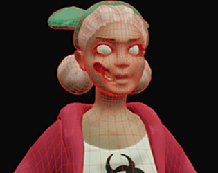
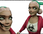
- Student: Nathan Taylor Challenge Tier: Search For A Star Assessor: Jessie Chan Hi Nathan, I love the design of this character and the contrast between the beautiful and the ugly. Here are some points I think you did well: ⭐ Great research and development into the desired style. Loved reading about your design decisions through the concept phase. ⭐ Generally a very even topology distribution across the body and clothing. ⭐ A fairly efficiently used UV space, some islands could have edges straightened out for a more compact fit. Some areas that I think you could improve on: 🌸 You have some excellent expressions drawn in your concept phase, it would’ve been awesome to see some of these come out in the character at the end with a bespoke pose or blendshape. 🌸 Make sure when box modelling that you are considering the major edgeflows for deformation, areas like the face, hands, toes, elbows, arms (anything that will deform) needs specialised edge loops. Check out DannyMac3D or 3DMutiny for tutorials on retopology to help you. 🌸 You can bake using your low poly in Substance Painter, this would have helped you create AO/Curve/Position maps to assist in your texturing. 🌸 Some areas of the texturing feels a little unconfident and non-committal. I would have liked to see more real signs of decay/gore that you had in your reference boards - this would really help to sell that “zombified” look of the character. For example, I think the area around the mouth and knee is excellent and adds to the design, but I would have liked to see this kind of detail carried forward to textures too (more varied hues, less blurry/patchy areas). 🌸 For hand painted characters, think about the base colour leading all the information, this includes the light source, the roughness of the material, cast shadows from each elements and more. I’d recommend watching this video of Annie Kwon’s process for League of Legends for improving your hand painting skills! https://www.youtube.com/watch?v=AY-6Ny8VArA Looking forward to seeing what you do next Nathan, best of luck for the future! Please feel free to reach out if you have any questions :)
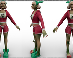
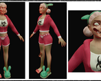
- Pros: + Very interesting concept development process. You’ve gone quite in depth acknowledging the pros/cons and steps you took to move forward. I especially like the expressions page where you portrayed the character in different poses. That gives her a lot of expressivity and the idea of repeating the actions before her death works quite well to justify the design. + Documentation is detailed and outlines each part of the process well and the techniques used. + I have to commend you for box-modelling the character from scratch in 3 days time, even though it is not an ideal pipeline. Also, the topology and polycount are quite good too. + The UV layout and grouping everything on one UDIM works quite well with this type of hand painted character, although be careful with overlapping UVs too much as it can give you mirroring where you don’t want it. Cons: - One thing that comes across and that you mentioned as well is focusing too much on the concept and not leaving yourself enough time for the rest of the pipeline. Here, planning and setting mini deadlines for yourself should have helped to manage your time better. - In terms of the final design in 3D, I think a lot of the shape language, details and expressivity were lost when translating the design. The messy hair with hair rollers stuck in it, combined with the toes spreader and the wax band really gives character and outlines her backstory, almost like she was caught by the zombie outbreak while at the beauty saloon. Going for a simpler hairstyle for the sake of time does take away from that, and certain details, like the wax strip, don’t look like what they’re meant to be. Also, the half waxed leg should have some hair on it like in the concept but it doesn’t, and there’s no writing on the back of her pants. The missing part of her face should have had some skull showing through, otherwise it feels less believable. Overall, the character seems rushed and lacking the attention to detail you had in the concept. - Due to box modelling, anatomy and cloth look quite stiff. I recommend practising some anatomy in ZBrush, and using that to make your base, instead of Maya as it gives you much more freedom and expressivity when tackling organic subjects. One book I highly recommend is Anatomy for Sculptors (https://anatomy4sculptors.com/understanding-the-human-figure/). Also, don’t forget to practise anatomy through drawing since a lot of the observations you make in 2D can easily be transferred to 3D. For this I highly recommend drawing quick poses (1-2 min) which force you to find the main lines of action and learn how dynamic the human body is. - As you are aware, the character is not posed so it can’t be considered a finished submission as per the brief. It’s still good you pushed through and tried to submit though. Overall, you have a very interesting interpretation of the theme and managed to come up with a cool design. I highly recommend you revise the project and follow a proper pipeline, giving yourself the time you need to represent the concept faithfully. You’ve done a good job in a short time and I look forward to see what you make next. Feel free to reach me at: verisof08 on Discord or via LinkedIn at https://www.linkedin.com/in/mihaiandrusandu/
- Great job on this project! The development of a concept for your character was very successful with a wide range of references and thorough exploration of design ideas. I like the addition of a turn around too! Some feedback: ∘ It would also be good to see some 3D references to understand the art style you're aiming for and act as a quality bar ∘ Use ZBrush to add details to the high poly and have more control by using layers, various brushes, polygroups ∘ layer up textures, add a variation in colours, make the lips look more wet, and add dirt and distress to the clothing to ground the character ∘ even though you weren't able to get to it in this project you should definitely continue to rig and pose the character in your own time to get some awesome final renders well done for finishing the character! She is full of personality. Feel free to reach out with any questions ~ Sasha Gallie, Character Artist at Double Eleven https://www.artstation.com/sashagallie
Challenge Tier
Search For A Star


Leave a comment
Log in with itch.io to leave a comment.