Play asset pack
Neil the Demonic Monk's itch.io pageResults
| Criteria | Rank | Score* | Raw Score |
| Creative Development | #18 | 3.333 | 3.333 |
| Final Presentation | #24 | 3.000 | 3.000 |
| Project Documentation | #36 | 3.000 | 3.000 |
| Research + Development | #37 | 2.667 | 2.667 |
| Technical / Workflow | #38 | 2.333 | 2.333 |
| Overall | #39 | 2.867 | 2.867 |
Ranked from 3 ratings. Score is adjusted from raw score by the median number of ratings per game in the jam.
Judge feedback
Judge feedback is anonymous and shown in a random order.
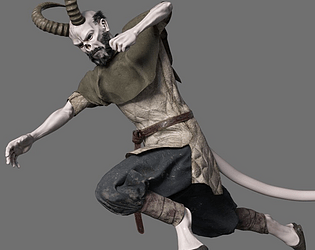
- This entry showcases a unique character concept blending mystical and demonic elements. The artist's skill in character design is evident, and the incorporation of traditional monk elements with a demonic twist offers a compelling narrative potential. Improving the texture detail and lighting could enhance the character's visual impact.
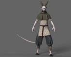
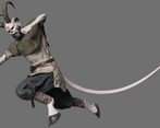
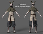
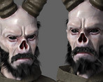
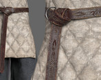
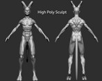
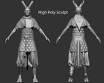
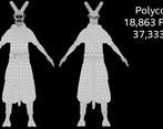
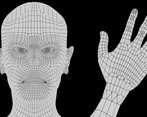
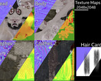
- First of all, it's a very impressive character idea, nice play on the opposites!. First read is solid, clear silhouette,clean presentation, all good stuff! Now regarding every aspect separately Design. The base design is solid, but there is room for improvement. Currently, the belt is the most bright clothing element, which is distracting from the face, that should be the focal point. I’d suggest toning the brightness down. The initial concept had him wear some sort of an amulet. I would suggest adding it back, as It would bring more interest to the face, that should be the natural focal point and also add some more clues about the backstory. His hands are currently feeling really empty. As he is a fighter, maybe adding bandages to the hands would add some balance to the design and also tell us more about the character at the same time. Cowl around his neck could be pushed out a bit and the hood enlarged around the head, so that the silhouette is more distinct My suggestions: https://drive.google.com/file/d/1EjEOfCrShHZHtB1lcYuPxTprcAIK08N5/view?usp=drive_link https://drive.google.com/file/d/1Ej7XD2s8EdTaN684Y38zI3fOAY0qO1Yo/view?usp=drive_link Body sculpting. Visible part of the body - hands have believable anatomy at first read, and that’s great! Focusing on a less typical muscle structure is a bold move!. However, that brings a different challenge. - bones and bony landmarks. As he is so thin, a lot of his bone structure should be more visible. It is not really important for this particular project, so I won't focus on it, but when you have time, I suggest you do some studies of the human skeleton - don't go into details, only basic shapes and volumes. Solid understanding of the skeleton is a very strong foundation for any character! Clothing. Pants are believable if a little edgy - triangulation is very visible. Gambeson padding and the belt are also well done! Piece on top needs some rework. It appears to me that you used whatever Marvelous gave you, but it is important to remember - just because something is simulated, doesn't mean it is appealing. There are tons of moments in real life even when folds are entirely natural yet not well structured. I’d suggest coming back to that piece and tweaking it until you get something closer to the references you attached in .pdf. That green cowl for example has a really nice shape and a Belt should press more against the gambeson, pushing the cloth inwards and creating both a nice silhouette and a shading variation. Technical parts. This part would need special attention in the future. First and most important - a lot of elements don't have thickness or are not capped, which results in a lot of see-through issues inside of unreal. Always make sure to either cap elements, give them enough thickness or assign a double sided shader. The last option however should be used carefully as it basically doubled the polycount from a technical standpoint. Using Marvelous topology as a first step for lowpoly of the clothing is fine, but make sure you optimize and rework it afterwards. There’s no need to have such a dense topology around the belt area, plus the fact that there are no proper loops there creates issues for animators. Nothing they can't handle, but part of the job of a character artist is understanding the needs of animation and making their job as easy as possible. Face topology follows general conventions and should work fine, however there could be less loops around mouth and eyes. without losing quality Loops around waist for animation Hair cards are too few and too small which creates a lot of angles where there are not enough cards to create the desired silhouette. You should not, however, add too many more. focus on increasing the size of the ones you have and positioning them so that you can cover more of the head. There are many tutorials on how to do hair cards. This one is a solid base, for example: https://marmoset.co/posts/presentation-lighting-and-hair-creation-for-a-sorceress-character/ Textures. First read on the textures is positive. Great job! The organic parts are lacking in color variation and detail. almost feels like it is filled with one color. I would suggest adding more blue under the eyes and generally add some darkness to attract the attention to the eyes. And eyebrows) Some color transition around the horns would be nice. Some smaller stuff would be to darken areas where elements come into contact. It would help simulate ambient occlusion and also in real life those are the areas that get the most dirty. Skin that is visible above hooves is just as bright as the head, which is distracting from the top of the character. I would suggest darkening it. Presentation in UE. This one was clearly done in the last possible moment - shading for the head is broken, scene is bare bones. Judging by the renders you are just not familiar with UE, because you can clearly make a decent looking lighting setup. No particular feedback here - just take some time and learn basics of UE, that will help you in the future) As a closing words - great potential here! the design is really solid. Maybe redo this character later after you gained some experience - can be a nice portfolio piece
Challenge Tier
Search For A Star
Leave a comment
Log in with itch.io to leave a comment.


Comments
No one has posted a comment yet