Play asset pack
Robert Punk's itch.io pageResults
| Criteria | Rank | Score* | Raw Score |
| Technical / Workflow | #2 | 4.400 | 4.400 |
| Final Presentation | #5 | 4.400 | 4.400 |
| Overall | #8 | 4.080 | 4.080 |
| Research + Development | #9 | 4.000 | 4.000 |
| Creative Development | #13 | 3.600 | 3.600 |
| Project Documentation | #16 | 4.000 | 4.000 |
Ranked from 5 ratings. Score is adjusted from raw score by the median number of ratings per game in the jam.
Judge feedback
Judge feedback is anonymous and shown in a random order.
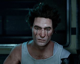
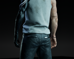
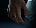
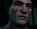
- Contestant: Christopher Hotson / @chotson Assessor: Tristan McGuire / @draconic_cowboy Tier: RS Congrats on completing your project! Things that went well: ✧ Honestly, everything about this project is hugely successful! I hope you are happy with what you have achieved :) ✧ The research into real game models is great and shows your understanding of how our artwork needs to conform to current trends in style and technical requirements. ✧ The concept art is nicely executed and well explained. ✧ The mood in the final renders portrays the bleakness of the cyberpunk genre excellently. ✧ Technical aspects are all on point. Things to consider next time: ✧ The wireframe render is really hard to see. Next time, try and render out the wireframe at a higher resolution. Marmoset Toolbag is great for wireframe renders, or there is also a material in Arnold that does decent wireframes. ✧ The shadows in your renders are very dark and it’s hard to see the cyber arm. If using a HDRI, try increasing its intensity, or if not using one, try adding one. As you are in the Rising Star tier, I hope this feedback can be used to inform how you approach future university projects and I would love to see you take part in the competition again next year! You can find me on the social medias in the link below. Feel free to reach out in the future. All the best! https://draconic-cowboy.carrd.co/ - Tristan, Deputy Senior Character Artist at Airship Interactive.
- First of all, I want to thank you for the work you've done; you've done well with the task. I found it very interesting to evaluate your character. Thank you for your effort and diligence. I want to wish you good luck in the challenge and creative success! Denis Beletskii. 3D Concept Character Artist. Wargaming. Also, I would like to add some useful materials on working with characters and more. I hope they will be helpful to you when working on new excellent characters. Good breakdowns in my opinion: • Sin Nombre—Valerious by Kristina Perinska https://www.artstation.com/artwork/YBQrOX • Frostpunk Explorer: Character Design for Cinematics by Claudiu Tanasie https://80.lv/articles/001agt-frostpunk-explorer-character-design-for-cinematics/ • Game Res character by William Paré-Jobin https://www.artstation.com/artwork/oAonE4 • Yokai Breakdown by Anastasia Fomina https://www.artstation.com/artwork/OGOn06 • Creating a Strong Male Character by Annina Weber https://80.lv/articles/creating-a-strong-male-character-in-maya-zbrush-substance/ • Marilyn Monroe by Alexander Lyan https://gamesartist.co.uk/marilyn-monroe/ Useful literature: • Excellent anatomy books for sculptors. https://anatomy4sculptors.com/ • A book explaining the use of lighting for artists. https://www.laurenceking.com/products/light-for-visual-artists-second-edition • Anatomy for 3D artists. https://www.brownsbfs.co.uk/Product/Legaspi-Chris/Anatomy-for-3D-artists---the-essential-guide-for-CG-professionals/9781909414242 • Character design. https://store.3dtotal.com/products/fundamentals-of-character-design • Another book on lighting, but this time for portraits. https://www.ammonitepress.com/mastering-lighting-flash-photography/
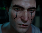
- Pros: + great research beforehand, looking into the technical aspects of characters in a similar style from established IPs and game studios + used documentation for self reflection + good clothing workflow, although look more into sculpting cloth properly and try not to rely on Marevelous too much and learn how to do it by hand first + very good workflow for skin but pore details seem faint, better to over-accentuate wrinkles and pores in Zbrush, then reduce the normal map intensity by shader in-engine (SSS will also make the face look softer so detail intensity needs to account for that) + very good technique and result for likeness (for asymmetrical faces you might want to retopo before breaking symmetry and project back the detail in Zbrush) + good retopology technique, although the polygons seem a bit stretched on the face in places due to the positioning of the poles + good body and facial rigging attempt + good shader setup, although in a production scenario you would have one Master Material and multiple Material Instances that use different parameters of the same shader, not a big downside but something to keep in mind Cons: - messy reference board, not too big of an issue but can affect productivity when you’re searching for the right image, better to group them into “piles” with name tags underneath so you can easily focus on one or the other depending on the stage of production you are at - no UV layouts shown in presentation or documentation, they can hardly be distinguished from texture maps but add them regardless for the sake of clarity - no source for scene background assets - high poly sculpt missing from presentation images, not a big issue but a good opportunity to evidentiate the sculptural detail of the character Overall, you’ve done a spectacular job and for most of the time looking at your project I thought I’m judging a SFAS, not RS, entry. You’ve got a strong set of fundamentals and I am confident that if you keep on this path you will come out of your studies with a high chance of landing a job in the industry! Feel free to reach me at: verisof08 on Discord or via LinkedIn at https://www.linkedin.com/in/mihaiandrusandu/
Challenge Tier
Rising Star
Leave a comment
Log in with itch.io to leave a comment.


Comments
You really managed to capture his likeness with this! It reads very well :)