Play asset pack
Lillian the dragon's itch.io pageResults
| Criteria | Rank | Score* | Raw Score |
| Research + Development | #2 | 4.667 | 4.667 |
| Project Documentation | #2 | 4.667 | 4.667 |
| Creative Development | #18 | 3.333 | 3.333 |
| Overall | #19 | 3.333 | 3.333 |
| Technical / Workflow | #32 | 2.667 | 2.667 |
| Final Presentation | #56 | 1.333 | 1.333 |
Ranked from 3 ratings. Score is adjusted from raw score by the median number of ratings per game in the jam.
Judge feedback
Judge feedback is anonymous and shown in a random order.
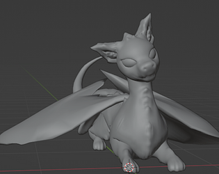
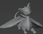
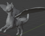
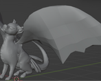
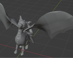
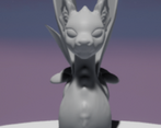
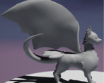
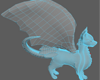
- Contestant: @x.Wolfie.x06 Assessor: Tristan McGuire / @draconic_cowboy Tier: RS Congrats on submitting your project! I really appreciate that you still submitted even though the character isn’t fully complete. Things that went well: ✧ Really great to see that you documented all of your planning and time management. ✧ I love that you self-reflected your progress at each stage - this is a really useful skill. ✧ It’s great to see that you were able to problem solve the issue with the inverted face normal in Zbrush. ✧ Great to see rigging skills! This goes above and beyond the responsibilities of a character artist, but is a very handy skill. I know how hard it can be to rig wings, as I have a couple of dragons on my portfolio. Things to consider next time: ✧ For the wings, next time I would recommend studying your references more closely. Your wings attach with a very thin base, but your konari dragon refs have wing membranes that connect all along the sides of their body right to the gliding tail. I think that this wider area of contact would have helped the design. But it is not a huge flaw at all. ✧ When retopologising the little tufts of fluff, don’t create an edgeloop that goes the whole way around the character, as this then makes the rest of the body too high poly. Instead select the face(s) where you need the extra geo and inset the faces. ✧ For retopology, aim fo your tri density to be quite even across the whole character, only having higher density on the face and maybe the paws. Your model here has wings that are too low poly (it would be a struggle to pose/animate such low poly wings) and the body is far too high poly. Aim for less than 100k tris in total. ✧ The UVs can be packed a lot more efficiently into the space. This can be tricky with an organic model. Feel free to look at the dragons on my portfolio for ideas. As you are in the Rising Star tier, I hope this feedback can be used to inform how you approach future university projects and I would love to see you take part in the competition again next year! You can find me on the social medias in the link below. Feel free to reach out in the future. All the best! https://draconic-cowboy.carrd.co/ - Tristan, Deputy Senior Character Artist at Airship Interactive.
- There is a really thorough development of ideas with a wide range of references. The character you came up with is very believable and fun! the sculpt has good proportions. Some feedback: ∘ The retopology is quite dense, try to use as few polys as possible whilst maintaining the silhouette and then add more edge loops at the end if needed. ∘ reference some quadruped topology and start by creating rings around the legs, head etc and then join them up. use an even number of faces on each ring, i try to start with 8. You can also use this method to map out the tufts of fur ∘ great job with the rigs and poses so far! Overall the project is looking great so far, and the block out in ue5 looks interesting! I look forward to seeing this project when it's complete. Feel free to reach out with any questions ~ Sasha Gallie, Character Artist at Double Eleven https://www.artstation.com/sashagallie
Challenge Tier
Rising Star
Leave a comment
Log in with itch.io to leave a comment.


Comments
No one has posted a comment yet