Play Real-Time Environment
Rising Star 2023 - Aughra's Observatory ('The Dark Crystal')'s itch.io pageResults
| Criteria | Rank | Score* | Raw Score |
| Research + Development | #1 | 5.000 | 5.000 |
| Final Presentation | #1 | 5.000 | 5.000 |
| Project Documentation | #1 | 5.000 | 5.000 |
| Overall | #5 | 4.200 | 4.200 |
| Technical / Workflow | #23 | 3.000 | 3.000 |
| Creative Development | #24 | 3.000 | 3.000 |
Ranked from 1 rating. Score is adjusted from raw score by the median number of ratings per game in the jam.
Judge feedback
Judge feedback is anonymous.
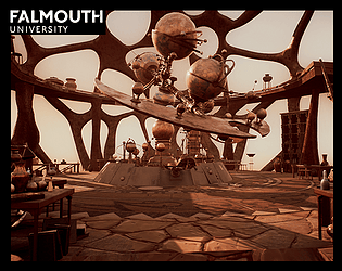
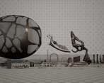
- Hi Olivia, Your project seems to be very strong. I love the fact you've done so much research on this them and been extremely serious about it. Technical / Workflow From what I could see, you seemed to have the opposite issue other students had with polycount, which is that it is too low on some areas, especially for the bigger rounded surface. Your normals don't seem to be smoothed on certain cylinders and therefore, the faces are breaking the sleek illusion of curves. When it comes to the UVs, having a very bright and white template makes it hard to judge but I could tell this huge structure deserved multiple tiles of Uvs. For the biggest surface, I would have loved to see some substance painter materials as well for the main structure. Decision making wise, I think you've been greedy in terms of quantity. I think you would have had something that is professional looking if you had focused all your energy on the interior part of the set and forget completely about the exterior. Some props on your tables seem to be extremely well detailed compared to the bigger surfaces of the set, this discrepancy breaks the immersion. Few nitpicks : On your video we can see the frames on those sphere crashing into the geometry which breaks immersion. The ladder, especially presented in closeup seems to have the wrong roughness and looks like a plastic material. They are few things that define surfaces property in a very important way, the width of your bevels and the roughness. Creative Development I did put 3 stars because it is a replication of something that's already been done and resolved for you. although the researches made were very deep and complete, I would have loved to see what you would be capable of concepting yourself. This is orverall a very impressive job done fast, well... Just keep going, to me, you are a rising star. Alexandre - hard surface artist - VFX Industry
Challenge Tier
Search For A Star
Rising Star
Chosen brief
Environment Art (Standard)
Leave a comment
Log in with itch.io to leave a comment.


Comments
No one has posted a comment yet