Play asset pack
Infinite Gallery's itch.io pageResults
| Criteria | Rank | Score* | Raw Score |
| Creative Development | #48 | 2.000 | 2.000 |
| Technical / Workflow | #51 | 2.000 | 2.000 |
| Project Documentation | #51 | 2.500 | 2.500 |
| Research + Development | #56 | 2.000 | 2.000 |
| Final Presentation | #58 | 2.000 | 2.000 |
| Overall | #62 | 2.100 | 2.100 |
Ranked from 2 ratings. Score is adjusted from raw score by the median number of ratings per game in the jam.
Judge feedback
Judge feedback is anonymous.
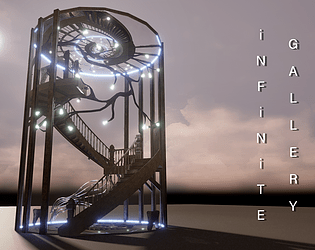
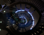
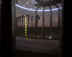
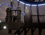
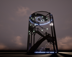
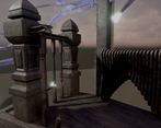
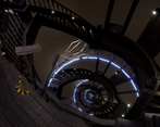
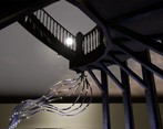
- Hi Michaela, This is very poetic and original project you've created there. Research + Development I think you could improve the storytelling behing this piece. We talk about an art gallery but if feels like we needed more pieces to the exposition, the branches being what we have to observe while climbing up. I would have loved to some branches growing on the glass surface and follow the curves, having the top of the structure much more busy and the lower part almost empty. You could have used more of this yellow construction band as it is now less relevant since it is so shy in this scene. Who built this ? Why ? To show what ? Those are questions I would have loved to have answers to in the lore. Technical / Workflow Uvs and modeling seem clean, I would have loved to see some trimsheet use on this project. Also I think modeling wise it would have helped a lot to have wider bevels on the wood parts as now they look too sharp to be wood. Such sharp edges catch the eye strongly and breaks immersion and make the objects appear like metal or laser cut beams. Creative Development Although the concept is highly original you could push it further like I've suggested above. In terms of execution you may want to revisit the wood texture as of now, the normal map is way too strong. Same issue for the yellow band. When it comes to the glass, since everything seems so old I was expecting imperfections on it. The fact it looks so clean makes it hard to believe. In a more personnal preference I think it would have been better to have smoother curves building those platforms as of now it looks very polygonny. I know this is manufacturing challenge but I'm sure you could have found good references of curved, carved, wooden surfaces. In general, I would say try to break the boxy aspect of you props, the lights look like extrude cubes. If we can tell how you made an object, with certain operations, then it deserves more treatment. Final Presentation Adding turntables, wireframe and greyscale is important to make a better presentation. This is a good project, good effort ! Keep going. Alexandre - senior hard surface artist - VFX Industry
Challenge Tier
Search For A Star
Chosen brief
Environment Art (Standard)
Leave a comment
Log in with itch.io to leave a comment.


Comments
No one has posted a comment yet