Play asset pack
Water Shrine's itch.io pageResults
| Criteria | Rank | Score* | Raw Score |
| Creative Development | #6 | 4.000 | 4.000 |
| Technical / Workflow | #19 | 3.500 | 3.500 |
| Final Presentation | #23 | 3.000 | 3.000 |
| Research + Development | #24 | 3.000 | 3.000 |
| Overall | #28 | 3.300 | 3.300 |
| Project Documentation | #33 | 3.000 | 3.000 |
Ranked from 2 ratings. Score is adjusted from raw score by the median number of ratings per game in the jam.
Judge feedback
Judge feedback is anonymous and shown in a random order.
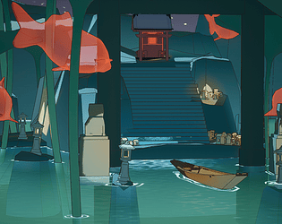
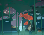
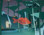
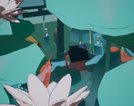
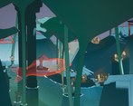
- Hi Lucie, Research + Development Although you've had a great idea to exploit and a more original approach to the subject, I would have loved to see fare more references for each material treated with the style you wanted. The wood, the stone, the vegetables are so present in your scene that they would have deserved their very own references set for the style you developed. Technical / Workflow As I can see there is no Uvs nor normal backing nor PBR textures or texturing of some sort. Since everything seems to be done with shaders I was way more regarding on this topic. On the water specifically I think you could have added hand drawn details on the waves, like the reference you used for Moëbius. https://images.squarespace-cdn.com/content/v1/54fc8146e4b02a22841f4df7/1651521936220- LP91Z1ZDPIOL17EY9MKA/Art_of_Moebius_.jpeg Color variations are also very important to get the same feeling. There is too much contrast of details between the stone Shrines and the rest of the geometry. The shrines have good bevels and are topologically logical. The stairs, the wooden shrine on top should also have bevels and a much higher detail level. https://seattleartistleague.com/wp-content/uploads/2020/08/Jean-Giraud2-2000x1430.jpg If you look a closer the floor, there are a lot of sub details you have been inspired by for those stairs. Same thing for the trunks on those vegetables https://cdn.rt.emap.com/wp-content/uploads/sites/4/2012/03/18074125/avoyagedhermes_moebius_03.jpg for the fishes : https://pbs.twimg.com/media/D5Y3i3OWAAEs_NM.jpg note there are some dots shading those elements, this is a very important element to nail this style, in my opinion. Final Presentation It would have been great to have a video showcasing your scene, wireframe and greyscale renders.
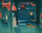
- Wow! What an awesome project! I love the effect you've created with your post process shaders, and the water shader. The composition works very well, I just wish there were a few more assets there, as there are large areas of empty space making the scene feel a little unfinished (which I think it is as the decorative statue is missing?). With a little more time spent on the project to add some more assets, and figure out the post process fog, this could be a very strong portfolio piece, well done!
Challenge Tier
Search For A Star
Chosen brief
Environment Art (Standard)
Leave a comment
Log in with itch.io to leave a comment.


Comments
No one has posted a comment yet